Hello world! Alongside news this section contains a multitude of topics that offer you insights into who we are, what we do and how we do it. Scroll serendipitously through the entire collection or filter by interest All Why go custom? Custom Work In-Use Preoccupations Releases
Releases
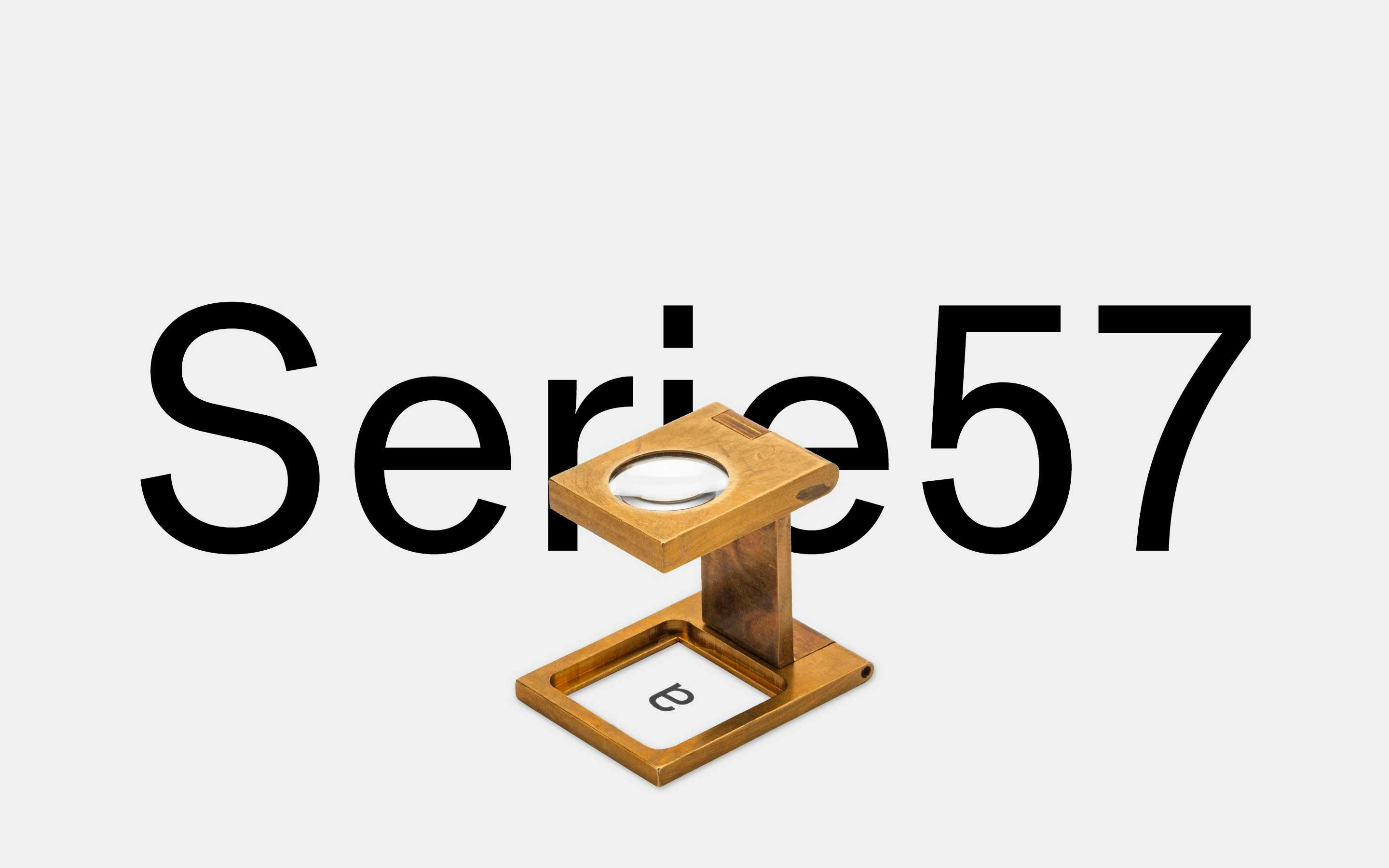
neue Serie57® Release
neue celebrates a world premiere — in collaboration with Erik Spiekermann we have created the first ever digital version of the forgotten and overlooked Akzidenz-Grotesk® Serie 57 metal type. We call it neue Serie57®.
Learn MoreReleases
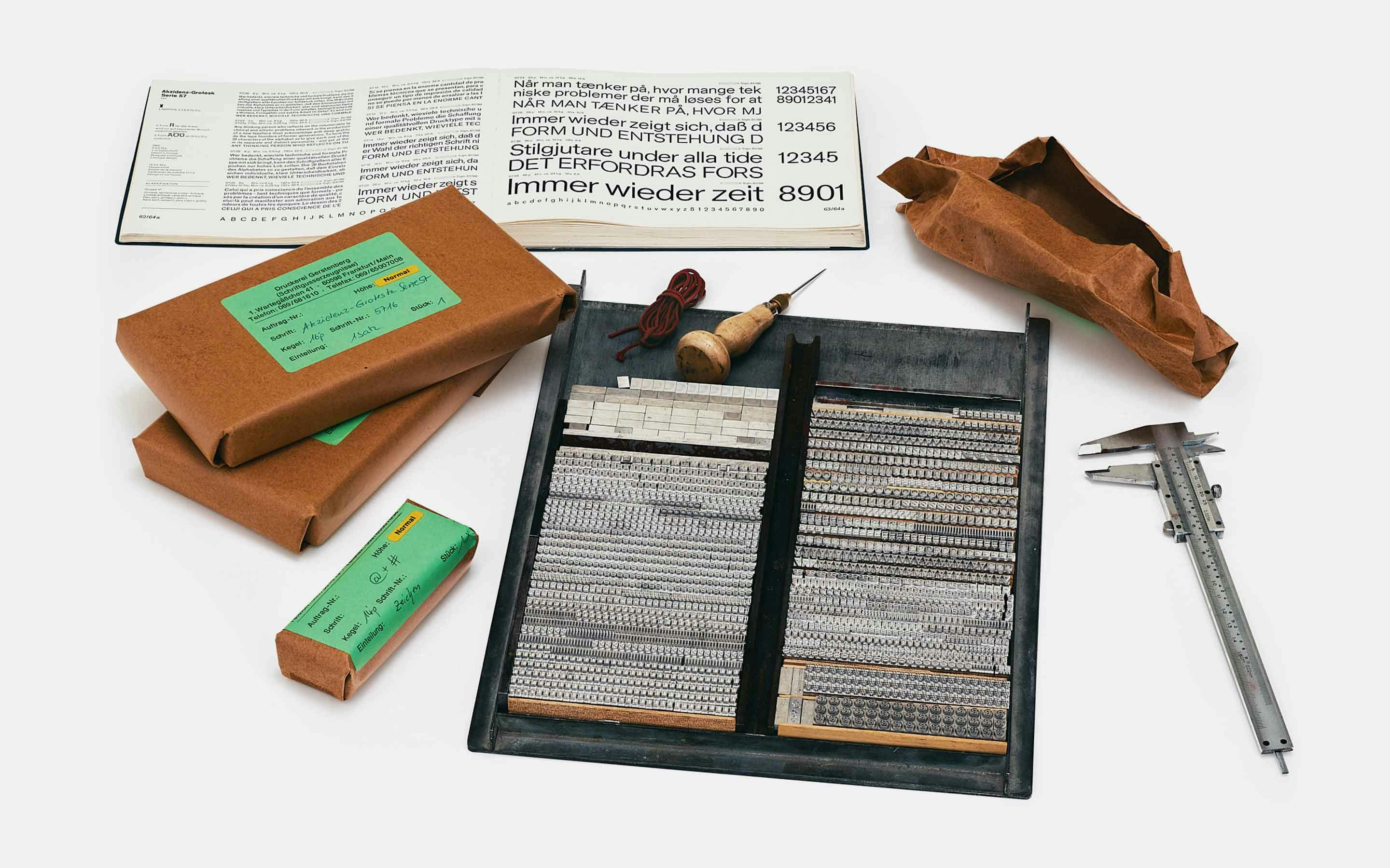
Akzidenz-Grotesk Serie 57 Cast
Rainer Gerstenberg — the last remaining type caster in Germany — was commissioned by Erik Spiekermann to cast a full set of Akzidenz-Grotesk Serie 57 for the neue Serie57 specimen and its insert. The masters were borrowed from Leipzig specifically for this job.
Learn MoreReleases
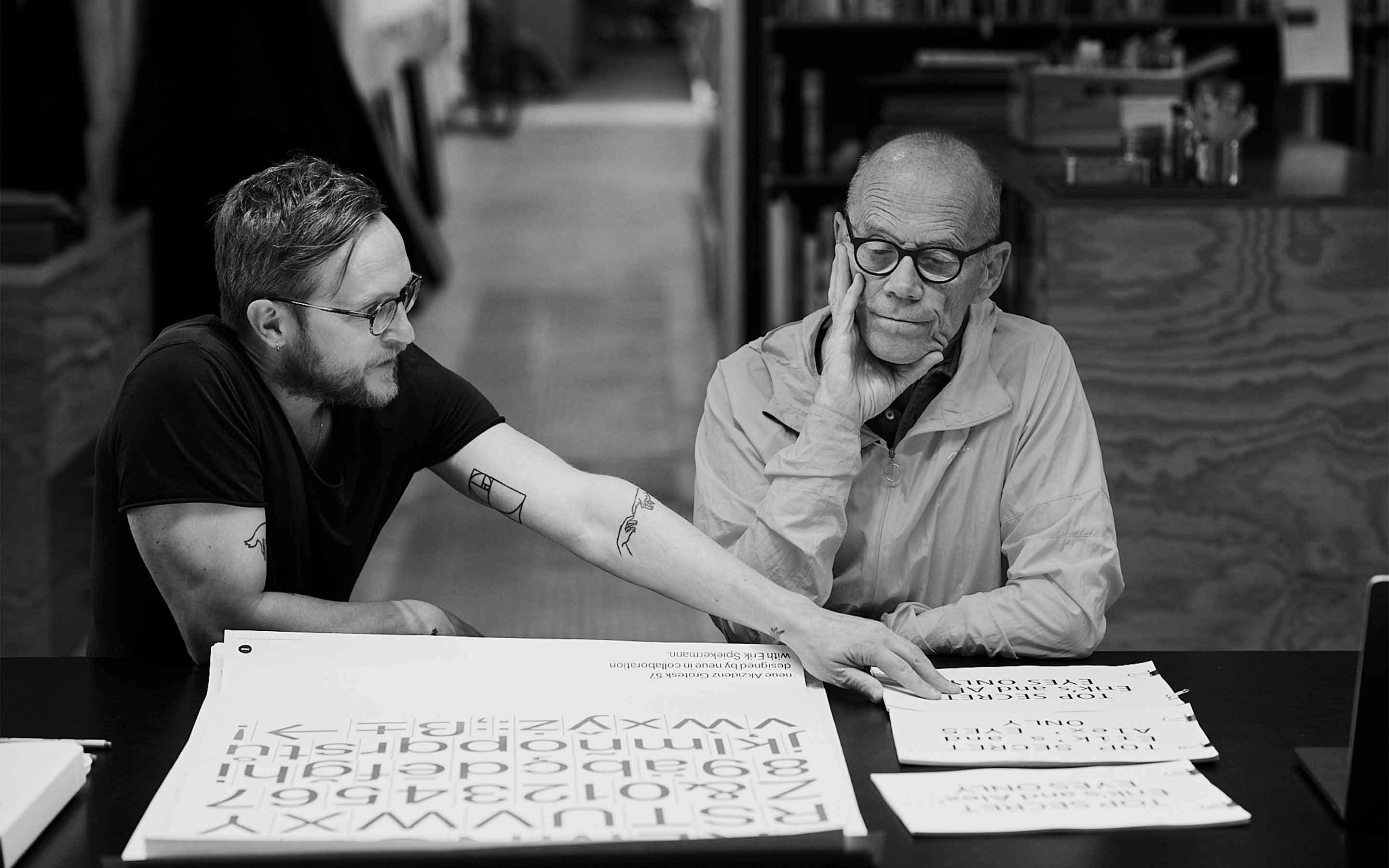
neue Serie57 Making-Of
Erik Spiekermann and Alexander Roth discussing over a batch of neue Serie57 proofs at Hacking Gutenberg in Berlin . Many such meetings were held each focusing on an individual topic such as shapes, weights, spacing, small caps, stylistic alternates, and more.
Learn MoreReleases
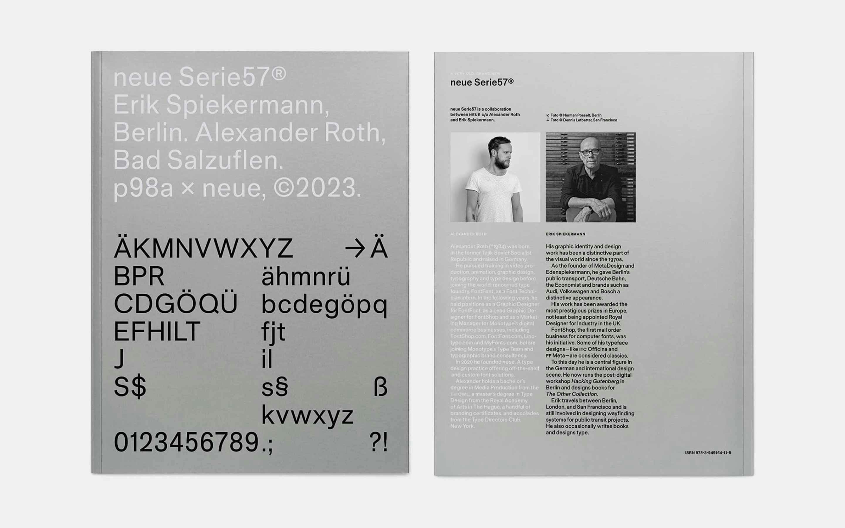
neue Serie57 Type Specimen
210×280mm in size, 380g in weight, 64 pages plus cover, and printed in 4C+Pantone 877 Silver on FSC-certified paper. The type specimen is distributed exclusively by Hacking Gutenberg . The edition is limited to 500 copies, numbered by hand and signed.
Learn MoreReleases
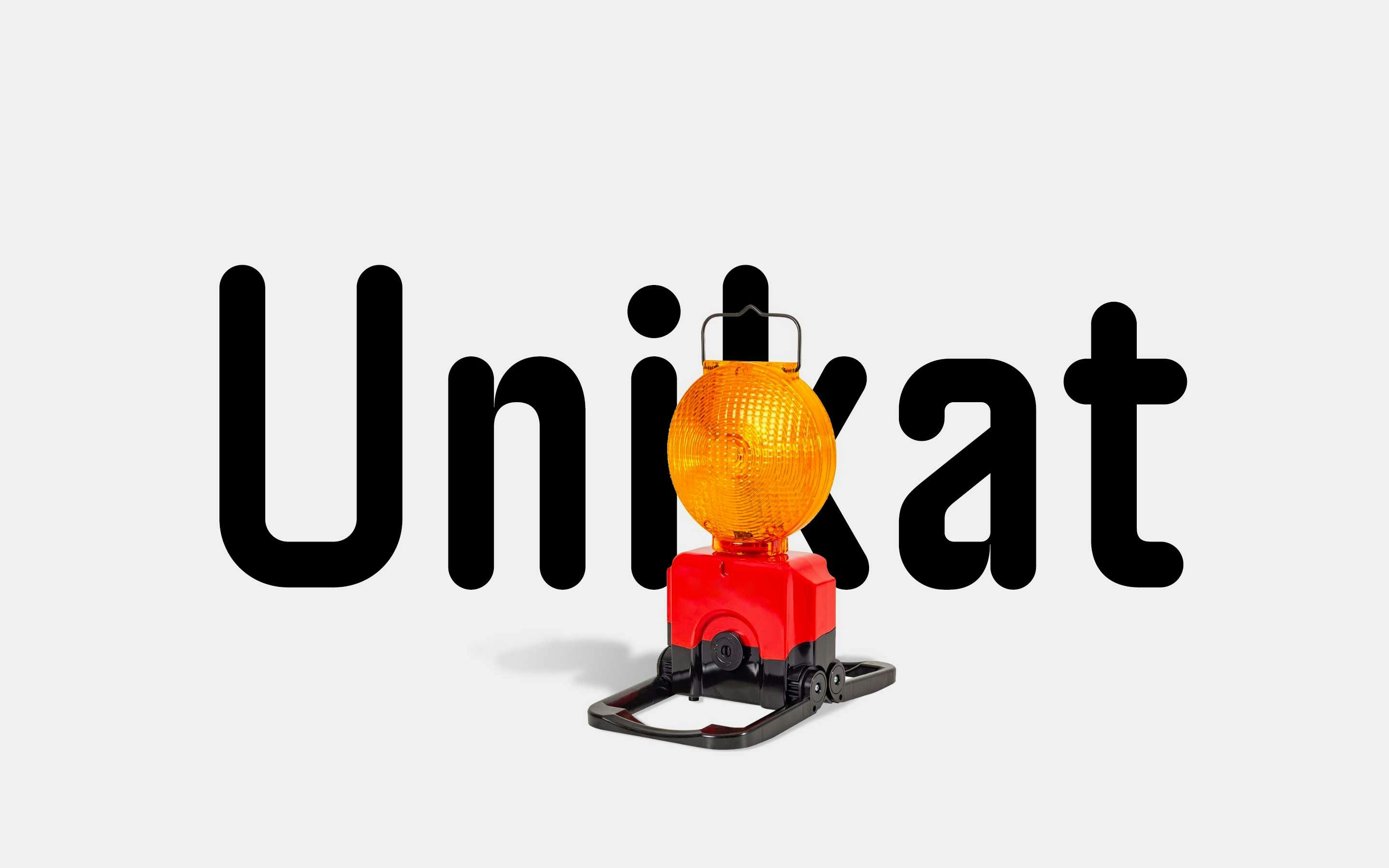
neue Unikat Stencil Release
neue Unikat Stencil is a further extension of our neue Unikat Superfamily — in addition to normal and round. Inspired by (typo)graphic street markings and with its multiple horizontal-only cuts this font family is far away from a traditional stencil designs.
Learn MoreReleases
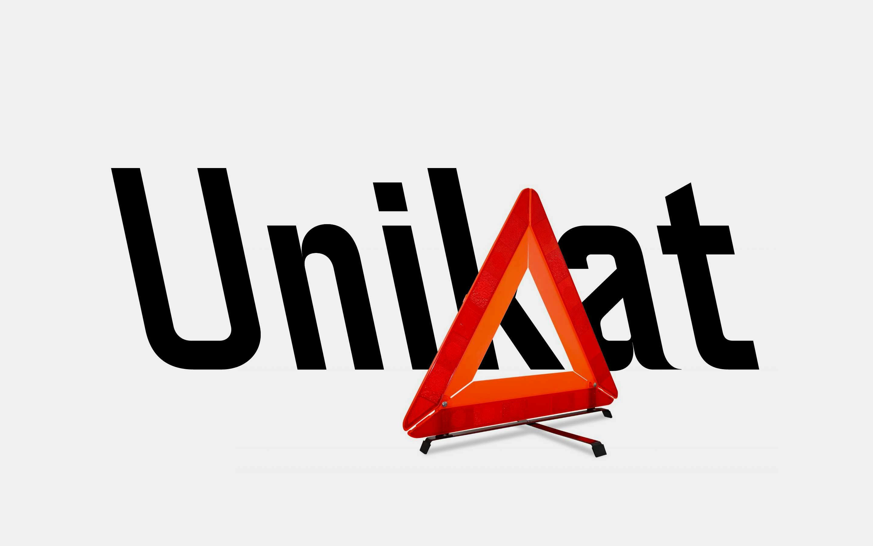
neue Unikat Round Release
To further diversify the potential usage of neue Unikat we have created neue Unikat Round — a less austere and a more friendly appealing sibling. While all stroke endings were replaced by half-circles the inner corners retained their explicit sharpness.
Learn MoreReleases
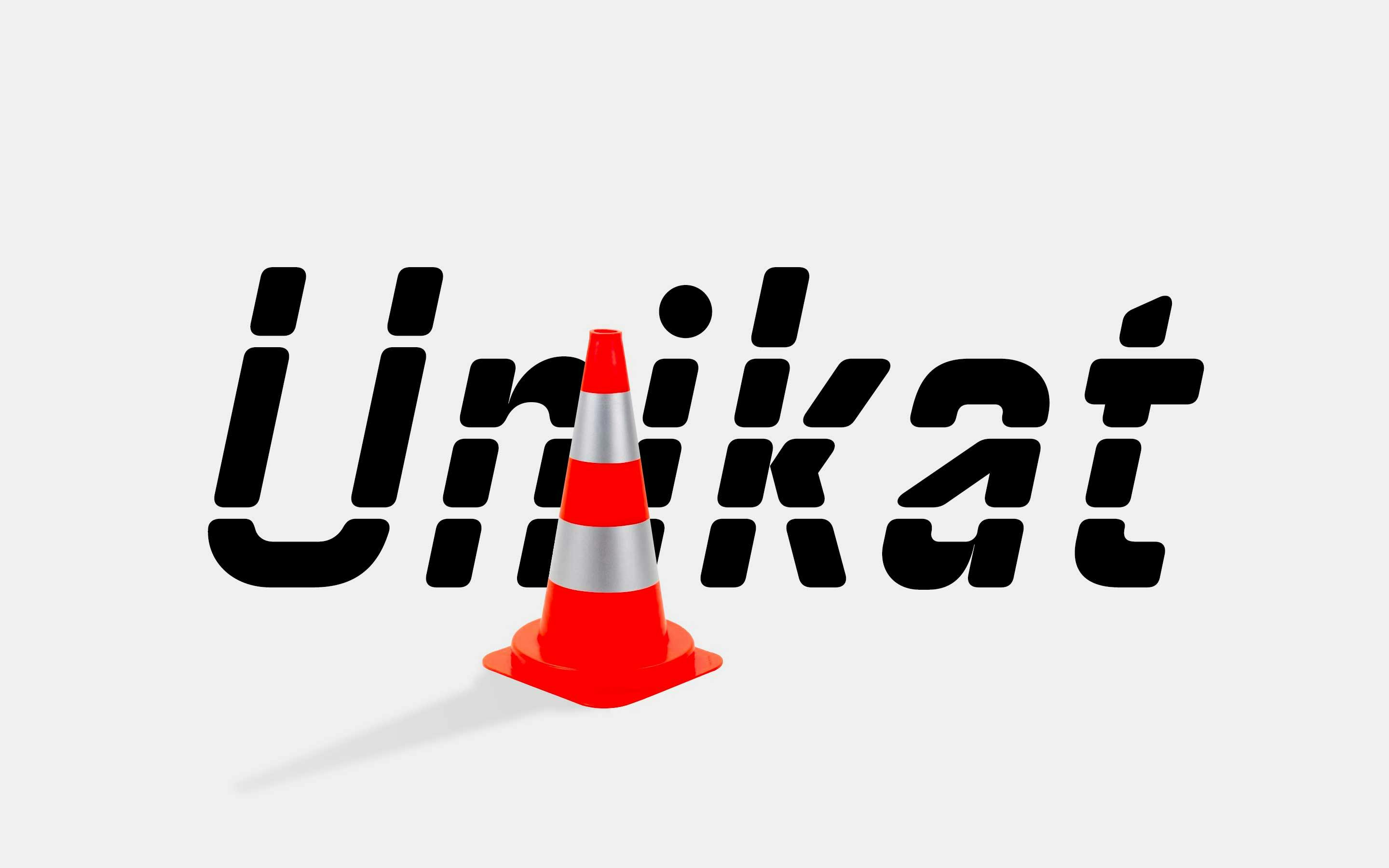
neue Unikat Release
neue Unikat is an interpretation of a typeface used by the Singapore Land Transit Authority for its directional signage. The typeface design is based on a rigid grid with little to no room for optical compensations or any kind of harmonisation.
Learn MoreReleases
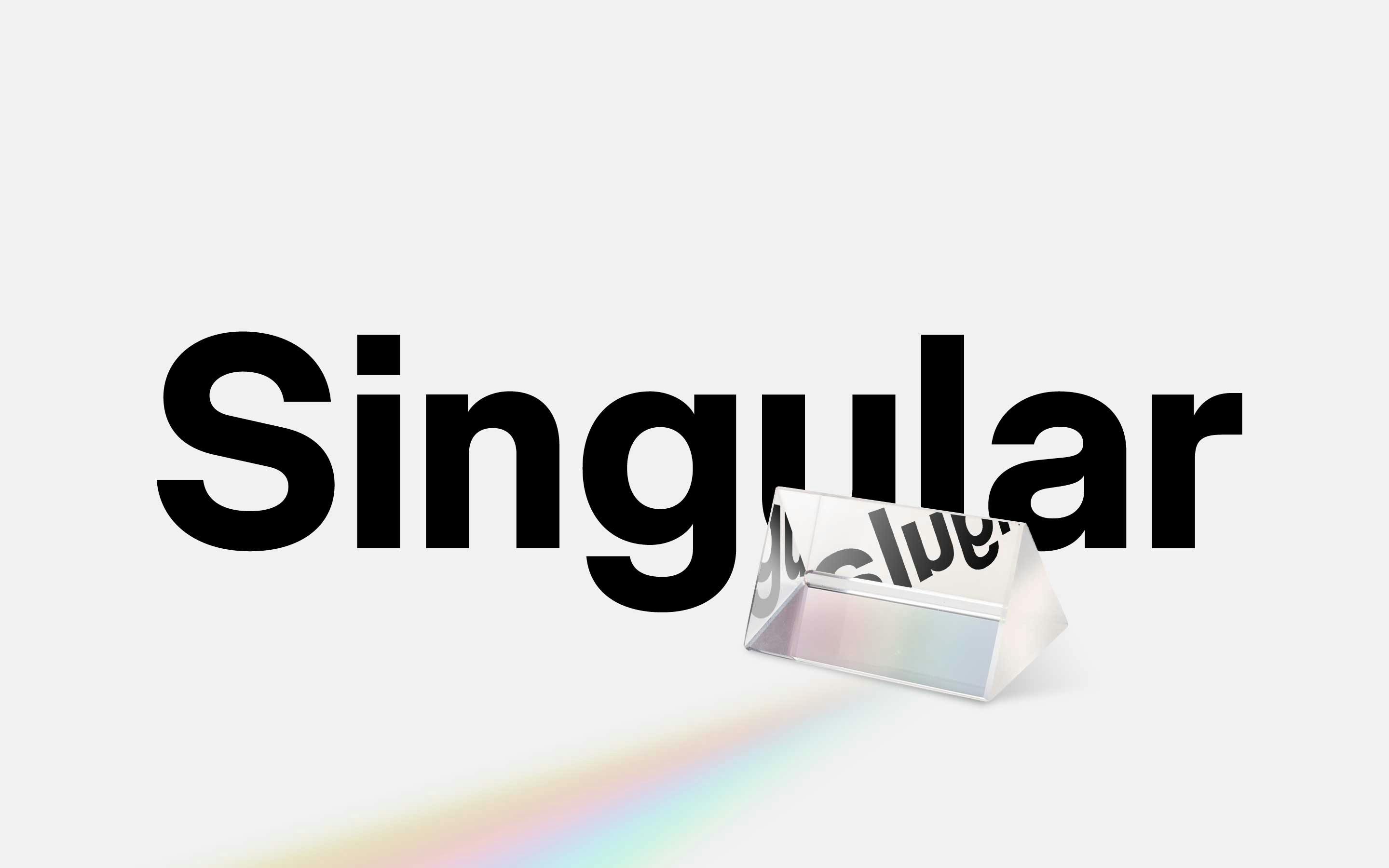
neue Singular Release
neue Singular is a contemporary Neo-grotesque sans-serif designed in three variants. The suffixes H, D, and V indicate the corresponding treatment of the stroke endings: H for horizontal, D for diagonal, and V for vertical.
Learn MoreReleases
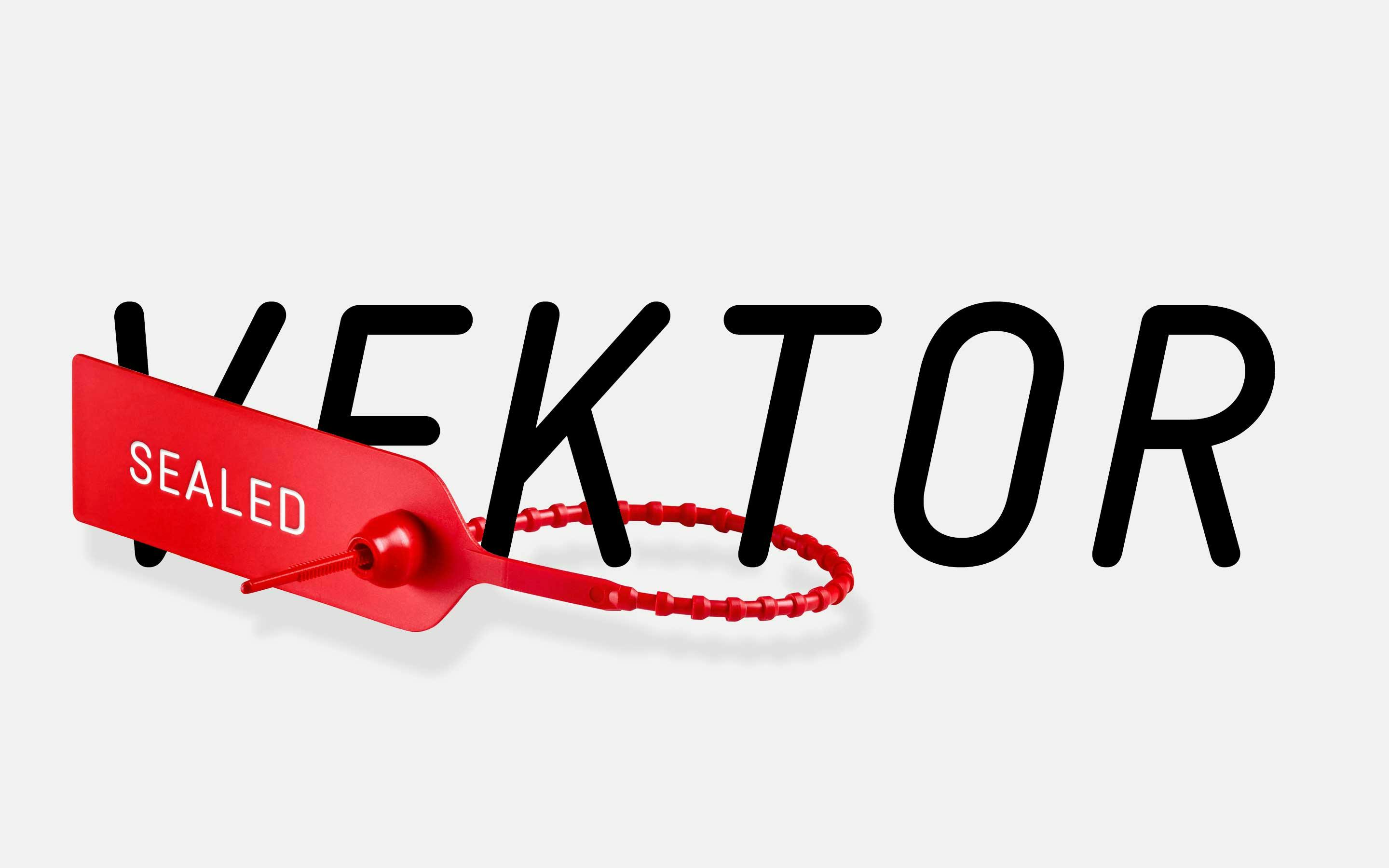
neue Vektor CNC Release
neue Vektor CNC is engineered, not designed. The family draws inspiration from the engravings one can find on German industrial goods such as drills, ball-bearings, nameplates and all kinds of infrastructural plaques.
Learn MoreReleases
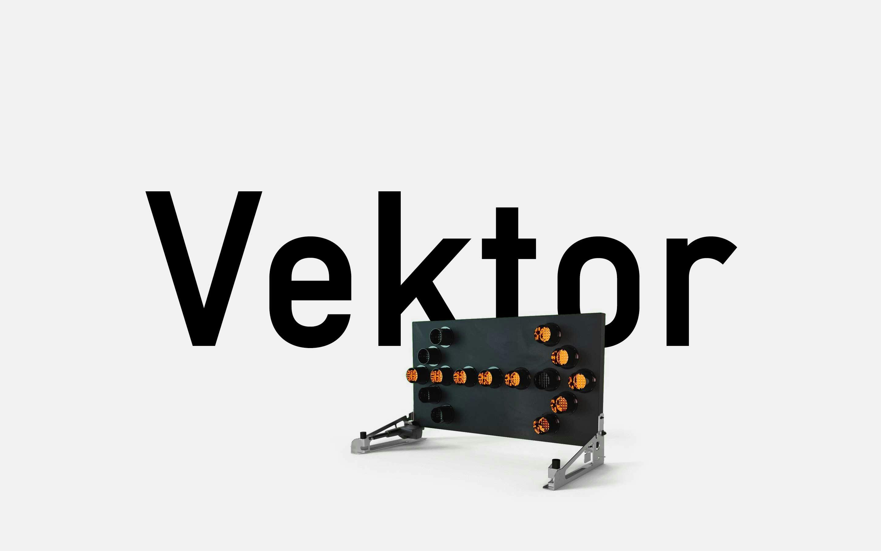
neue Vektor Release
neue Vektor is subject to the idea of “one destination, two routes”: satisfying one particular design demand with identical characteristics such as character set, number of styles, OpenType functionalities and metrics, but doing it so in two stylistically different ways.
Learn MoreReleases
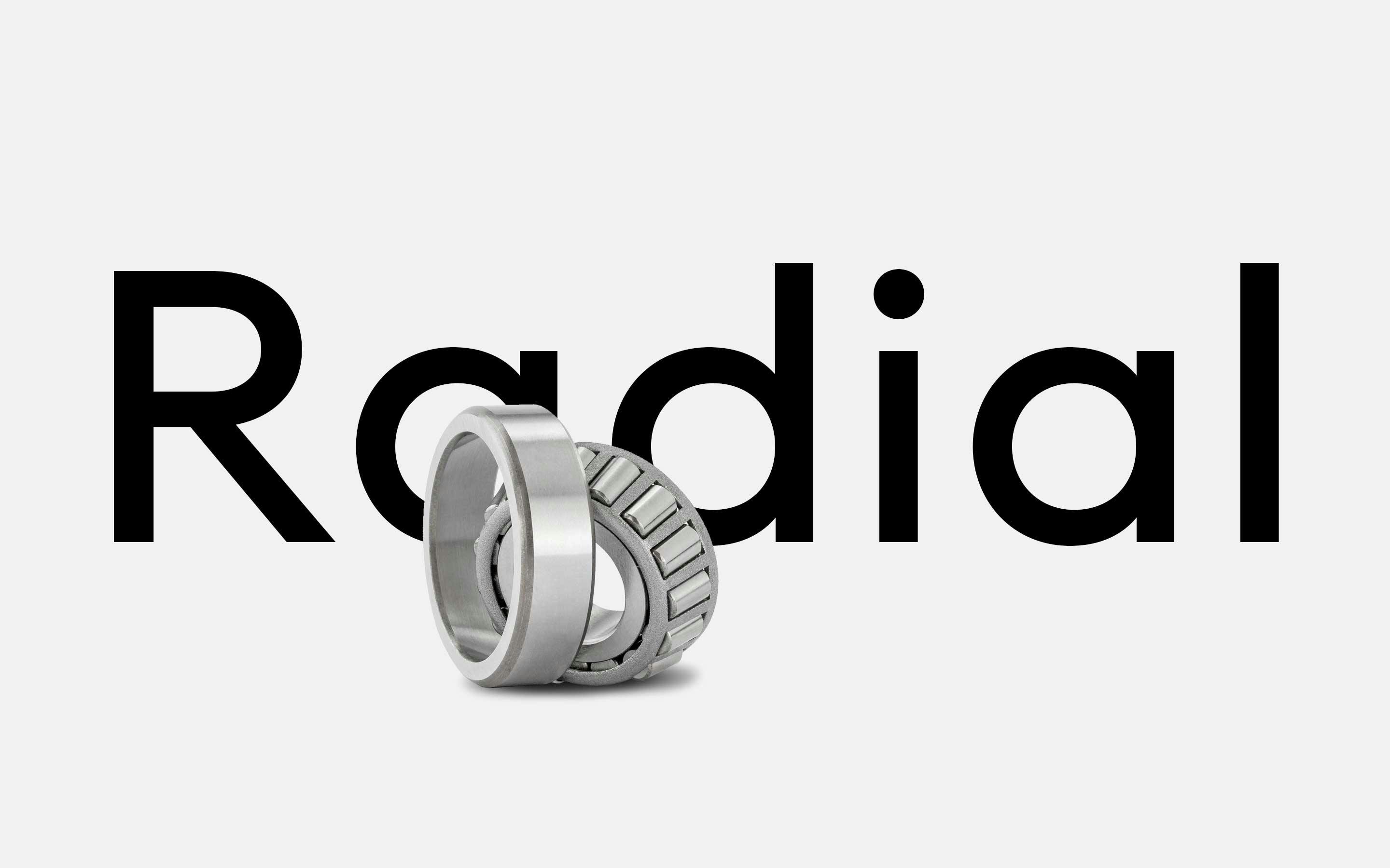
neue Radial Release
neue Radial is not what it seems at first sight. Most certainly it is not another geometric grotesque, but an impeccable visual system that unites four of the most popular sans serif genres of recent decades, integrated in this superfamily under the suffixes A, B, C and D.
Learn MoreFurther Information
Try before you buy. neue offers Trial Fonts for each family with a reduced character set Download trial fonts. Want to customize one of our retail fonts? Sometimes a small modification of an already existing neue font does the job Learn more about Custom Fonts. Let’s have a Video Call in case you prefer it over writing emails Schedule a video call. Get in touch: neue, c/o Alexander Roth, Im Wellenbügel 14, 32108 Bad Salzuflen, Germany Find us on the mapEmailInstagramLinkedIn.