neue Radial Release
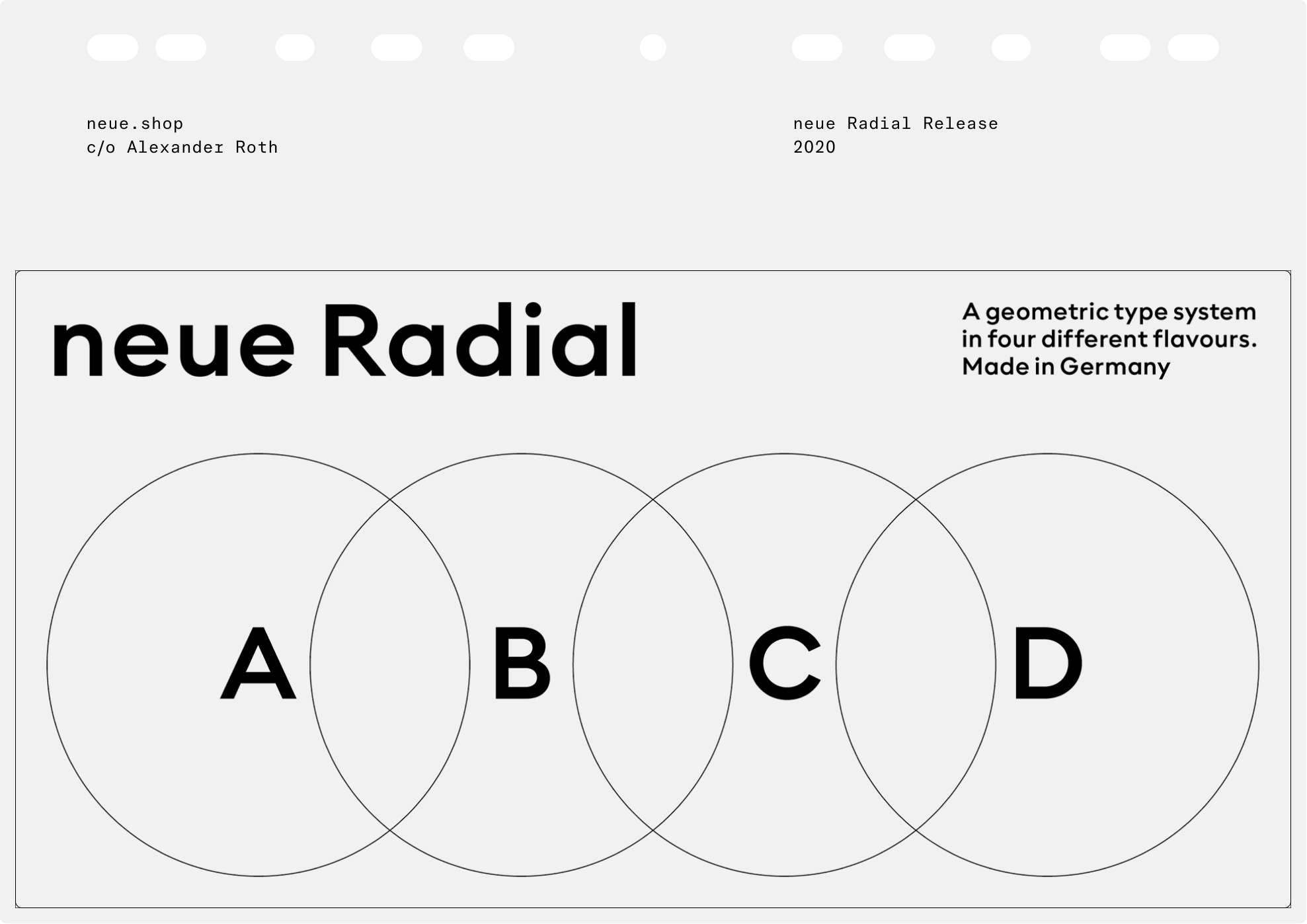
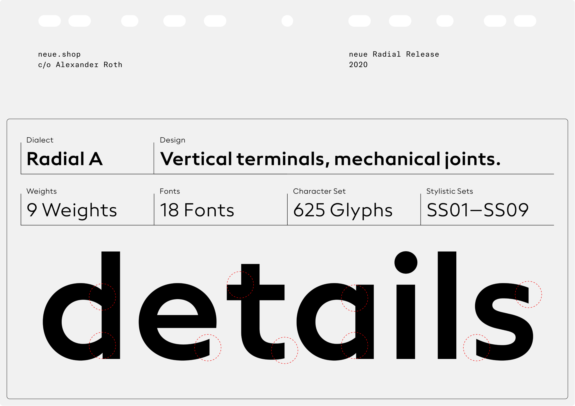
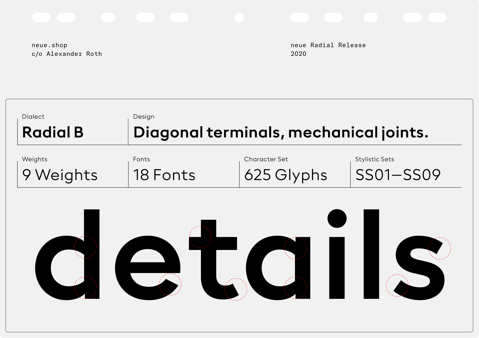
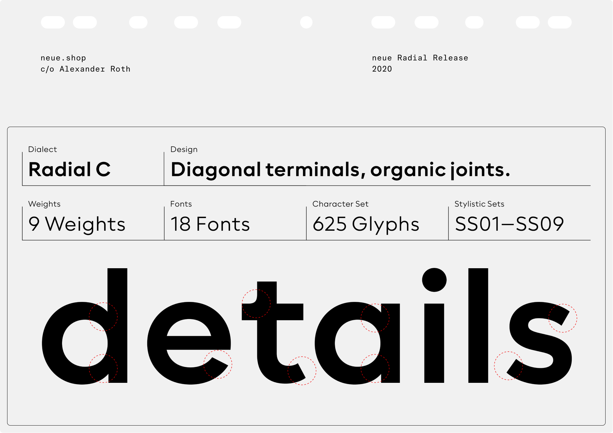
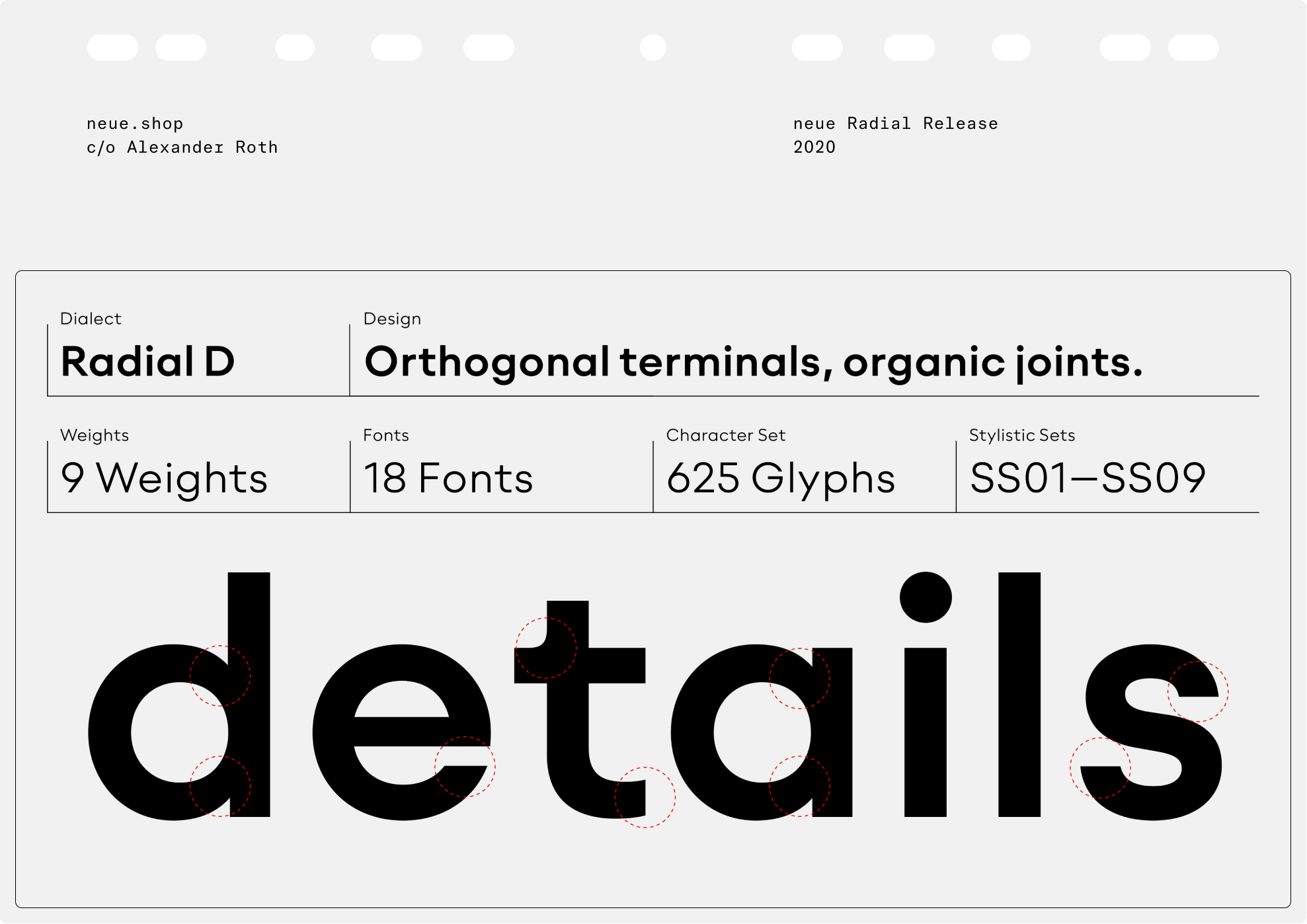
neue Radial A follows the idea of New Functionalism that cultivates the model of the original London underground typeface in some details, while neue Radial B exemplifies the roots of a rational grotesque of the late nineteenth century, a continuous success-story. neue Radial C is a contemporary representative of the geometric sans, mechanically constructed to optically appeal to the appearance of a true ‘compass and ruler’ typeface. Avant-Garde-esque elements ensure a smooth transition into neue Radial D that reflects the tradition of neo-grotesques.
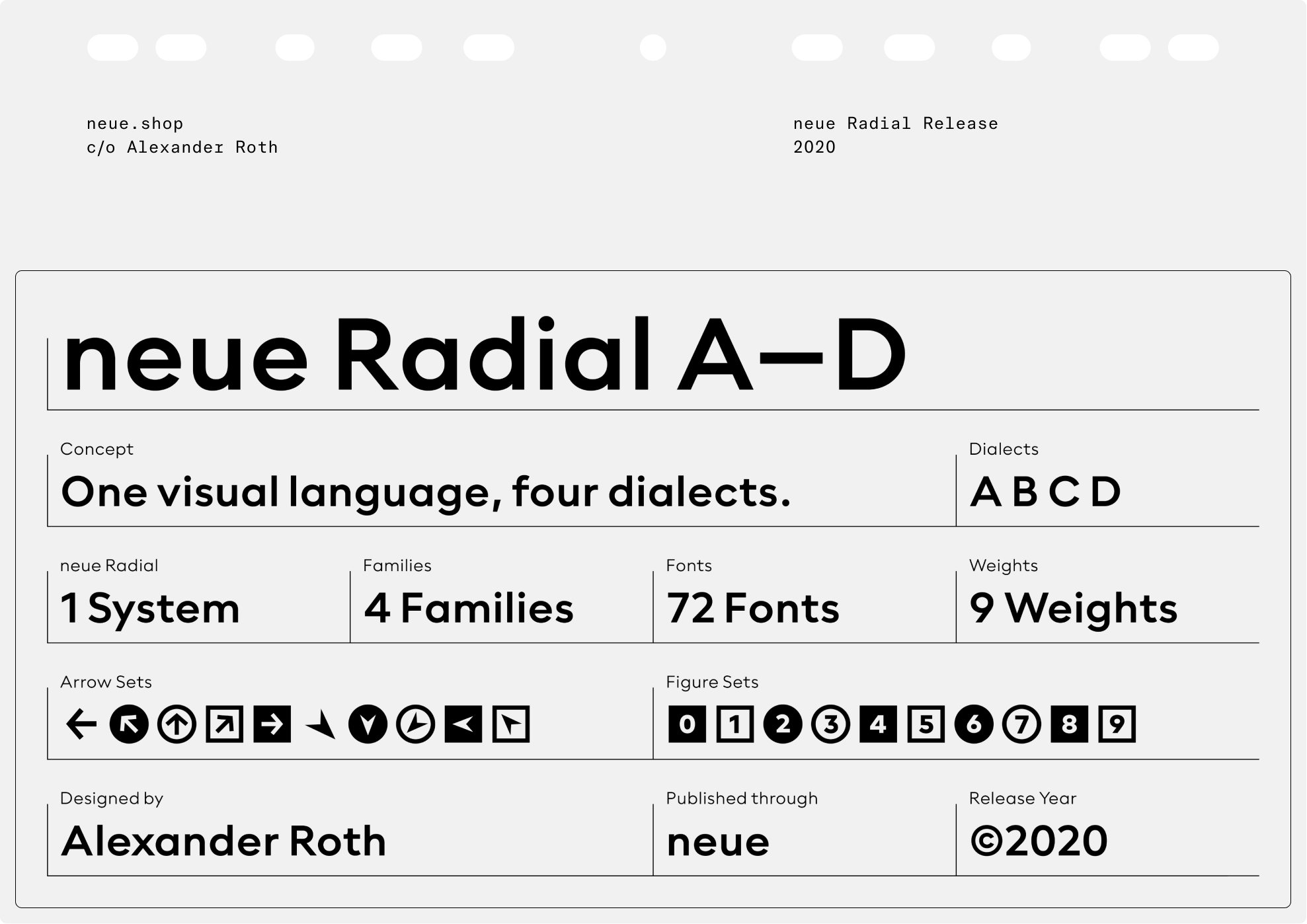
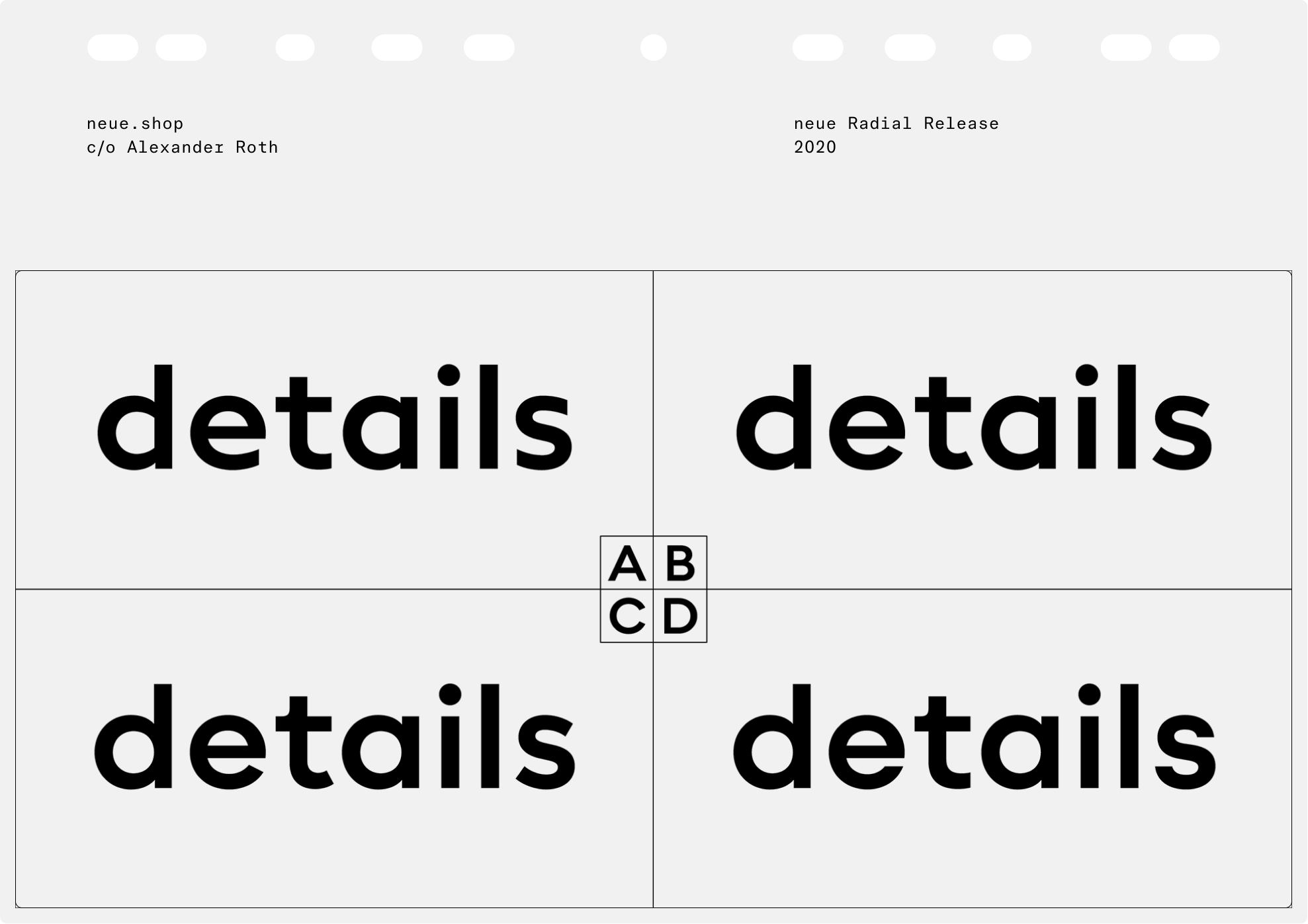
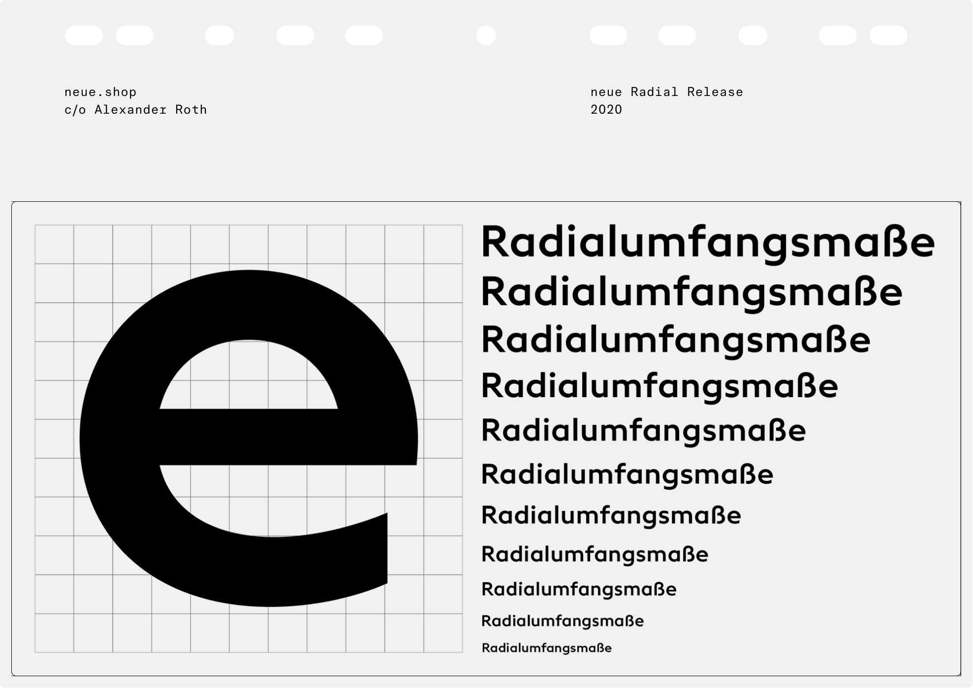
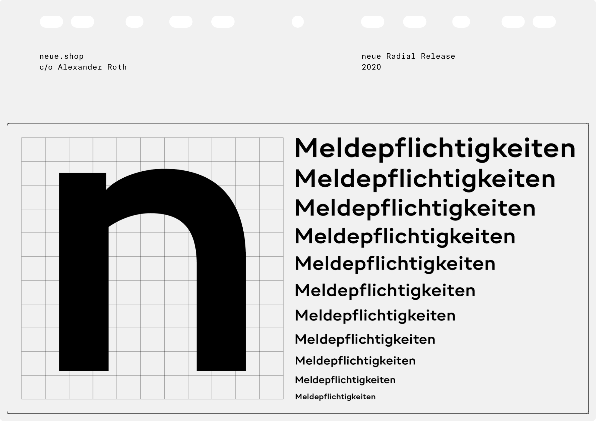
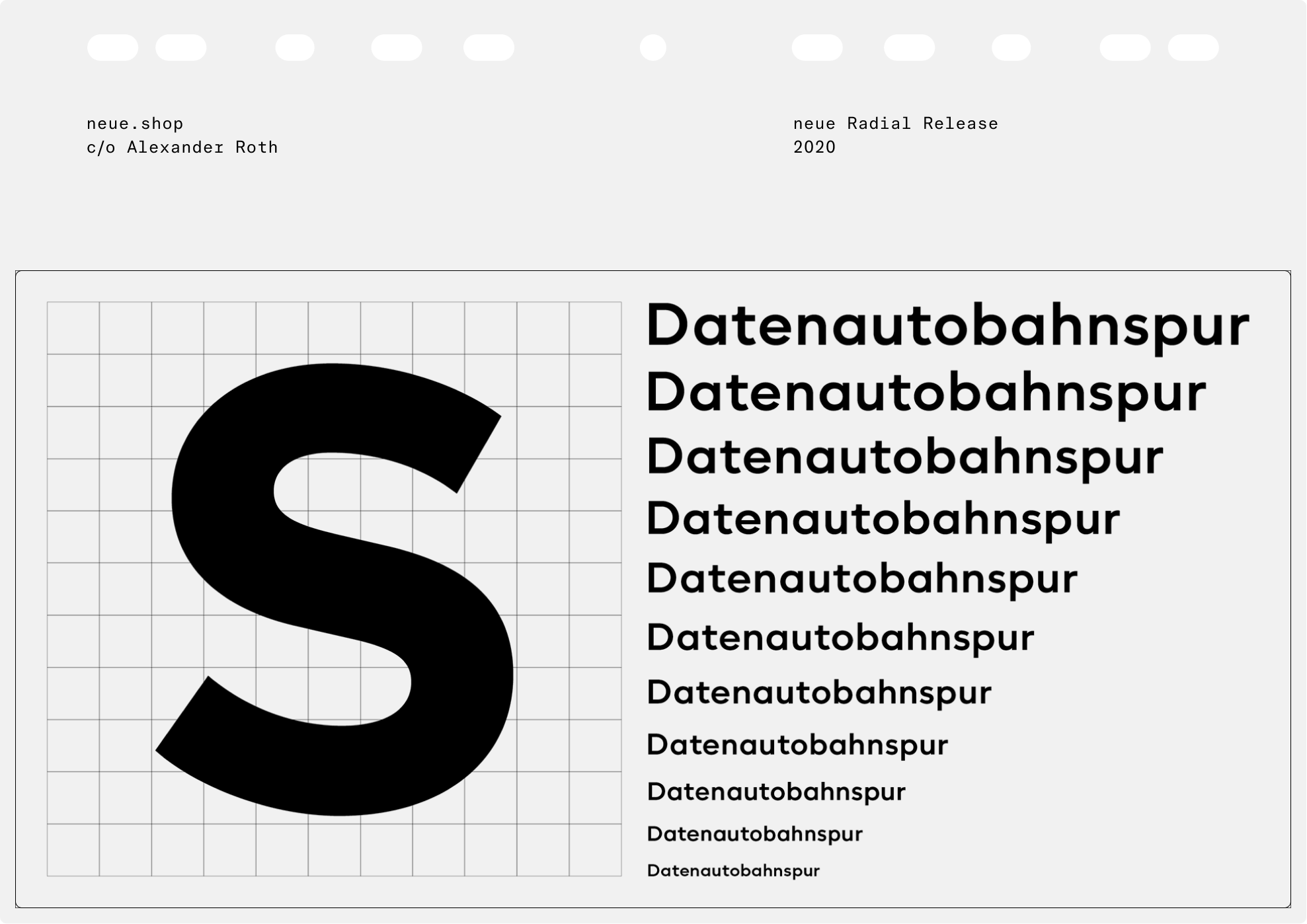
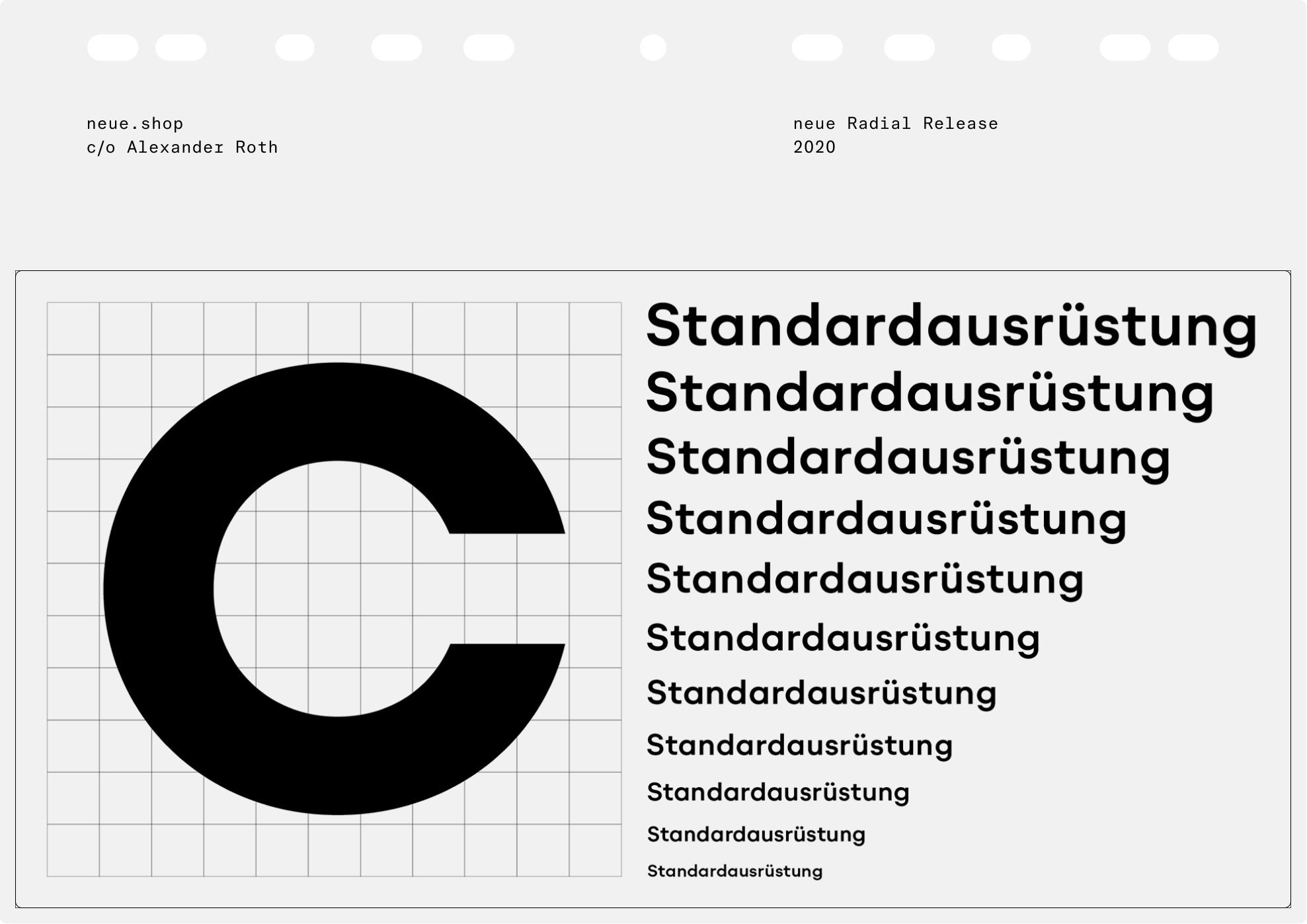
The capital letters in all four families, almost square in appearance, follow an ancient model first demonstrated in the Roman capitalis. With only little metamorphosis from one family to the next, the capitals constitute the backbone of neue Radial, although a common denominator also lies in the overall structure of several prominent lowercase characters such as a, b, d, h, i, n, u. At the same time, details in stroke endings, strokes that enclose counter forms and transitions from bows into stems are carefully adjusted in detail to match the respective genre. The system successfully merges the three traditional stroke endings, i.e. vertical, diagonal, horizontal, and joins organic with mechanical stem structures. As a result, each family member speaks its own dialect, while all four stylistically share the same language. In other words, the range of weights, number of glyphs and font metrics are identical in all four families that each offer their own style and expression.
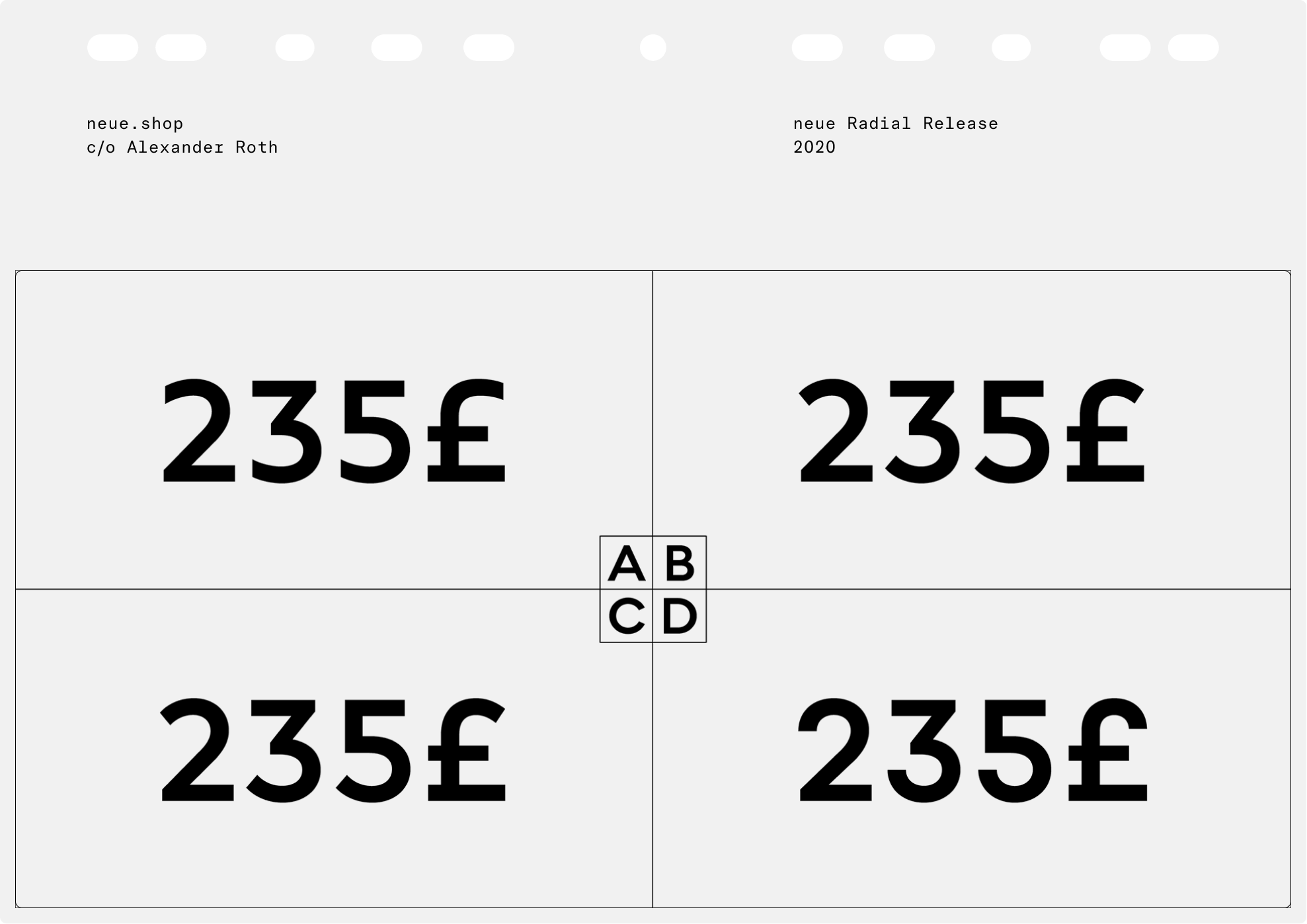
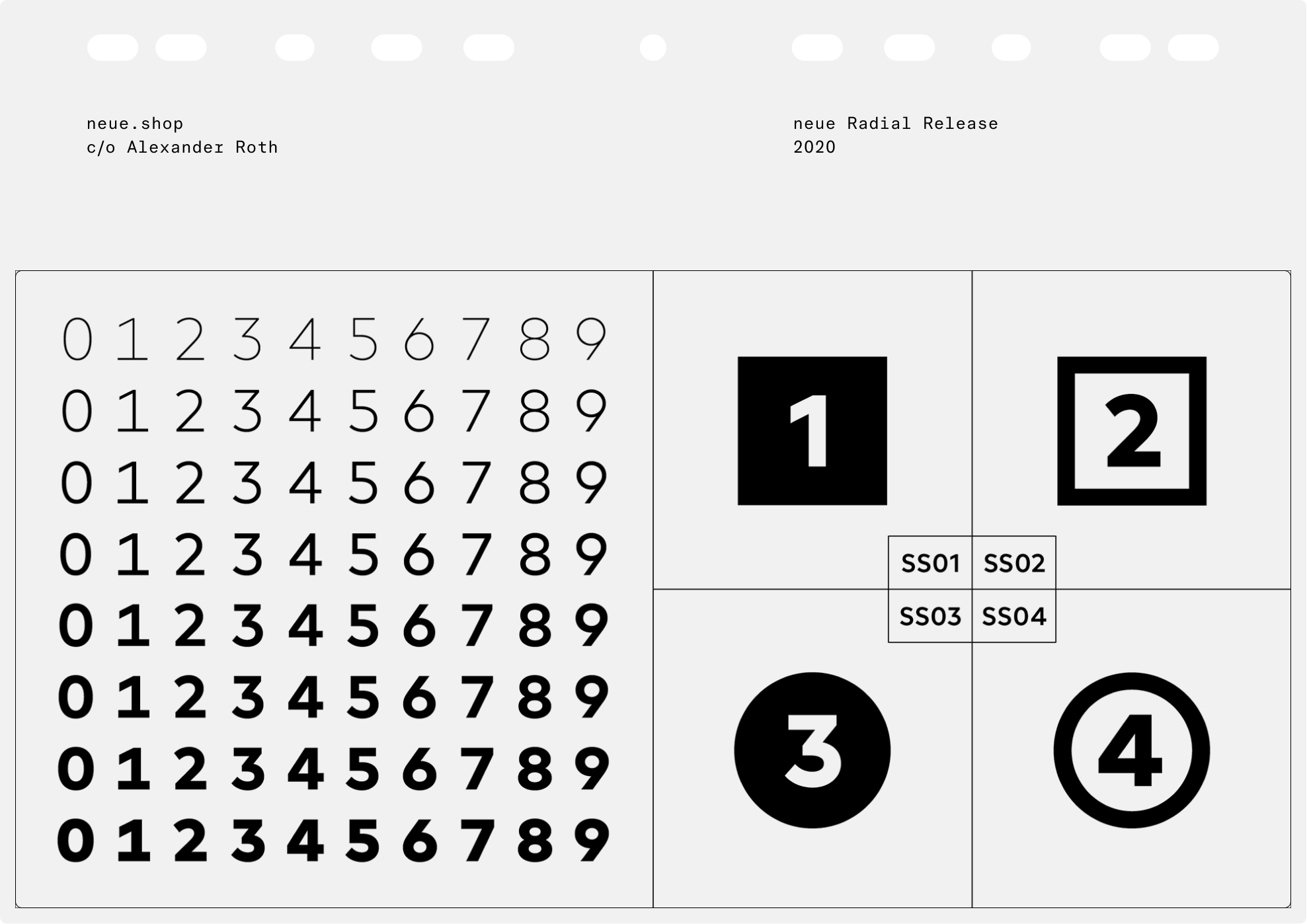
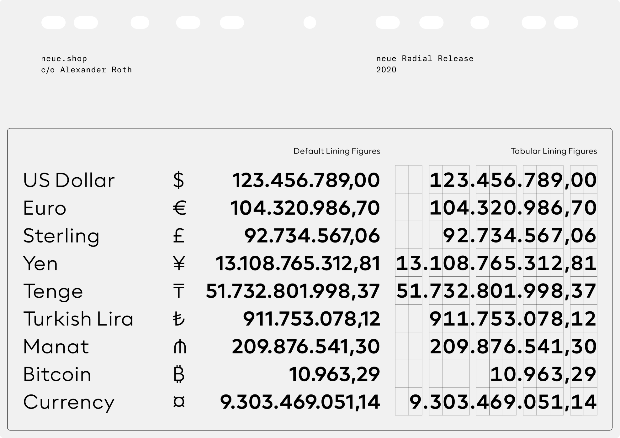
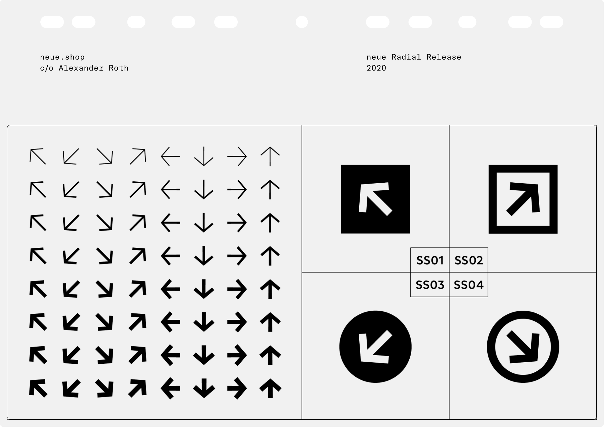
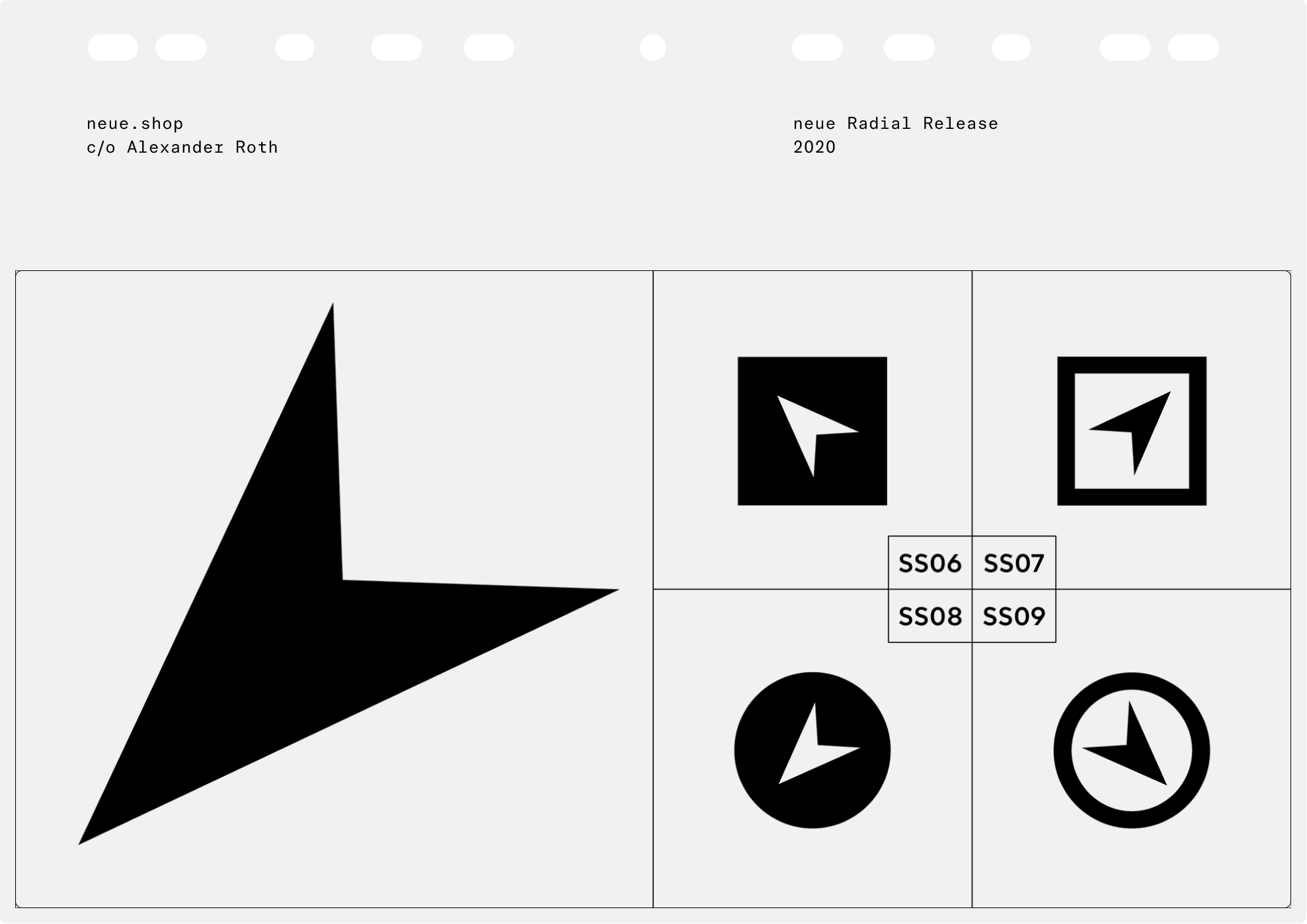
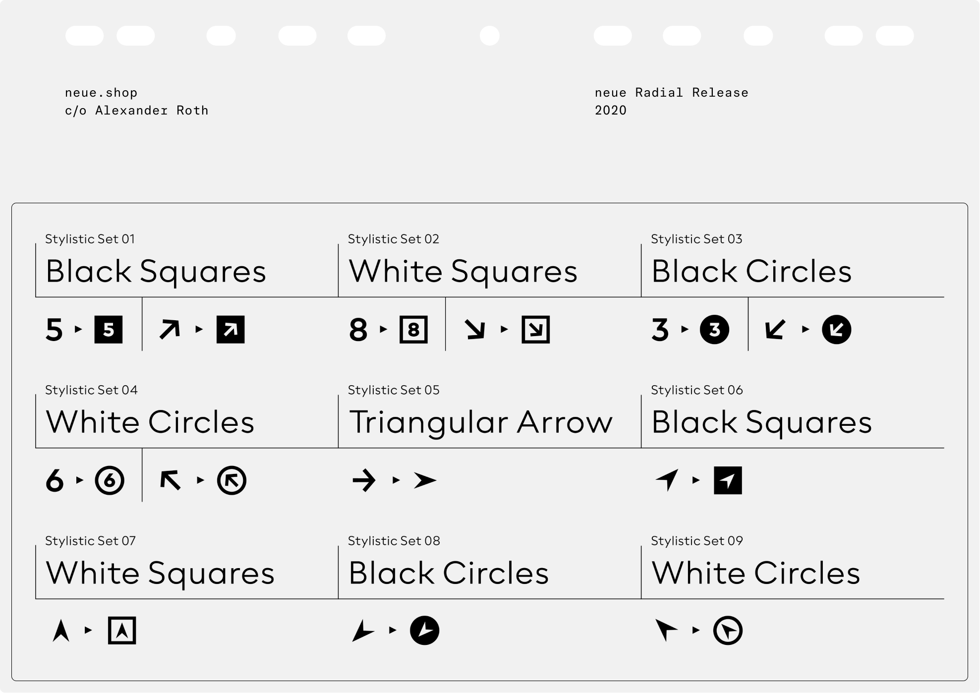
Let’s be clear, neue Radial is a highly consistent design machine. Each family comes in no less than 18 weights ranging from thin to black, decorated with regular and book weights, if necessary. No need to mention different sets of figures, but essential to point out squared and circled digits as well as several styles of arrows allowing for extensive use in identities, information design and orientation systems.
Copywriting: Ferdinand Ulrich