Hello world! Alongside news this section contains a multitude of topics that offer you insights into who we are, what we do and how we do it. Scroll serendipitously through the entire collection or filter by interest All Why go custom? Custom Work In-Use Preoccupations Releases
Why go custom?
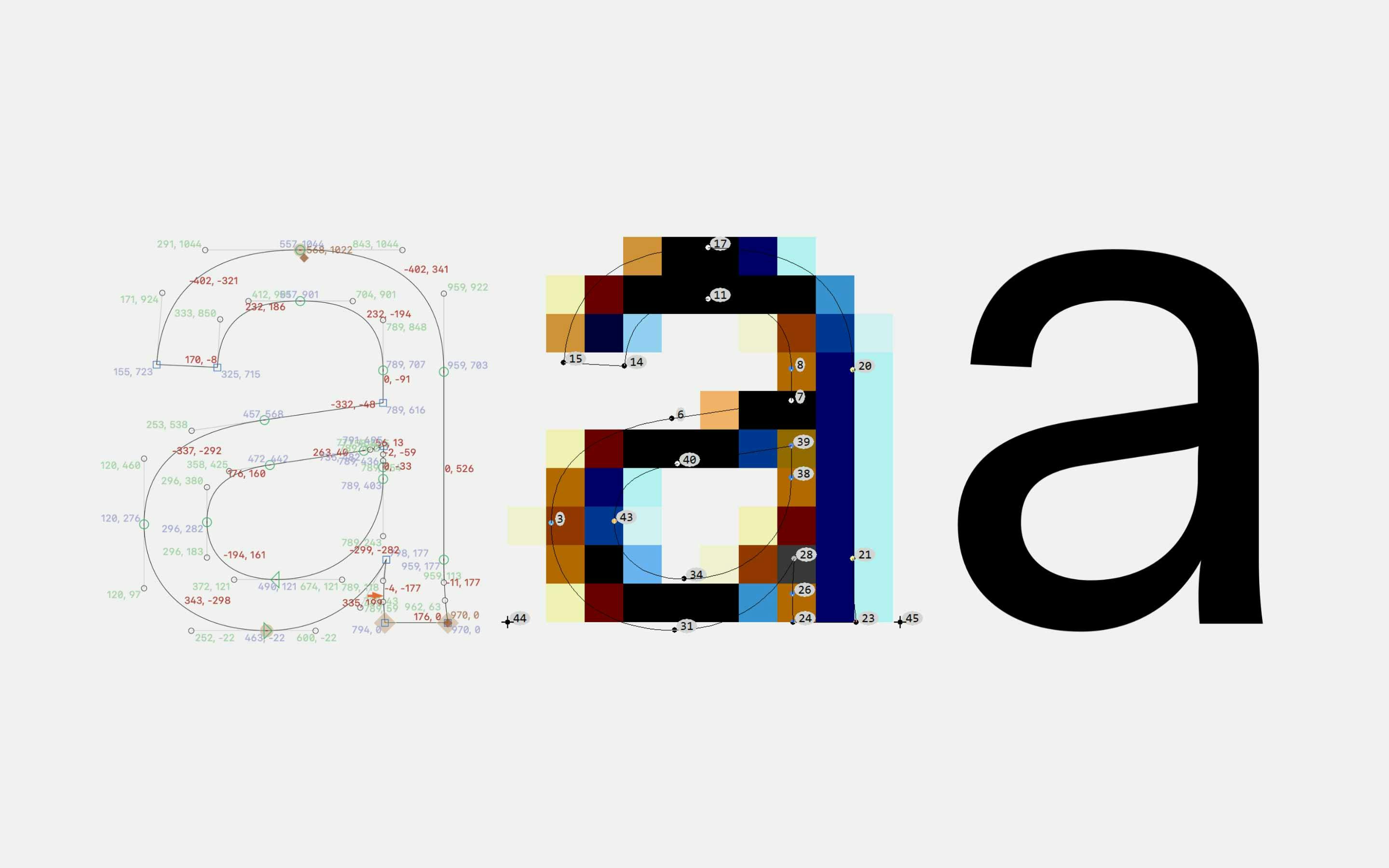
Why go custom?
Are you looking for arguments in favor of a custom font to convince yourself, your boss, or your client? We’ve compiled a list of topics that might play an important role in your and your client’s decision process. It doesn’t cover everything but hey it’s a start.
Learn MoreWhy go custom?
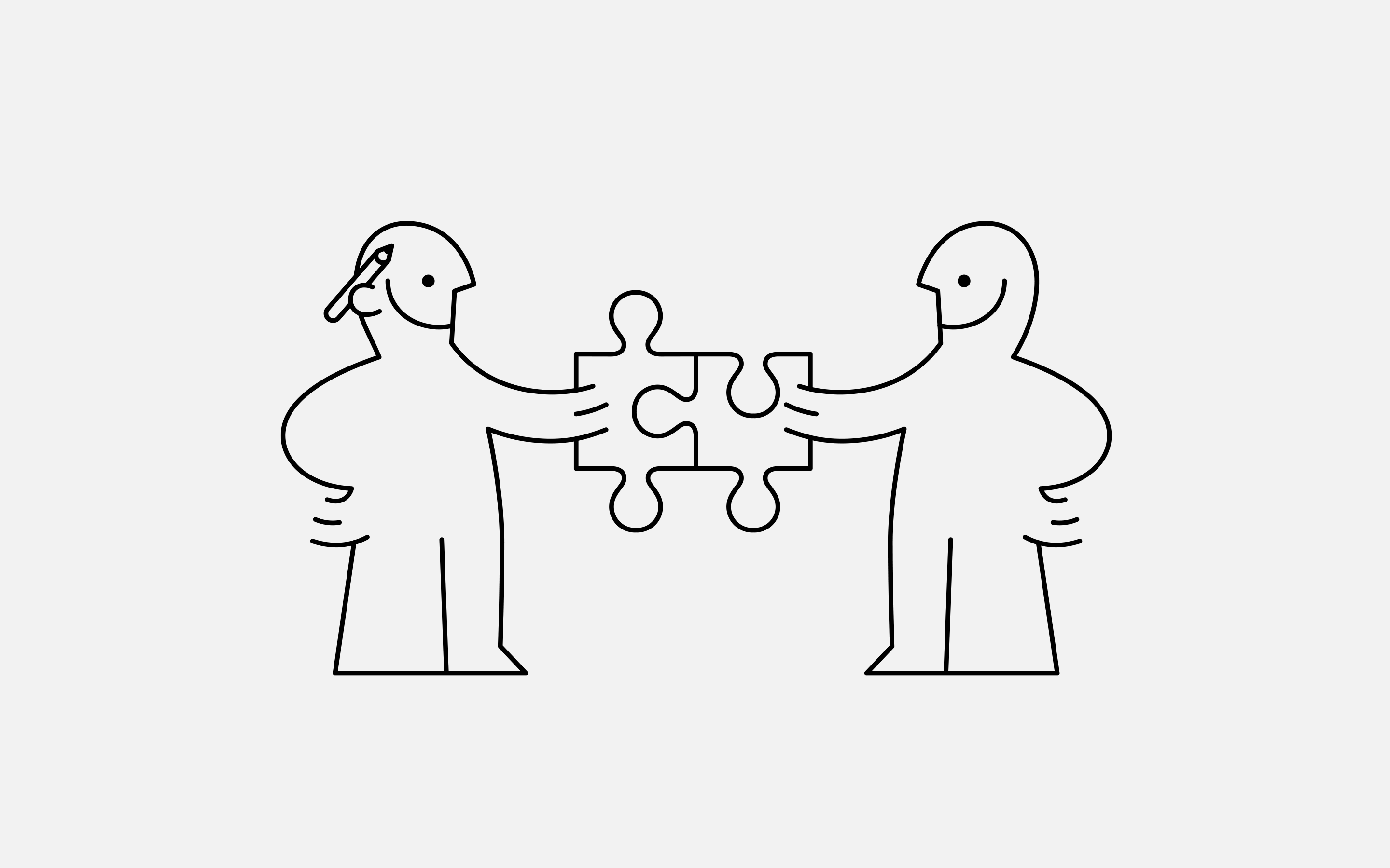
How working with neue works
You may wonder how the process and design of a custom font solution looks like. You might be even intimidated. Most foundries keep their processes secret. We don’t. Though neue is highly adaptive to your way of working the following shows you our suggested workflow.
Learn MoreReleases
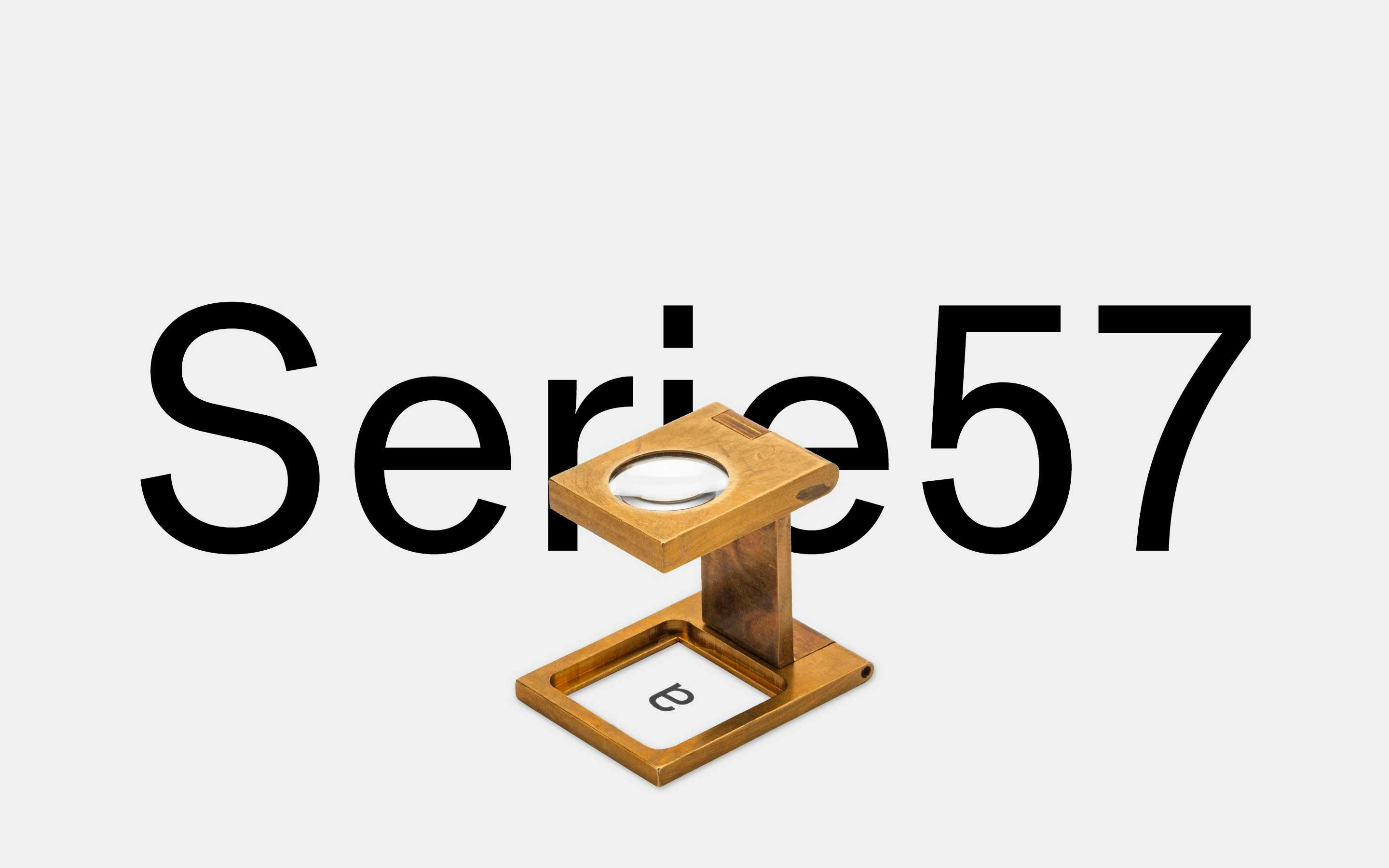
neue Serie57® Release
neue celebrates a world premiere — in collaboration with Erik Spiekermann we have created the first ever digital version of the forgotten and overlooked Akzidenz-Grotesk® Serie 57 metal type. We call it neue Serie57®.
Learn MoreCustom Work
HM Foundation
In collaboration with Open Studio Stockholm we have developed a series of icon fonts adapted to the vertical metrics of the existing fonts of the HM Foundation and mapped the icon set to a Swedish keyboard layout.
Learn MoreCustom Work
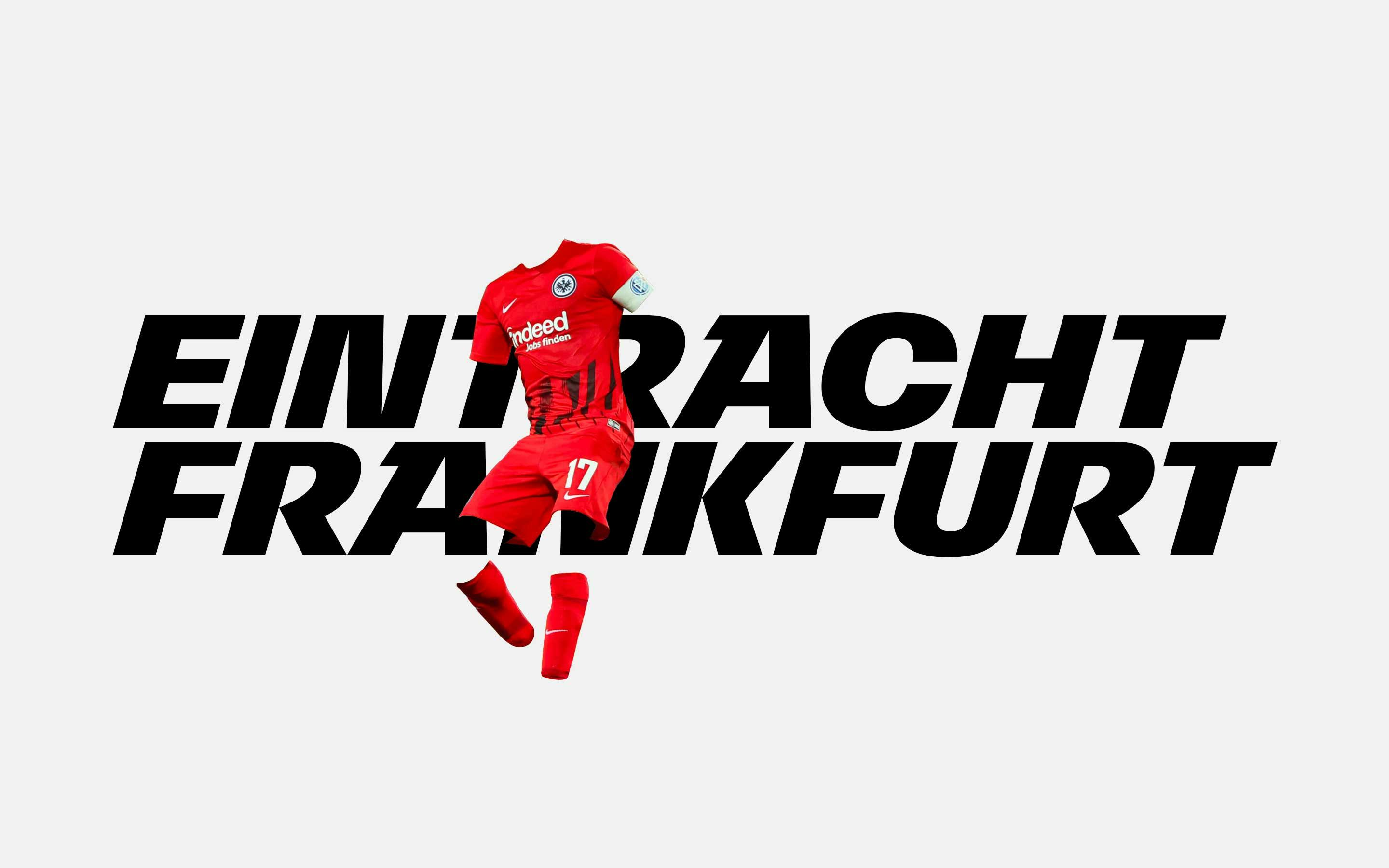
Eintracht Frankfurt
Together with Sherpa Design we have developed a wholistic typographic framework consisting of multiple font families such as Display, Display Rounded, Sans and Serif. The latter two font families were tailored to on-screen reading.
Learn MoreCustom Work
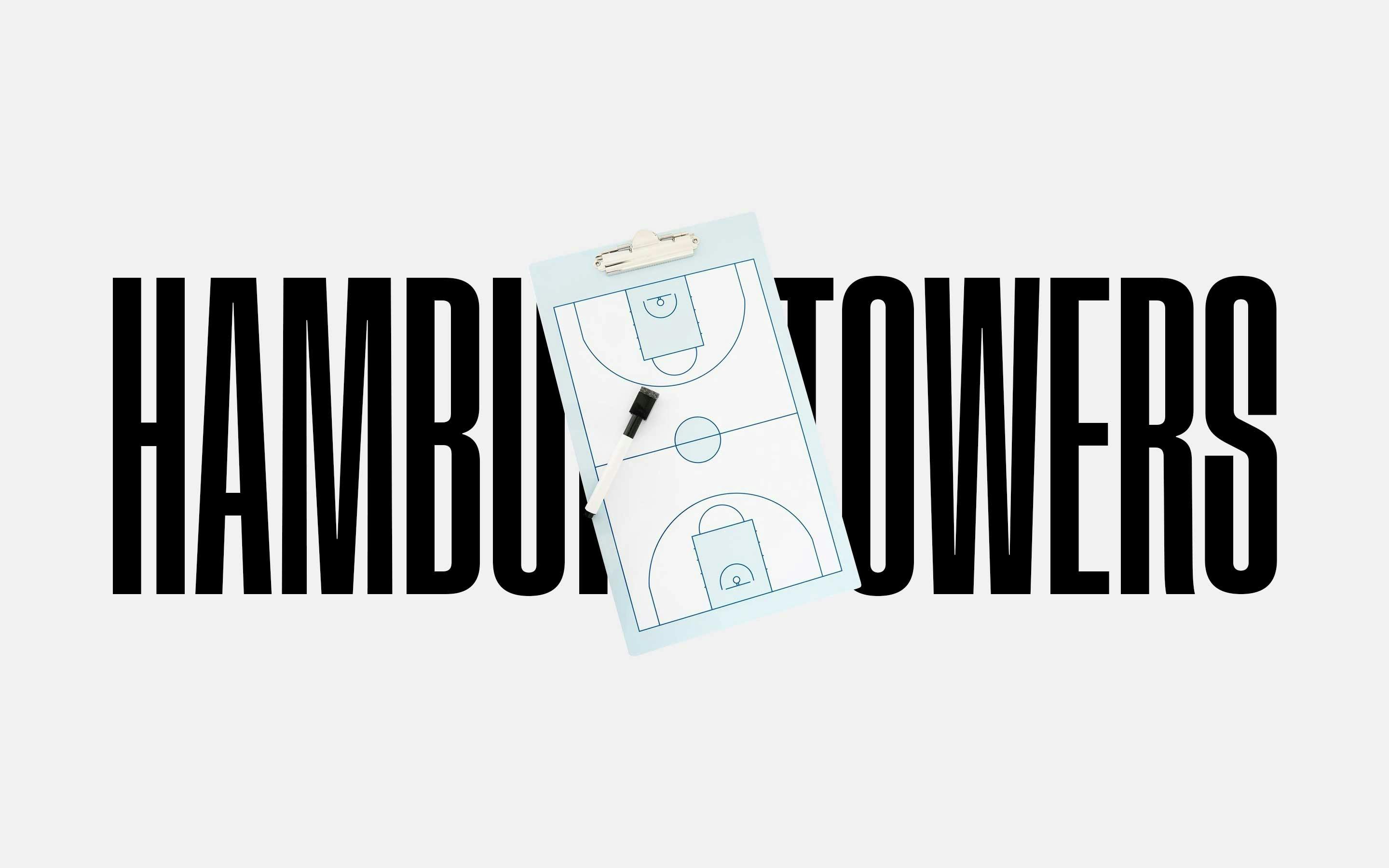
Hamburg Towers
For the Basketball Bundesliga team Veolia Towers Hamburg Sherpa Design and neue have created an in height adjustable Variable Font as a primary branding and marketing typeface that plays well alongside a modified and renamed neue Singular as a text typeface.
Learn MoreCustom Work
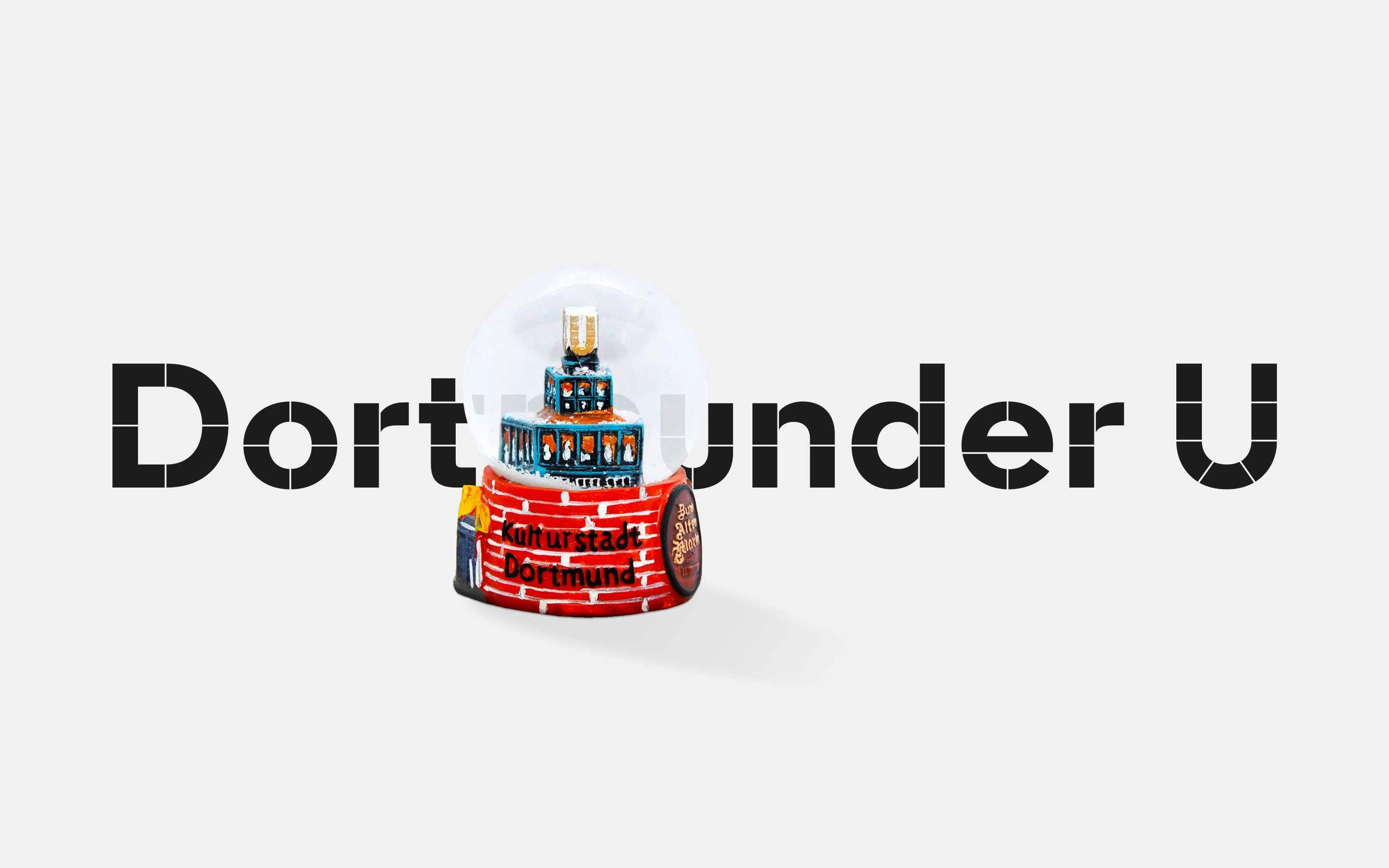
Dortmunder U
Under the creative direction of Florida Brand Design neue developed multiple font families. While the Display version is derived from the iconic U which thrones above the museum’s building the Text version is a compromise between readability and identity.
Learn MoreCustom Work
Applied Information Group
Under the creative direction of Erik Spiekermann a custom version of IBM Plex was developed for the Applied Information Group — internationally renowned spatial experience designers with clients such as Google, Princeton, London and Paris.
Learn MoreCustom Work
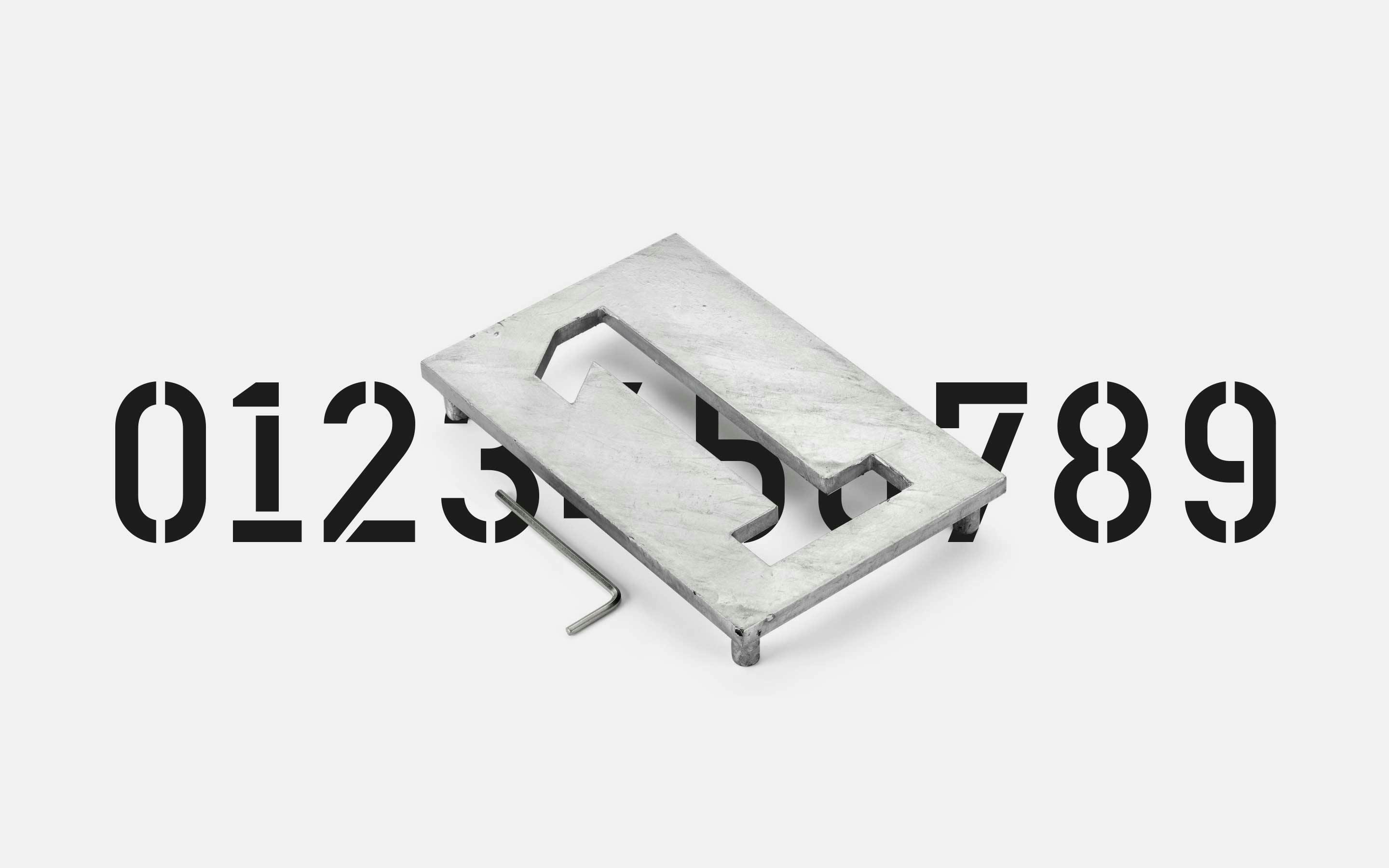
Erik Spiekermann
For Erik Spiekermann neue has translated his heavy-duty, laser-cut from the steel plate and colour-coated Industrial House Numbers designed for and distributed by Manufactum into a digital font under the name of Haus.
Learn MoreCustom Work
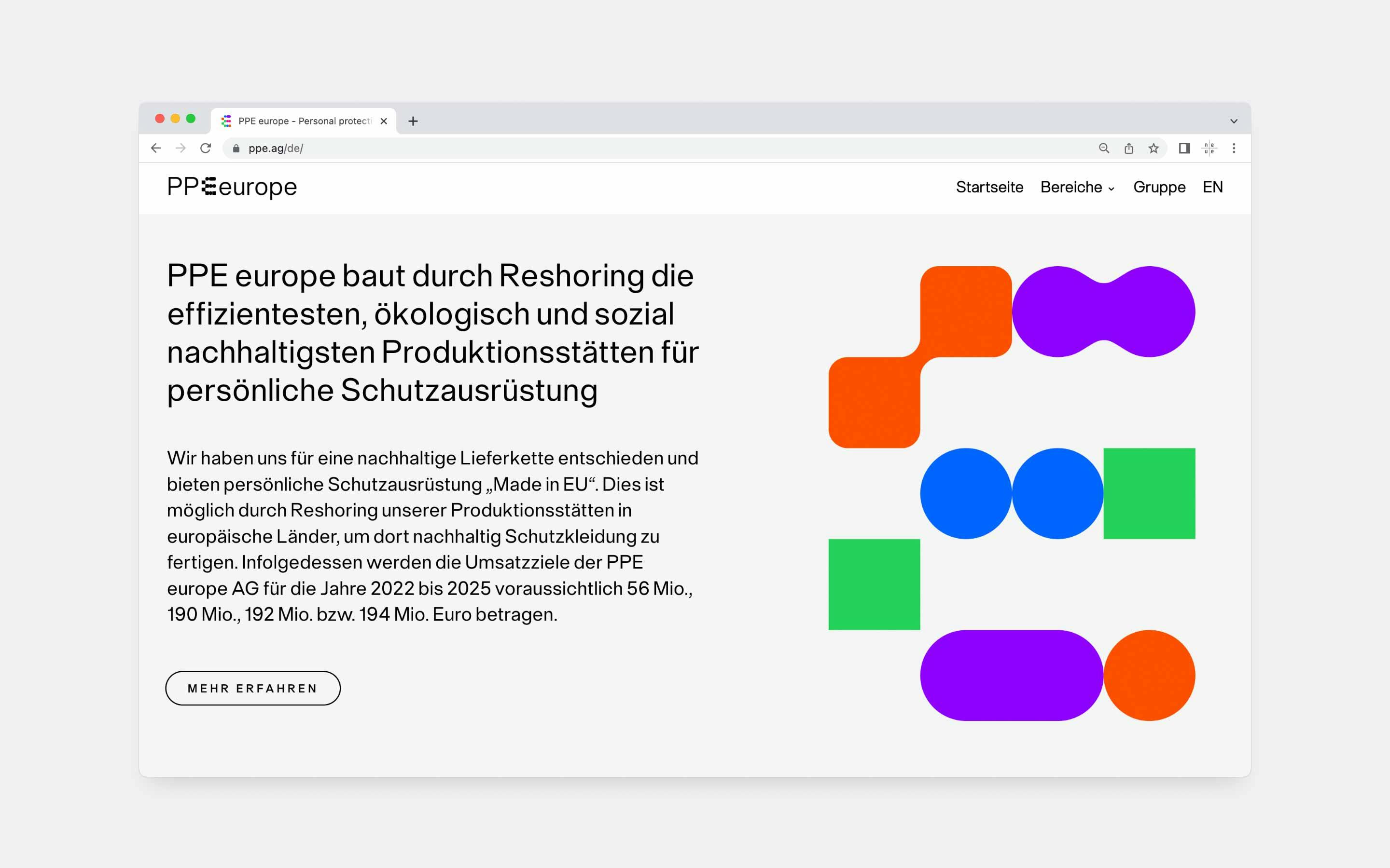
PPE europe
Together with the German design collective DE.design a visual and strategic branding for PPE europe was developed — the leading manufacturer for personal protective equipment in Europe. Custom neue Singular and a permutating logo make up its visual identity.
Learn MoreCustom Work
AndRobin
AndRobin helps companies in their start-up or scale-up phase with expertise in growth hacking, fundraising strategy, organisational development, and more. For Benny Schaupp we had the pleasure to fine-tune and quality control his logo design.
Learn MoreCustom Work
Selfapy
Commissioned by diesdas.digital and directed by Benny Schaupp neue helped with multiple typographic interventions in regards to the logo. Including modifying letters, spacing and quality control.
Learn MoreCustom Work
FinLink
In partnership with Benny Schaupp a visual identity for FinLink was developed — a real estate CRM service provider. The logotype is based on a customized version of our very own neue Radial typeface.
Learn MoreCustom Work
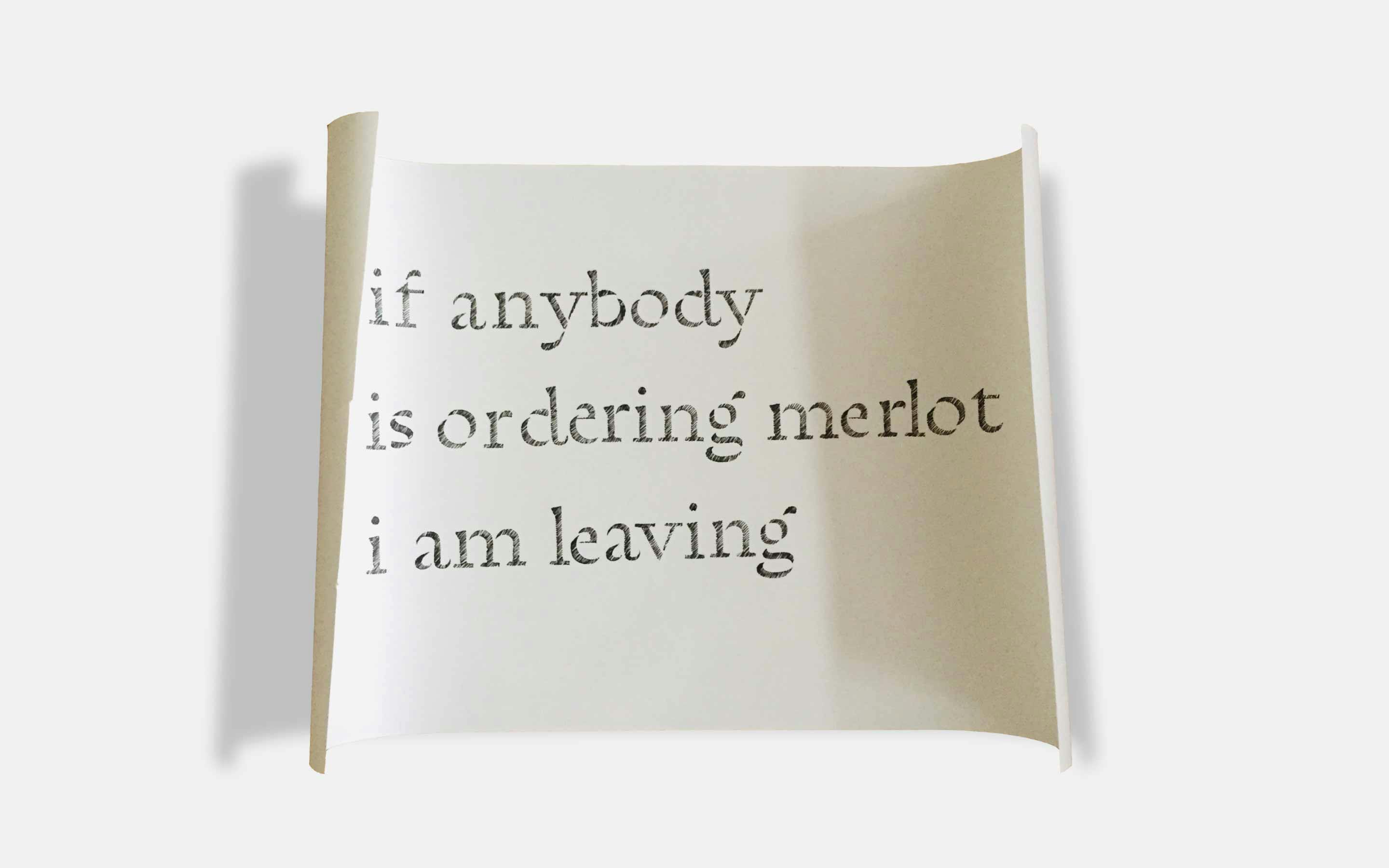
CO2 Slash
Together with Daniel Goldscheider — the CEO of yes® and member of the supervisory board of the Global Footprint Network — neue has developed possible solutions for a typographic mark that indicates CO2 output for products and services.
Learn MorePreoccupations
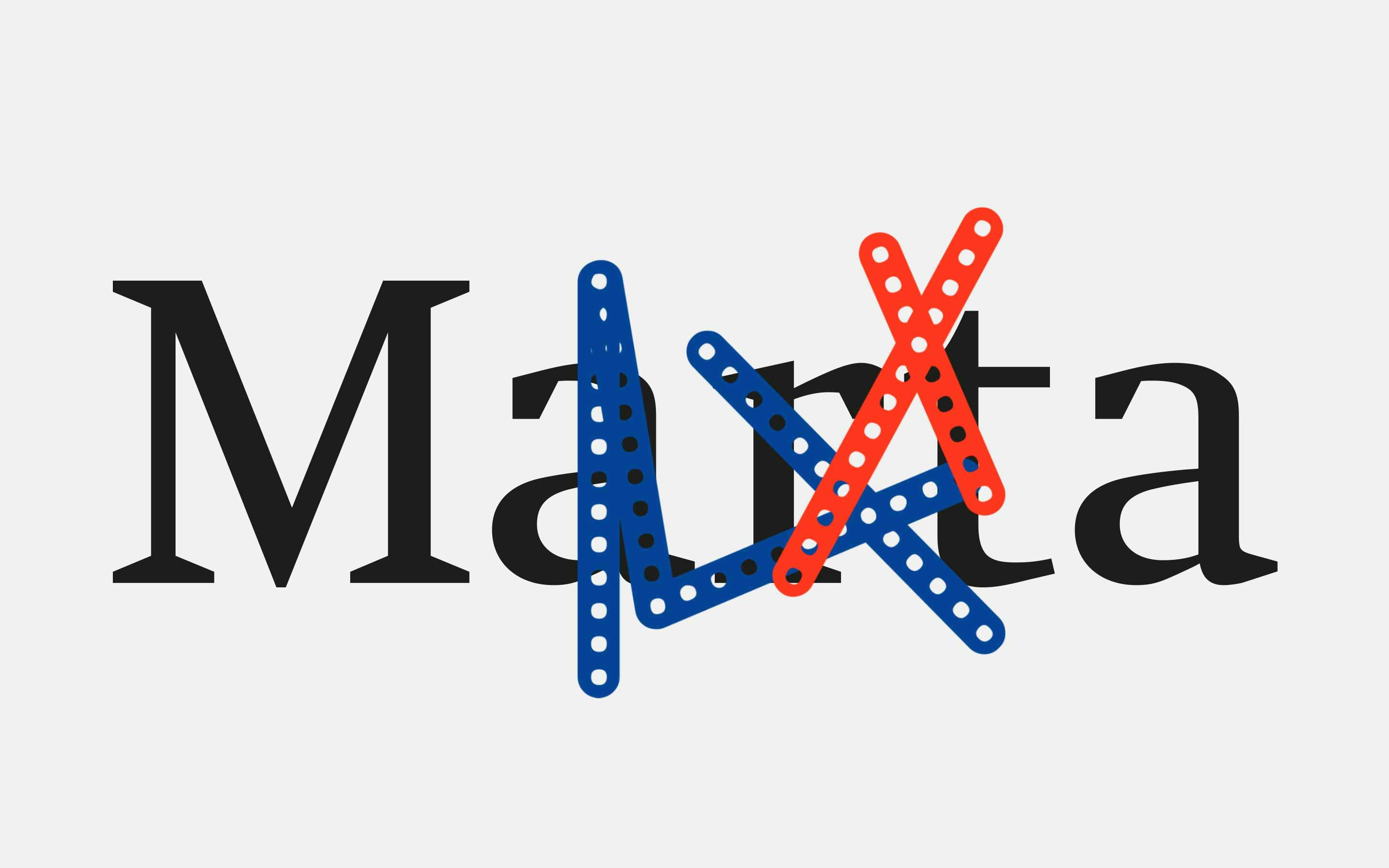
Marta Herford
In collaboration with Marta Herford neue conceptualized and designed a typographic outdoor exhibition during the highs of the coronavirus pandemic. The exhibition took a look back on 101 years of experimental type design in The Netherlands.
Learn MoreCustom Work
Raumerfinder
Raumerfinder is a Berlin-based studio spacializing on architecture, augmented reality and 3D visualization. In collaboration with Benny Schaupp neue developed a logotype that features our neue Singular typeface in a profoundly modified version.
Learn MoreCustom Work
Mangold Branding
For Cornelius Mangold and his branding practice neue designed a visual identity including a symbol and a logotype alongside a customized version of neue Vektor. The prior two were designed in two versions — for large to regular settings and for small settings.
Learn MoreCustom Work
ison
For ison neue helped the German design collective DE.design to articulate a typographic design solution consisting of a number of different arrangements of the logotype and a customized neue Radial font family to accompany the design.
Learn MoreCustom Work
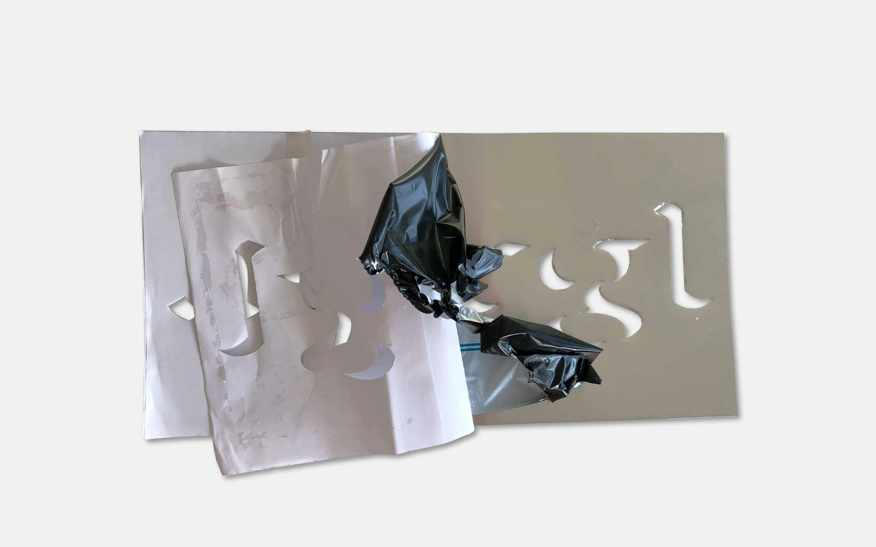
Kreativ Campus Detmold
Kreativ Campus Detmold is a creative hub that intends to connect the broad variety of creatives in and around the city of Detmold. neue created a logotype with a dynamic range which gives control over the thickness of the stencil cuts.
Learn MoreCustom Work
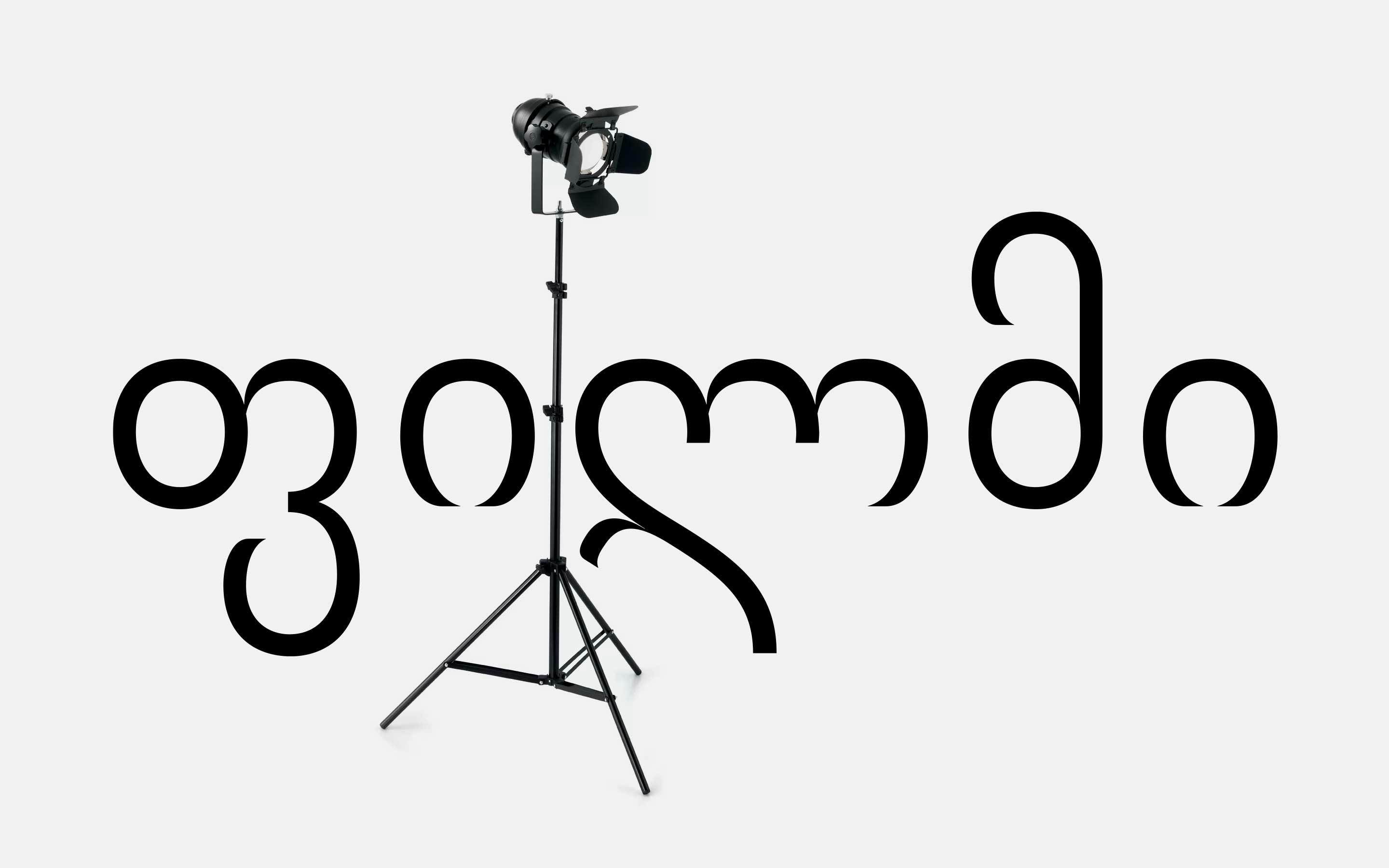
NewMatterFilms
For Aleksandre Koberidze’s critically acclaimed masterpiece “What do we see when we look at the sky?” neue was commissioned by its German publisher NewMatterFilms to design a Georgian version of Alexander Roth’s Uoma typeface for titles and posters.
Learn MoreCustom Work
vviinn
Together with Cornelius Mangold from Mangold Branding neue consulted vviinn on the right choice of typefaces during their re-branding process and presented multiple approaches how to further develop its logotype — including the one you see above.
Learn MoreCustom Work
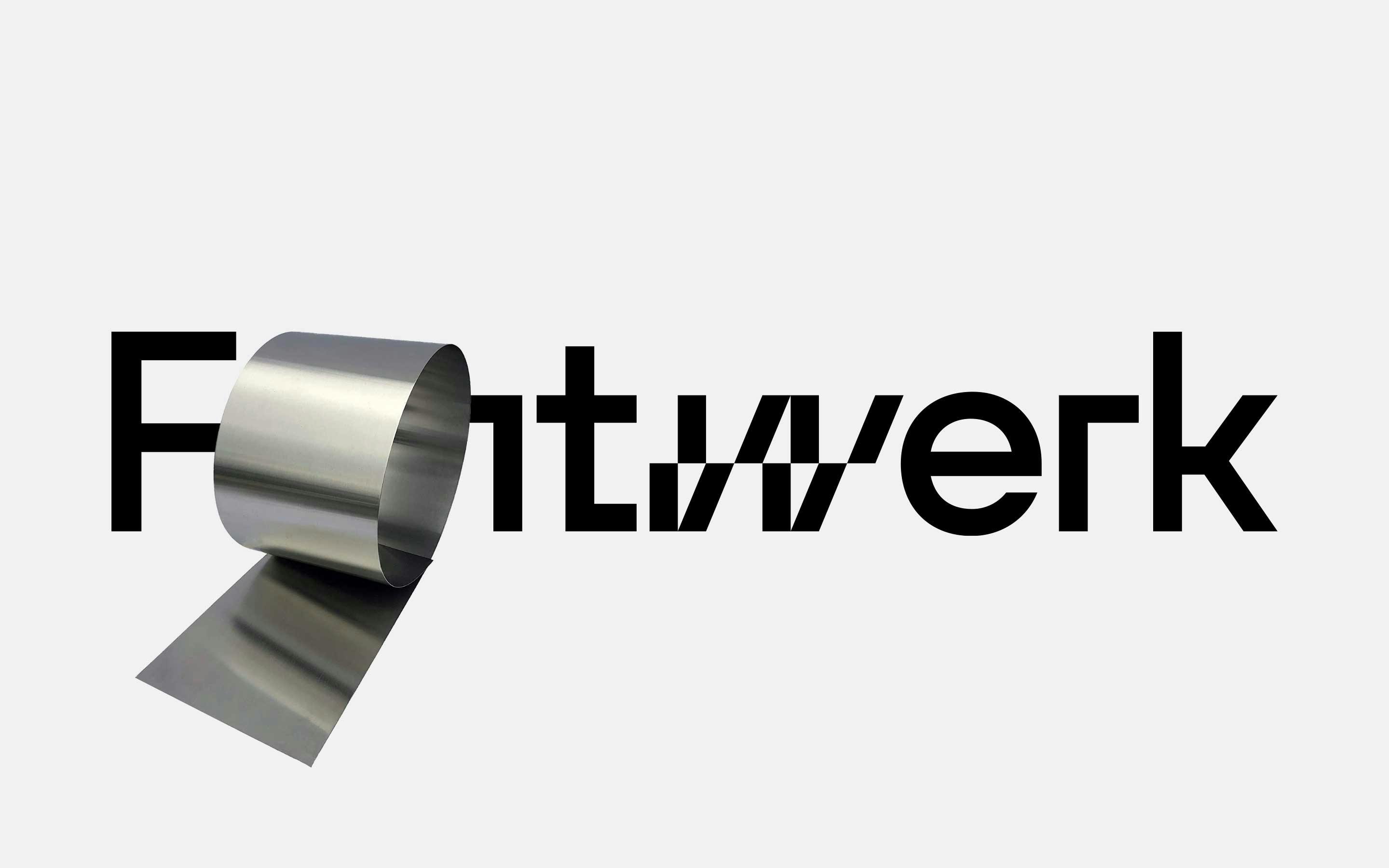
Fontwerk
For the Berlin-based type foundry Fontwerk neue designed a custom logotype including an array of possible permutations of the ever evolving dynamic element. It is rumored that some designers consider it as the best foundry logo on the market.
Learn MoreCustom Work
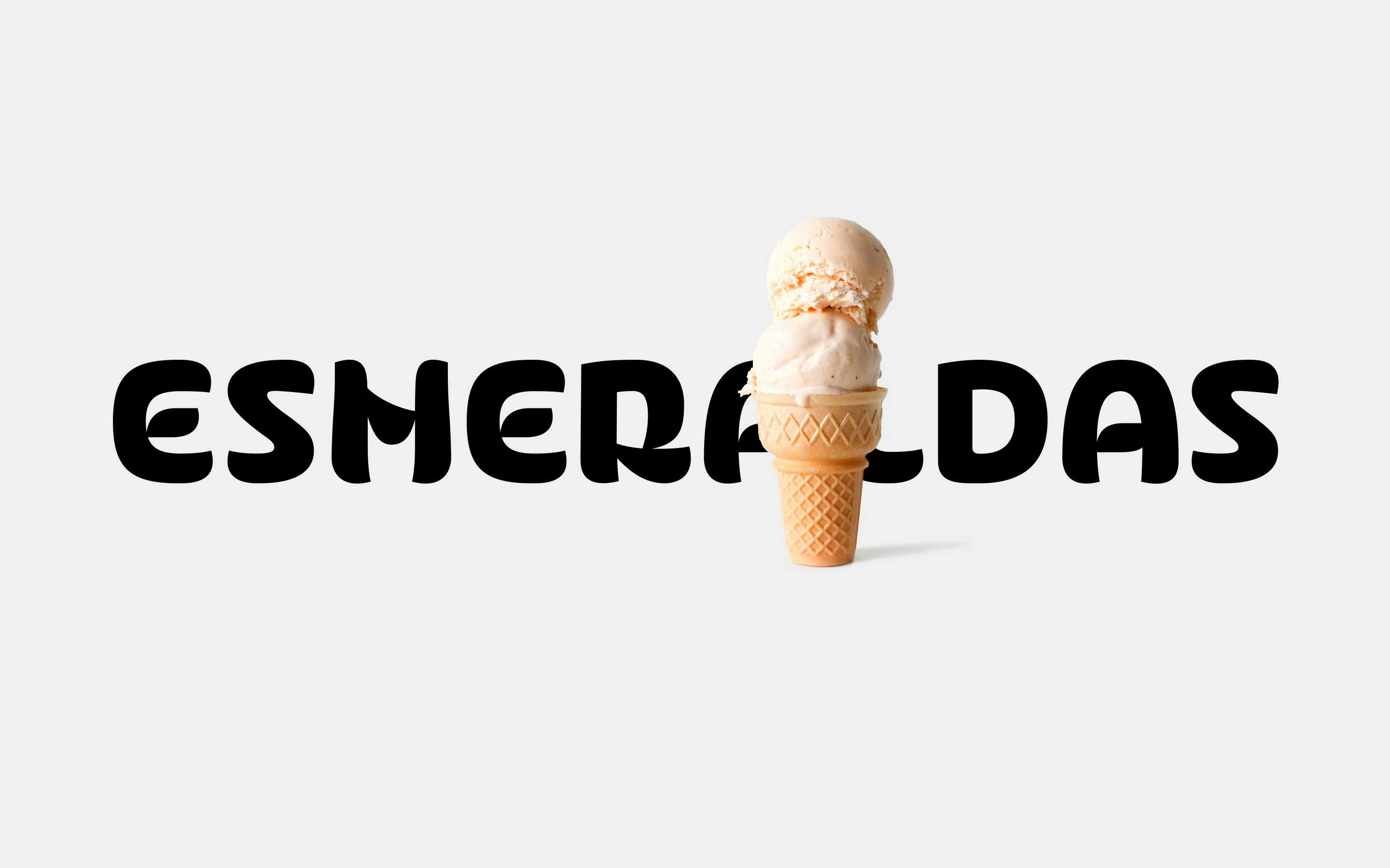
Esmeraldas
Esmeraldas is a highly praised Peruvian restaurant with a broad selection of handmade ice cream in the heart of Berlin Schöneberg. The custom logotype is an attempt to accentuate on the owner’s culture, history and attitude.
Learn MoreCustom Work
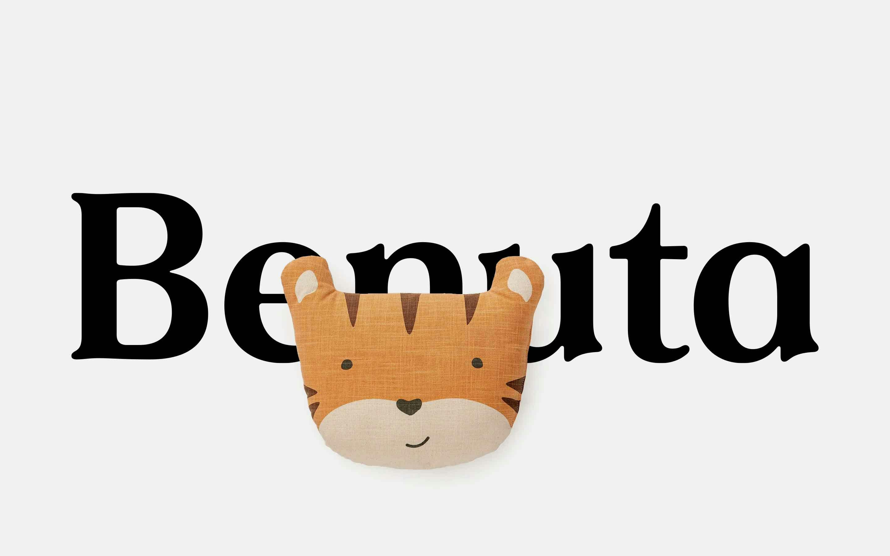
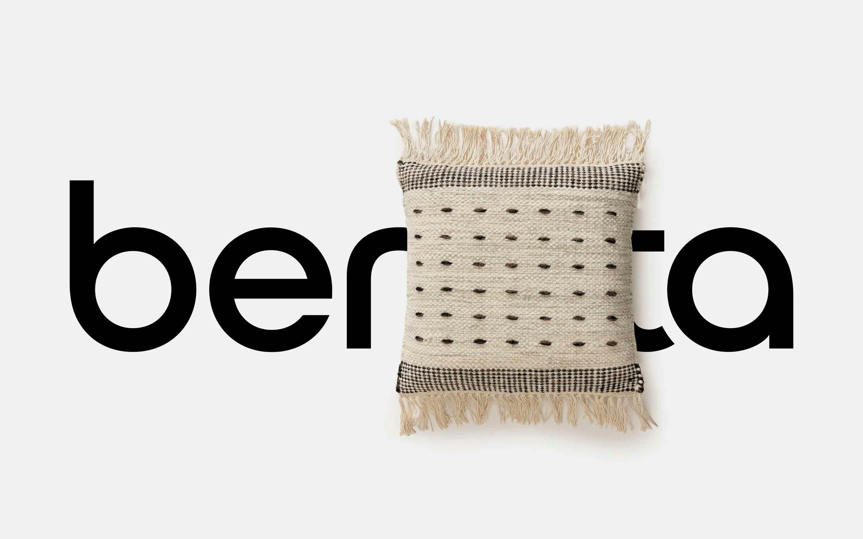
benuta.de Serif
In partnership with Helder Design we designed a custom serif font for benuta.de — a rugs and home accessories online shop. The goal was to instill the warmth and cosiness of benuta’s products into the type design itself.
Learn MoreReleases
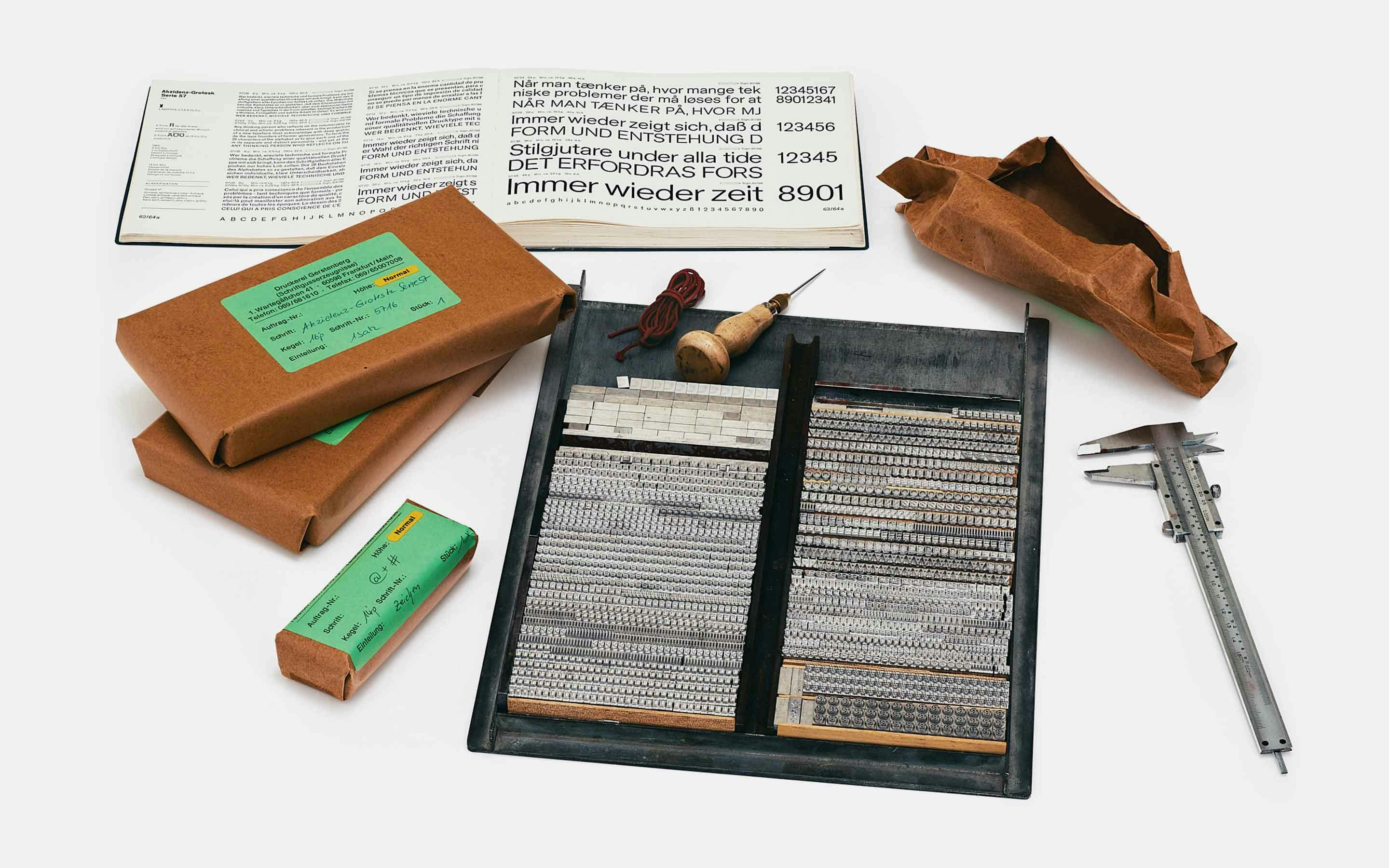
Akzidenz-Grotesk Serie 57 Cast
Rainer Gerstenberg — the last remaining type caster in Germany — was commissioned by Erik Spiekermann to cast a full set of Akzidenz-Grotesk Serie 57 for the neue Serie57 specimen and its insert. The masters were borrowed from Leipzig specifically for this job.
Learn MoreReleases
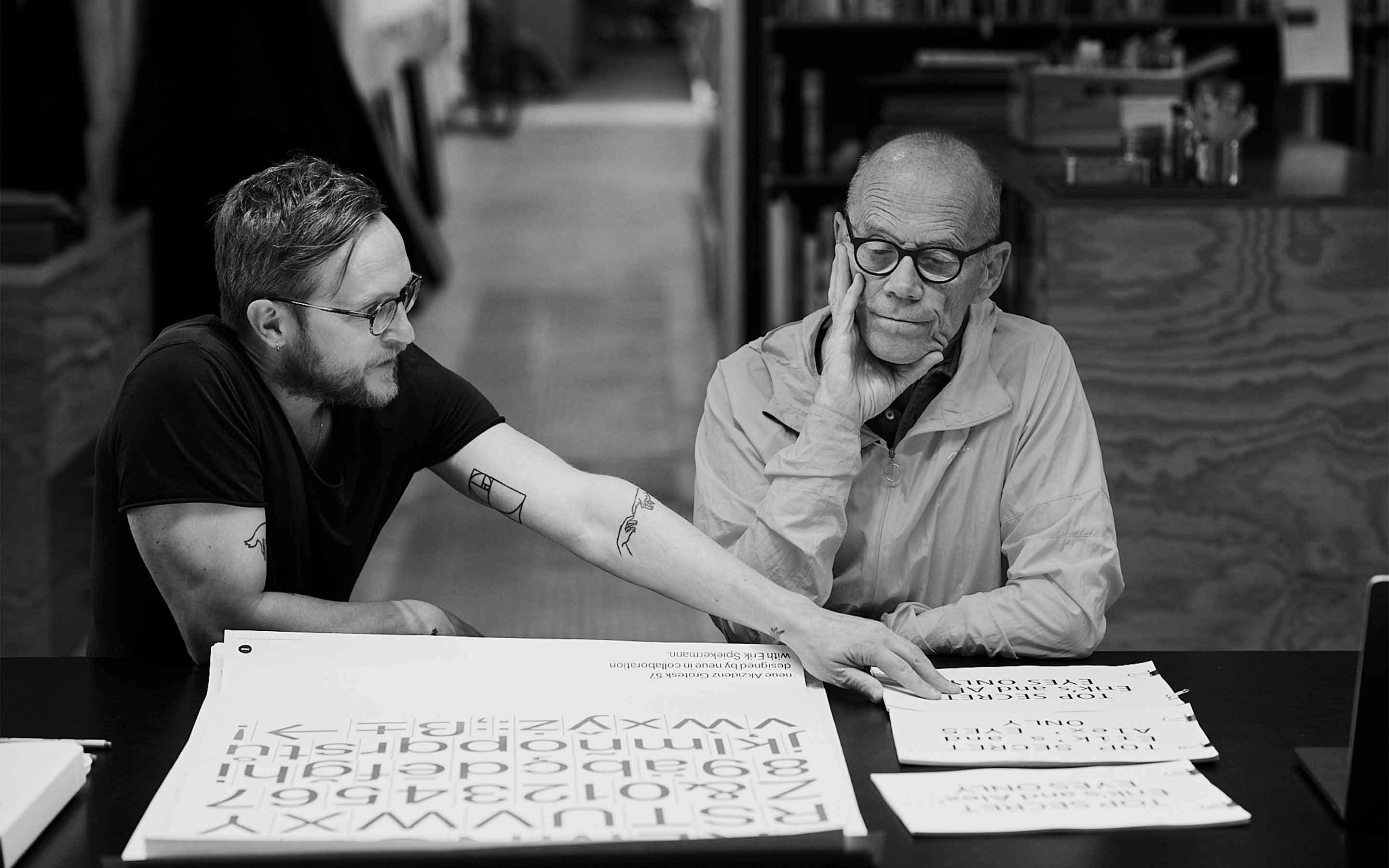
neue Serie57 Making-Of
Erik Spiekermann and Alexander Roth discussing over a batch of neue Serie57 proofs at Hacking Gutenberg in Berlin . Many such meetings were held each focusing on an individual topic such as shapes, weights, spacing, small caps, stylistic alternates, and more.
Learn MoreReleases
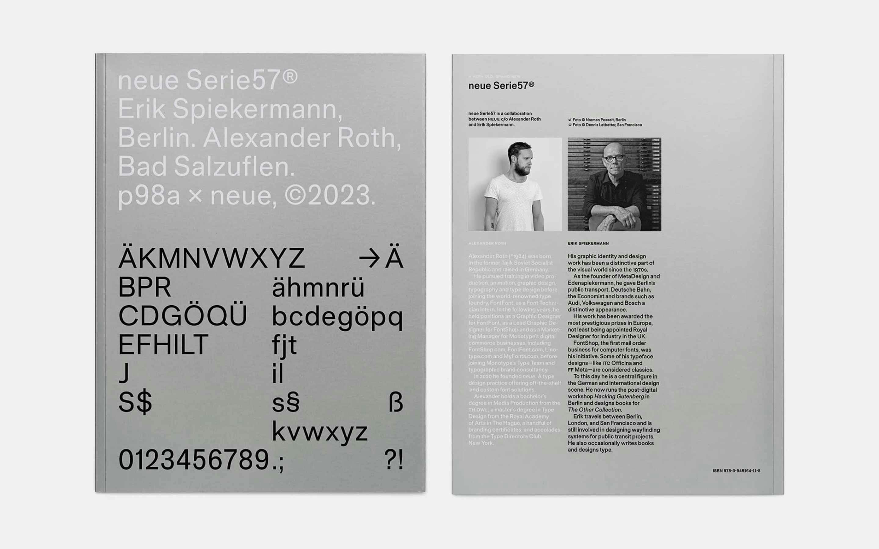
neue Serie57 Type Specimen
210×280mm in size, 380g in weight, 64 pages plus cover, and printed in 4C+Pantone 877 Silver on FSC-certified paper. The type specimen is distributed exclusively by Hacking Gutenberg . The edition is limited to 500 copies, numbered by hand and signed.
Learn MoreCustom Work
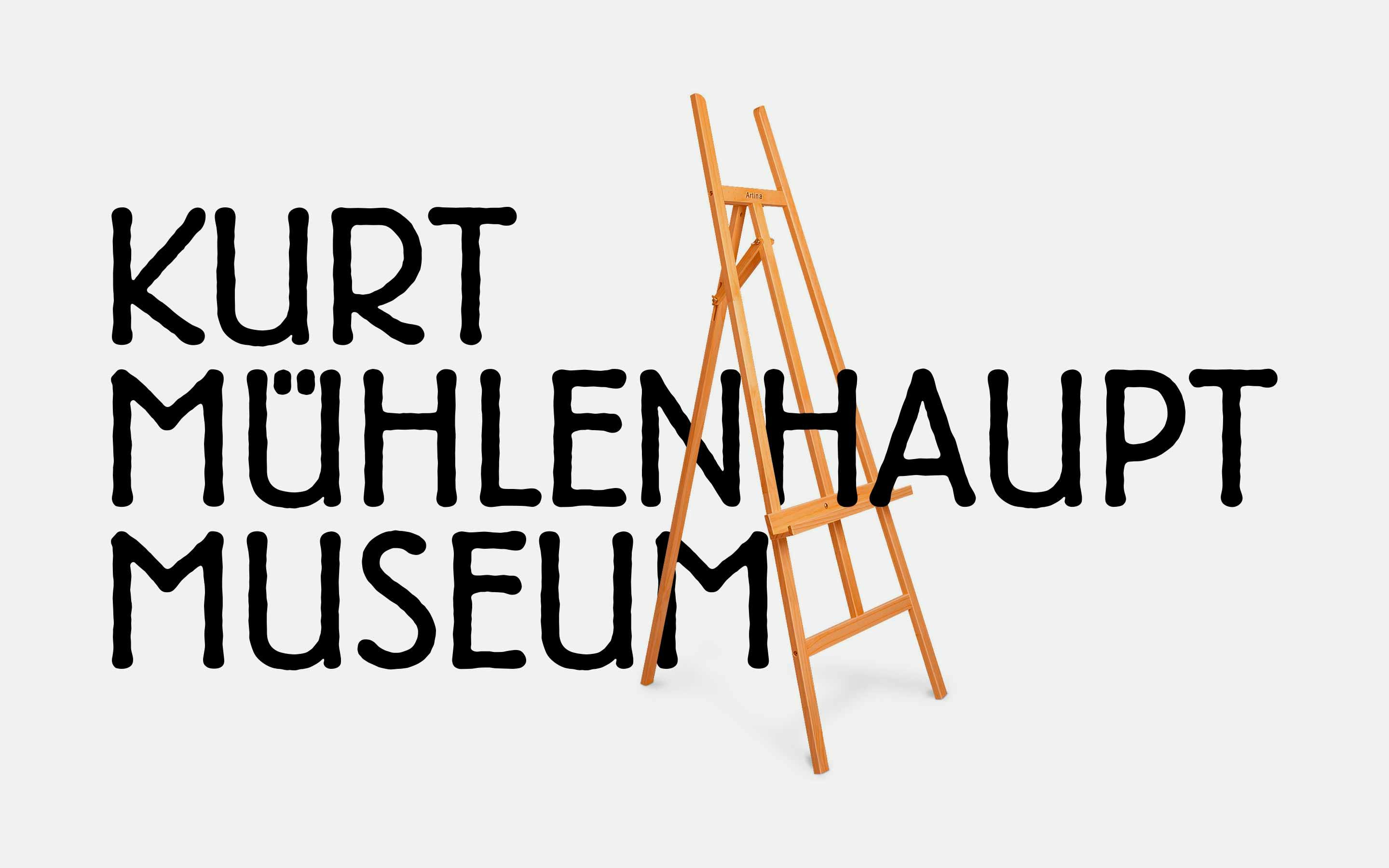
Kurt Mühlenhaupt Museum
Commissioned by Erik Spiekermann we designed a customised version of the Block typeface for the Berlin Kreuzberg-based Kurt Mühlenhaupt Museum. The typeface comes in three weights and is called “Kurt” .
Learn MoreCustom Work
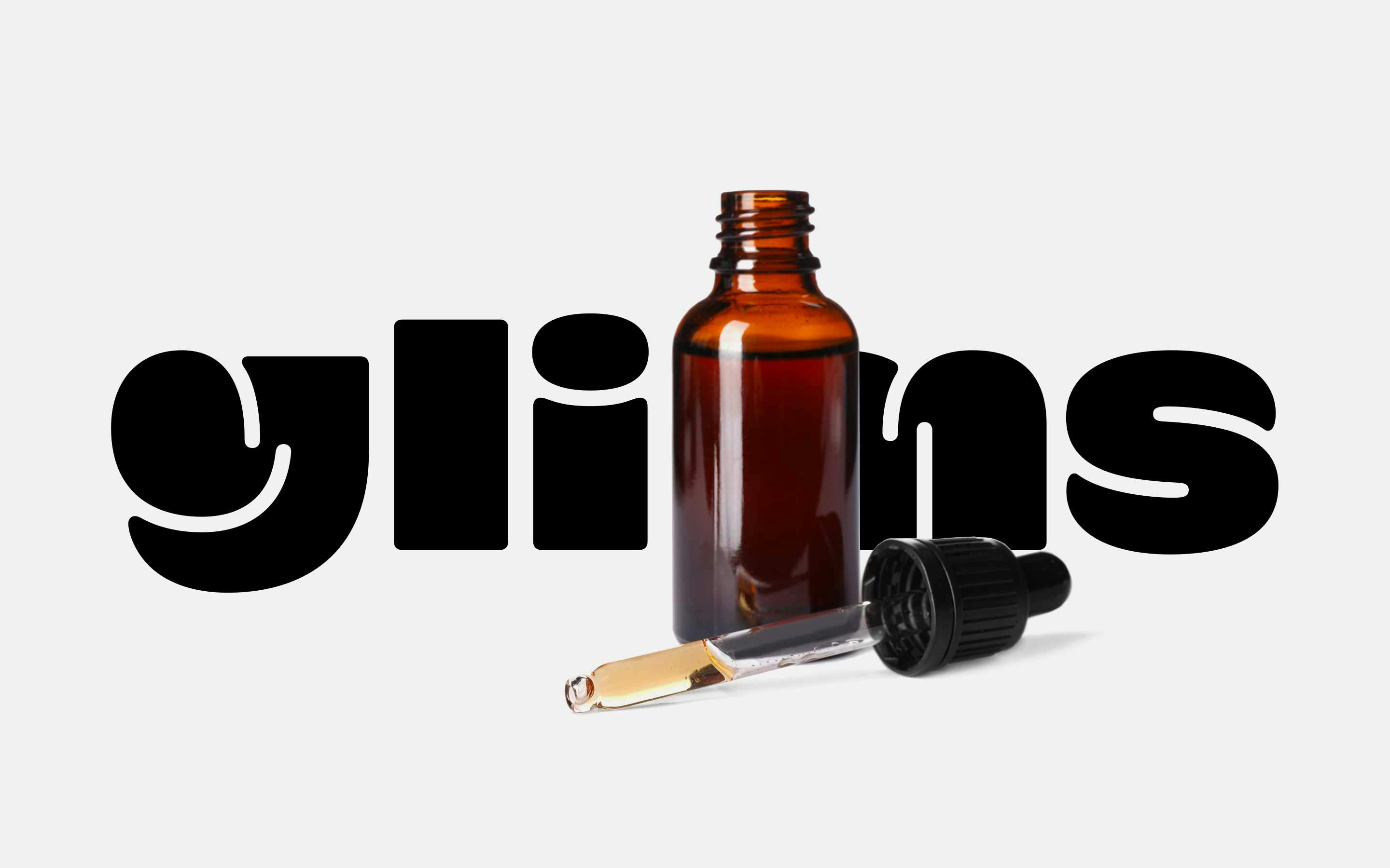
glims
Commissioned by Helder Design to take a closer look at their logotype for glims we checked and improved the quality of the outlines, presented modifications for individual letters, adjusted and homogenised the spacing, and exported the design.
Learn MoreCustom Work
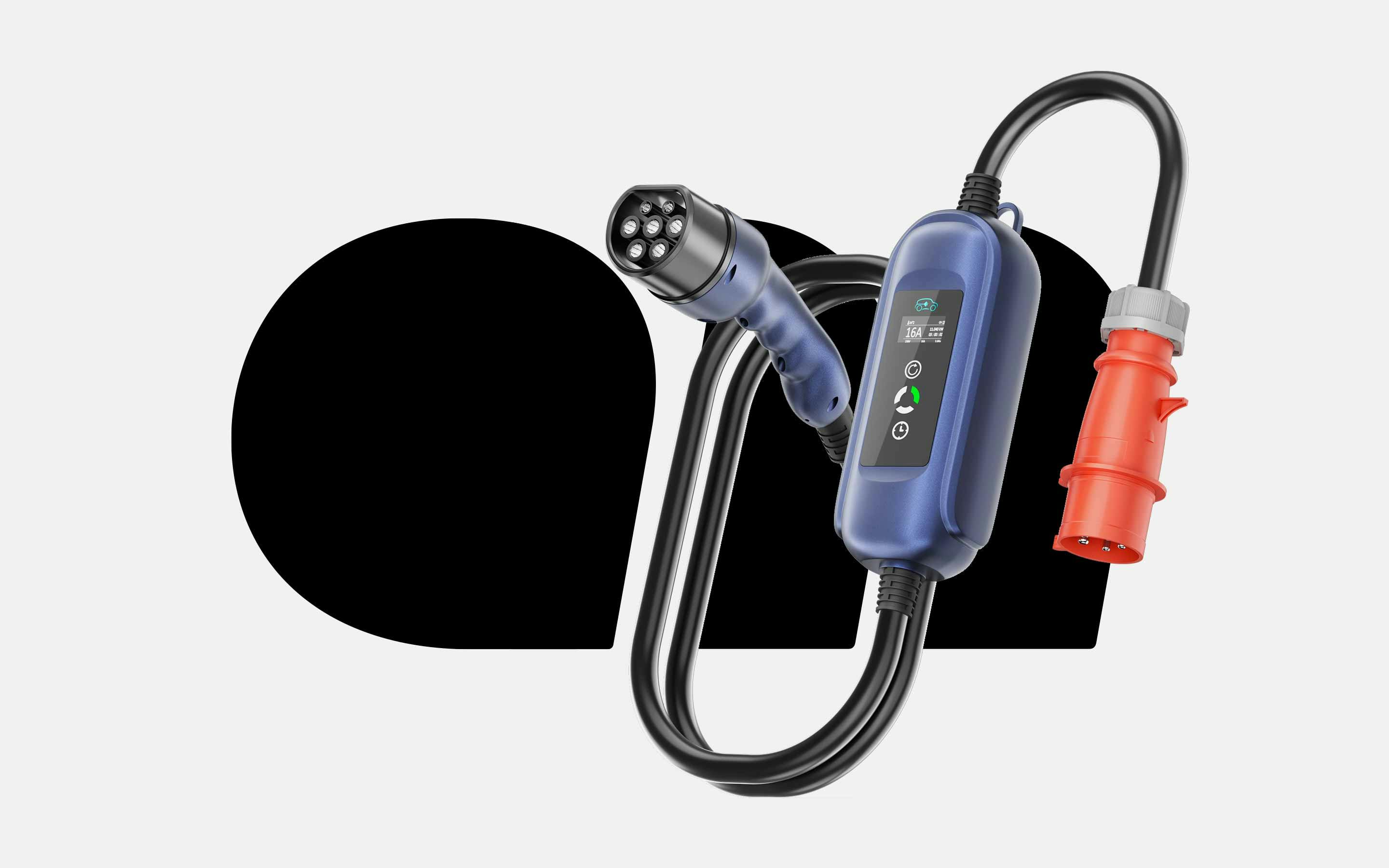
allride
allride is a Swiss provider for e-mobility. We were asked by edenspiekermann to take a closer look at their logotype proposal. We checked the outlines, visually corrected the rounded corners, homogenised the spacing and exported the design.
Learn MoreCustom Work
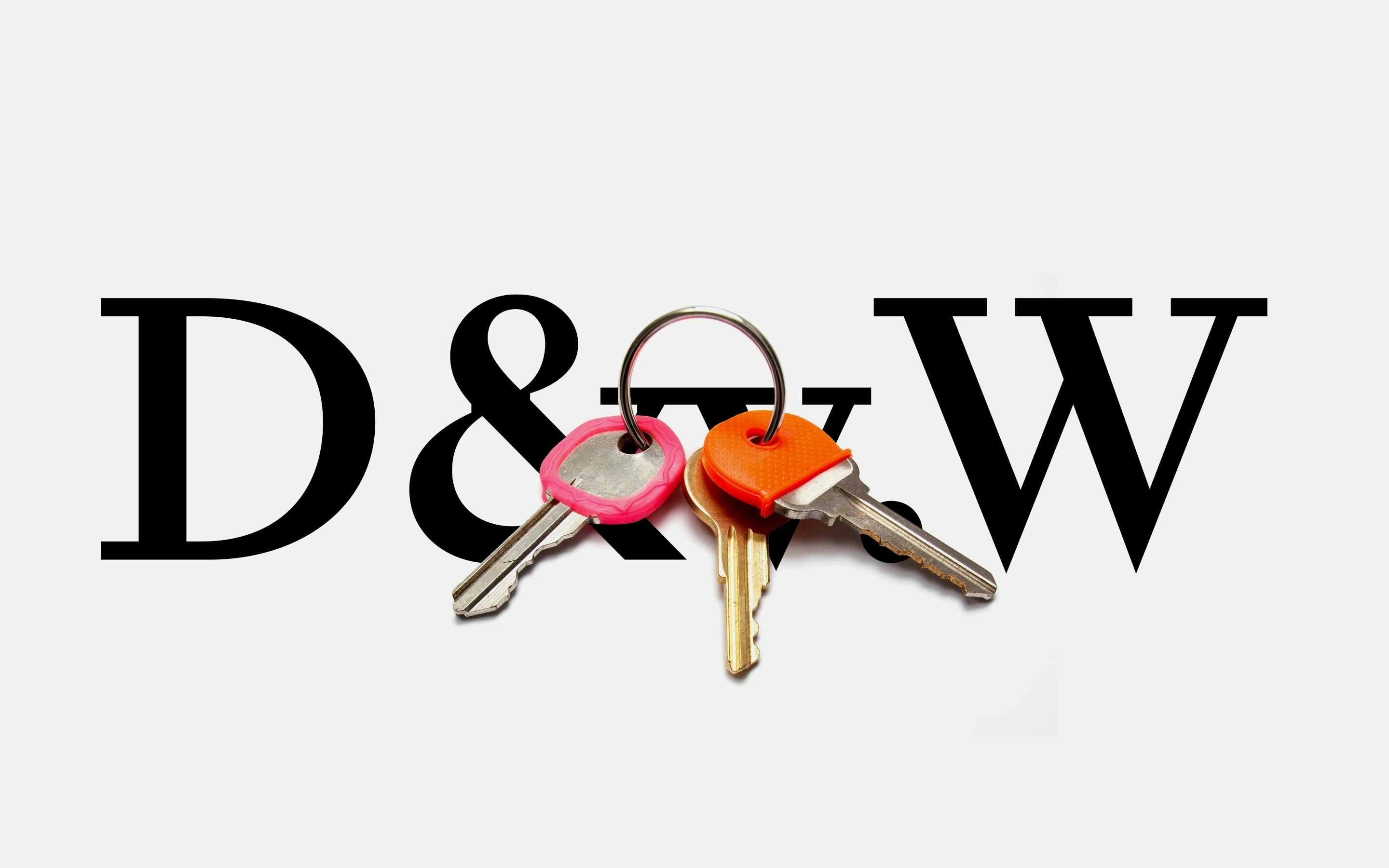
Duken & v. Wangenheim
Duken & v. Wangenheim is a prestigious real-estate agency for high-end property. We added final typographic touches to the design provided by Benni Schaupp. Three different variants were fine-tuned and exported.
Learn MoreCustom Work
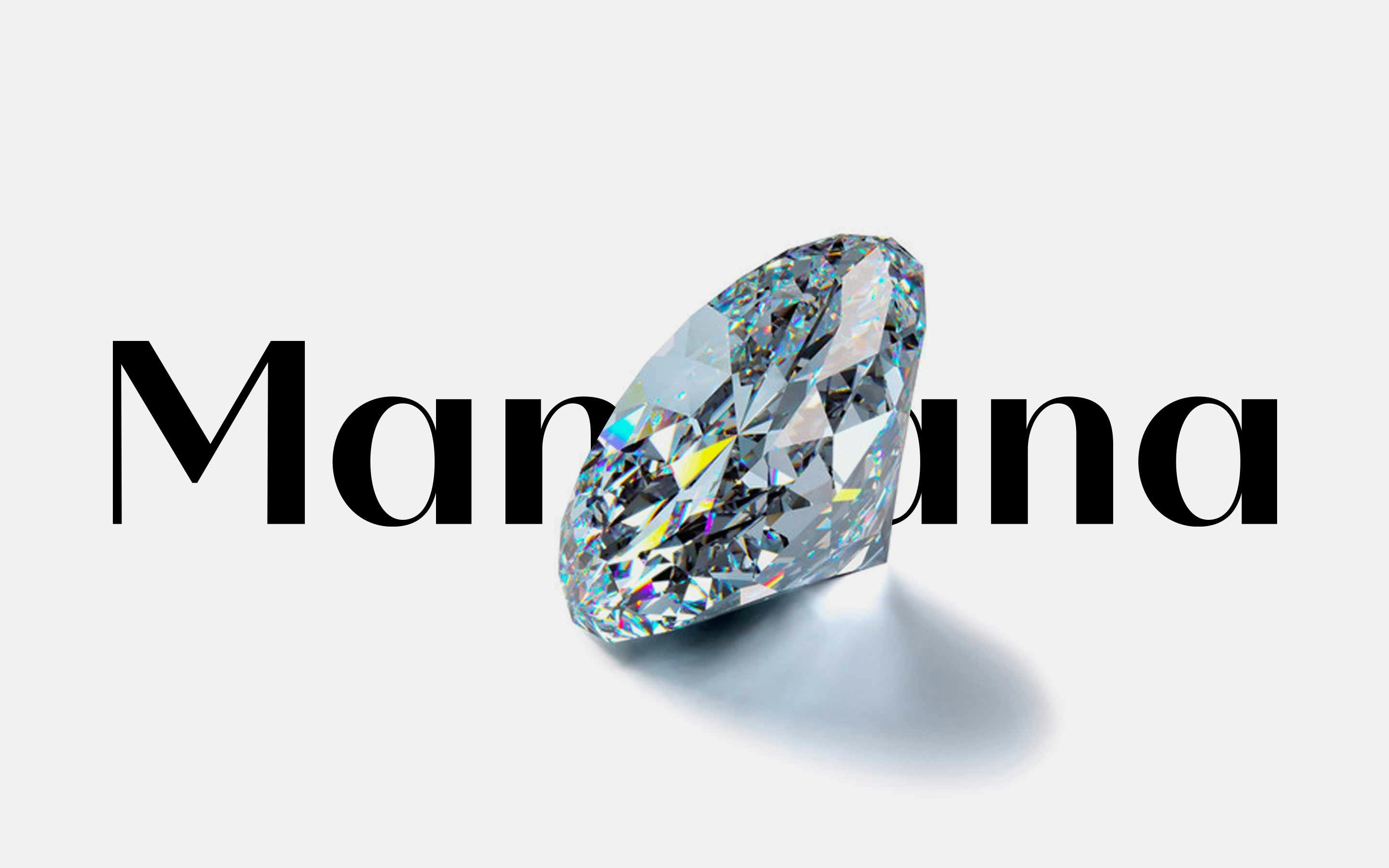
mandana Jewellery
Together with the team from Helder Design and the in-house designers from Nevermined Diamonds we created a custom font both for the company and the jewellery brand mandana. “Diamonds” is an all variable font that seamlessly goes between low- and high-contrast.
Learn MoreCustom Work
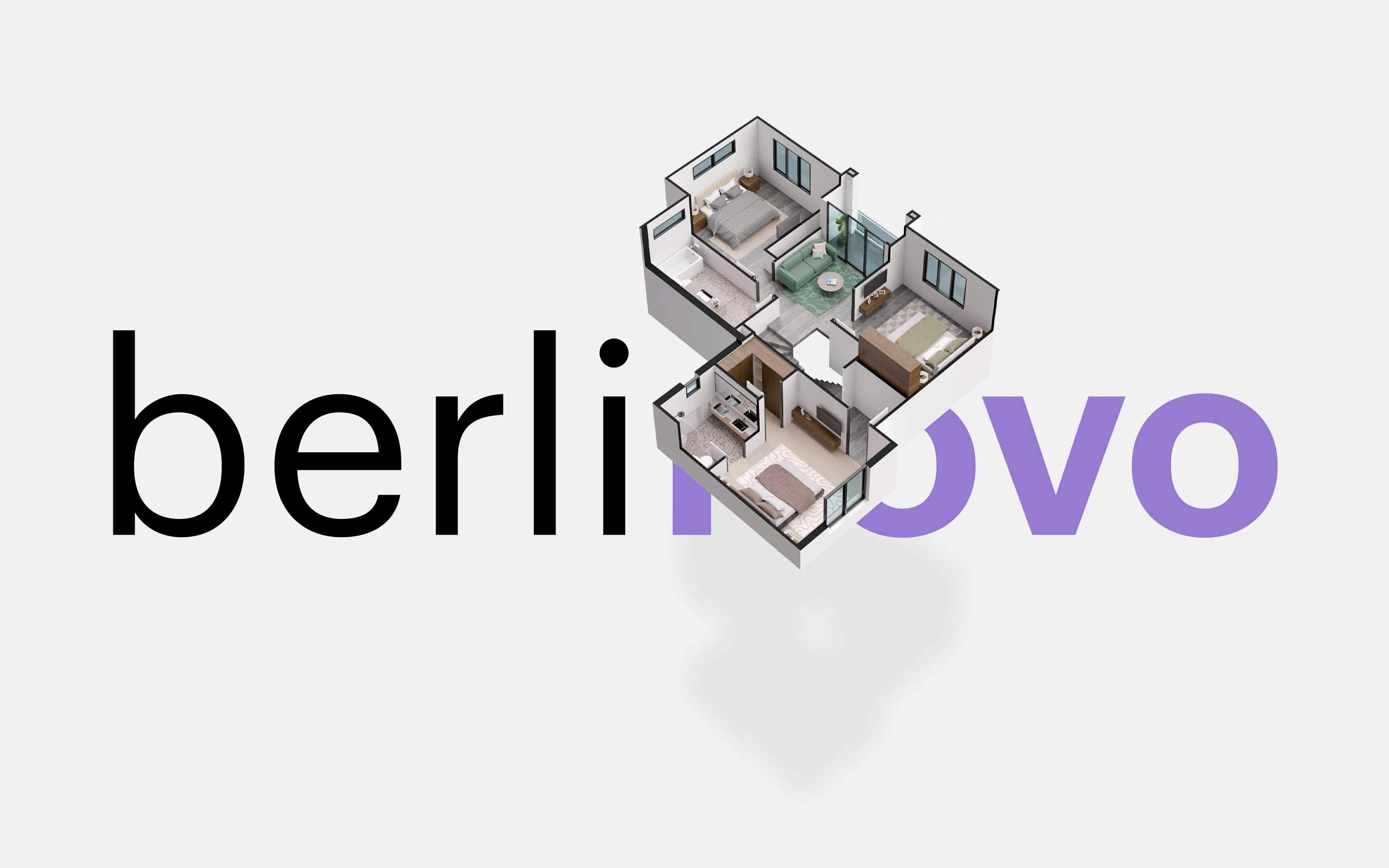
berlinovo
In collaboration with REALACE we systemised and fine-tuned the brand architecture for berlinovo — a Berlin-based real-estate company. Logo versions both in colour and monochrome were revised and prepared for export.
Learn MoreCustom Work
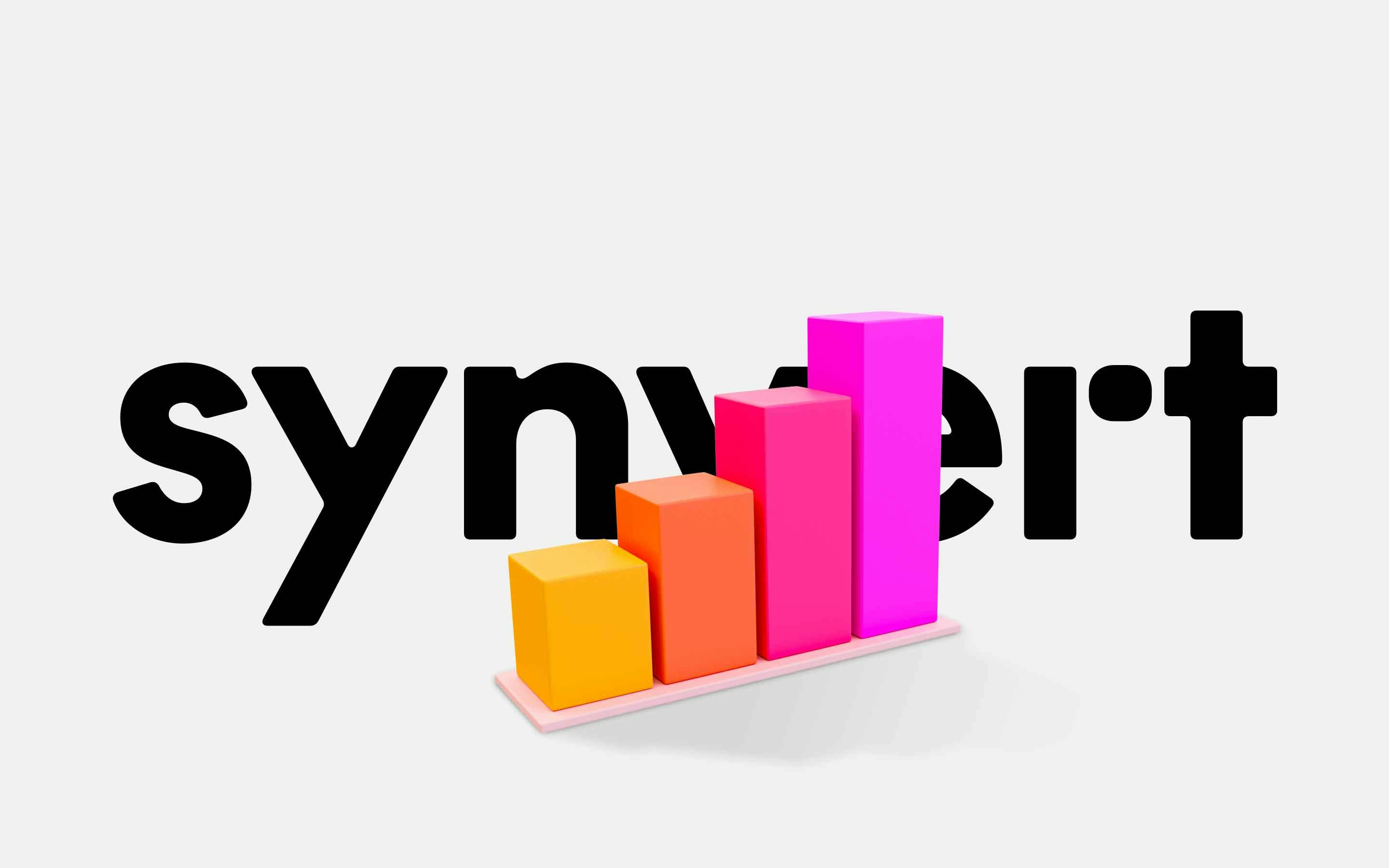
synvert
For Helder Design we took a closer look at their logotype proposal for synvert — a group a six data analytics consulting companies. We explored the radii of the letters, retouched individual shapes, spaced and kerned the logotype and prepared for export.
Learn MoreCustom Work
benuta
Commissioned by Helder Design we revised the logotype for benuta.de — a rugs and home accessories online shop. The logo was designed in two different optical sizes: for big and for small settings with slight variations in letter spacing and details.
Learn MoreCustom Work
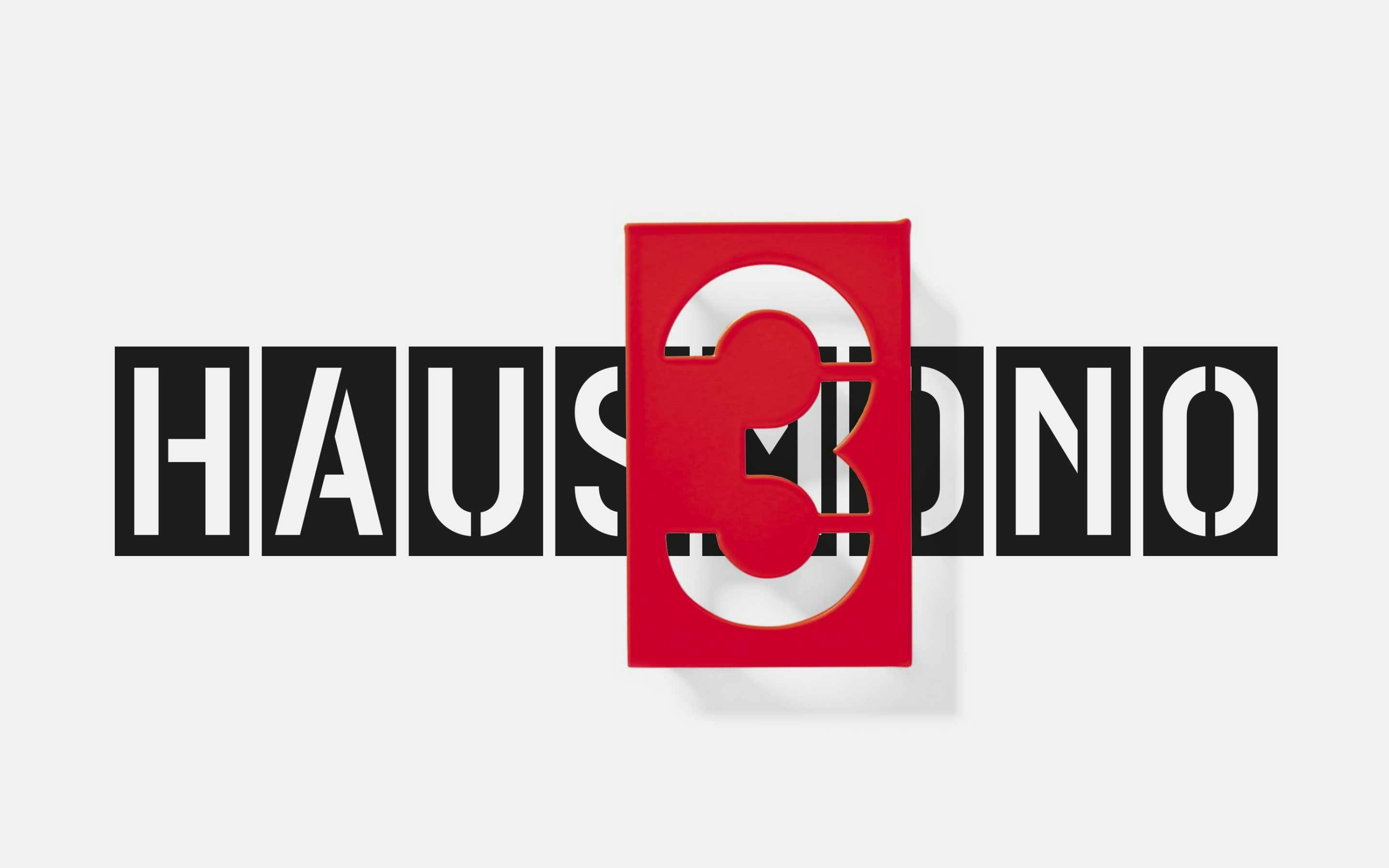
Haus Mono for Erik Spiekermann
Haus Mono is an additional digital interpretation of Erik Spiekermann’s iconic house numbers alongside Haus. This monospaced design is uppercase only but has a character set big enough for sophisticated use-cases such as signage projects.
Learn MoreIn-Use
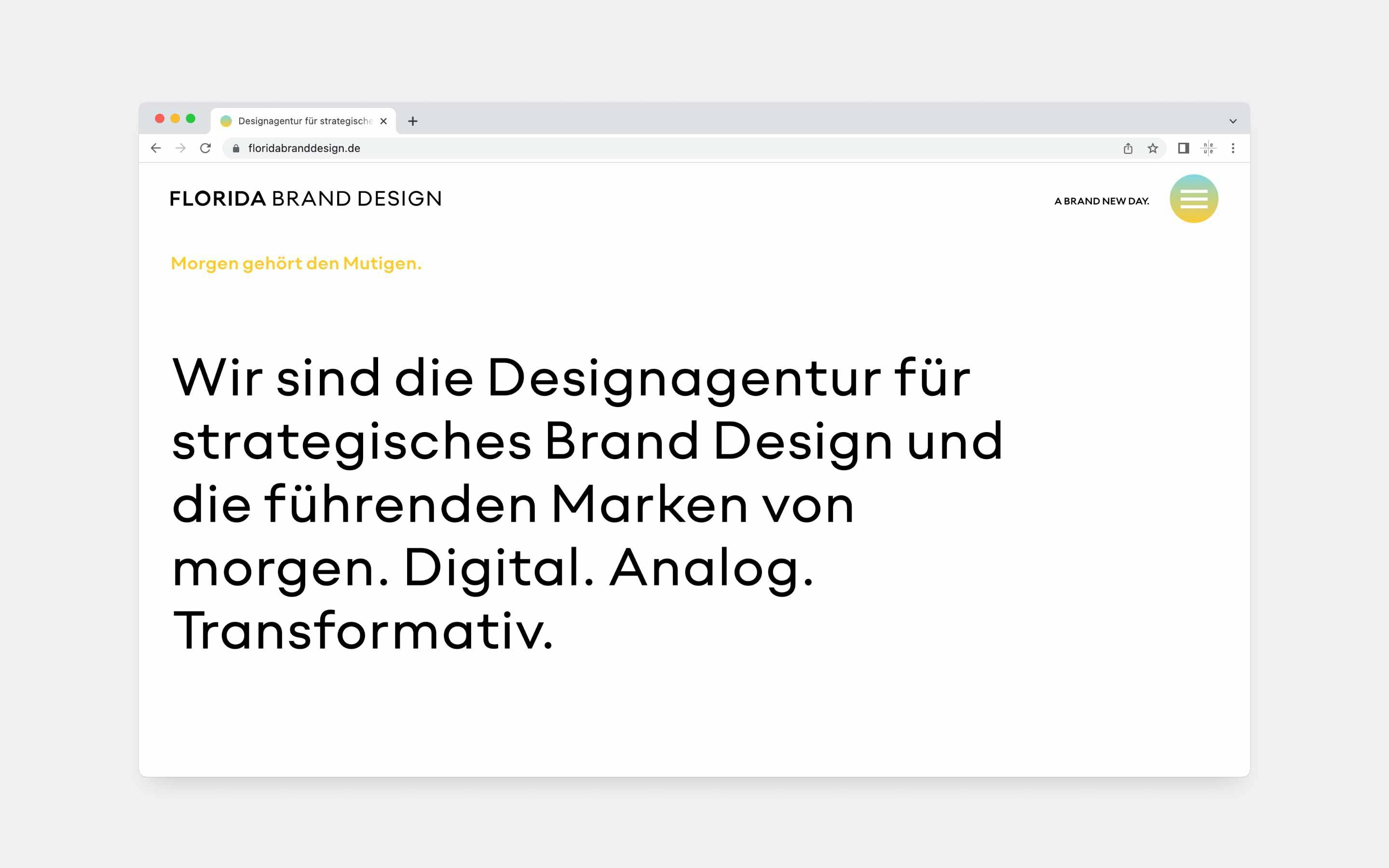
neue Radial for Florida Brand Design
Florida Brand Design is a Dortmund-based branding studio specialized in strategic branding in both physical and digital environments. In addition to their work for high-profile clients Florida is the initiator of the annual Process Festival.
Learn MorePreoccupations
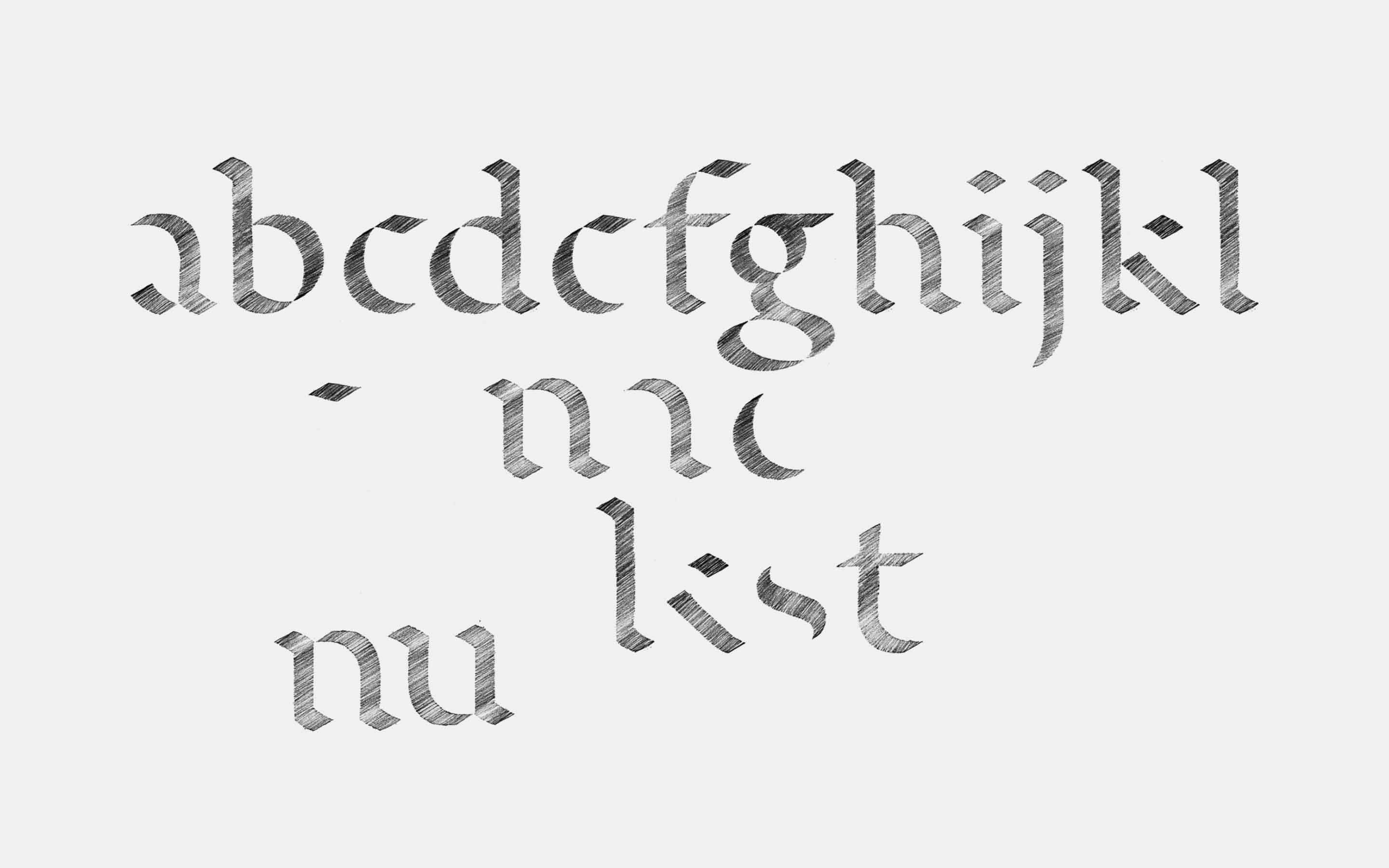
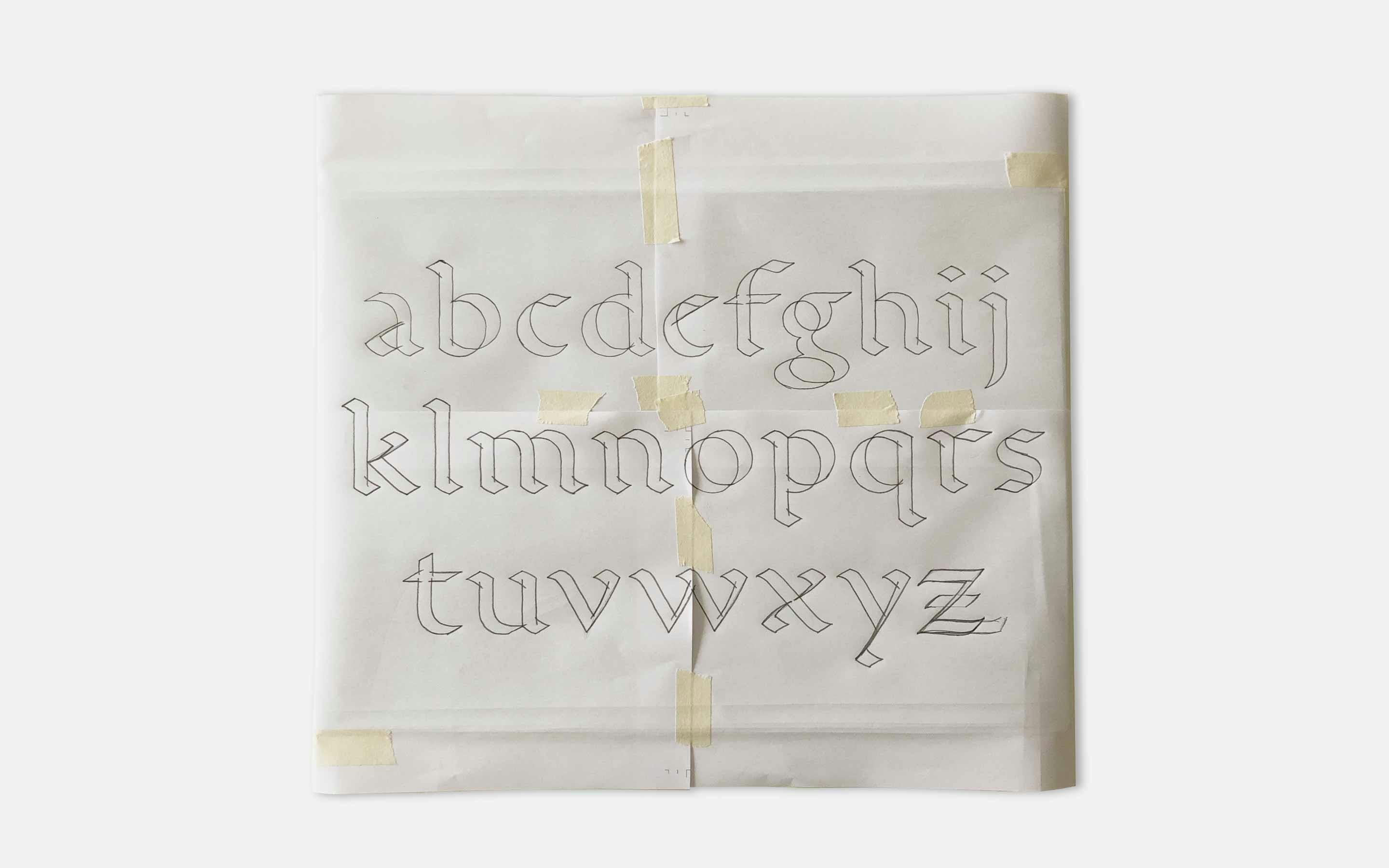
Broad Nib Construction
Highly influenced by the work of Gerrit Noordzij this broad nib alphabet was an attempt to create my own “standard” alphabet for the purpose of teaching and explaining about the construction and patterning of the Latin lowercase alphabet.
Learn MorePreoccupations
Uniform Stencil Alphabet
One of the early and more playful approaches to design a uniform alphabet. Borrowing shapes created by multiple writing tools such as broad nib, pointed nib and brush, and combining them into one single alphabet is what gives this design a certain liveliness.
Learn MorePreoccupations
Broad Nib Stencil Cutting
Based on the “standard” broad nib alphabet this stencil is a good example for neue’s reoccurring fascination for uniform alphabets where a limited amount of shapes can be used to compose entire alphabets with a more or less conventional look.
Learn MoreIn-Use
neue Vektor for Mangold Branding
Cornelius Mangold is an architect, a publisher and a branding specialist. He worked for top-notch and highly demanding companies such as Daimler, FSB, mawa and the infamous BER airport. Cornelius continues going strong with Mangold Branding.
Learn MoreIn-Use
neue Singular for PPE europe
PPE europe plays an important role in supplying governments, businesses and individuals with personal protective equipment such as medical masks, gloves and non-woven products. Efficiency and sustainability are core values to the company.
Learn MoreIn-Use
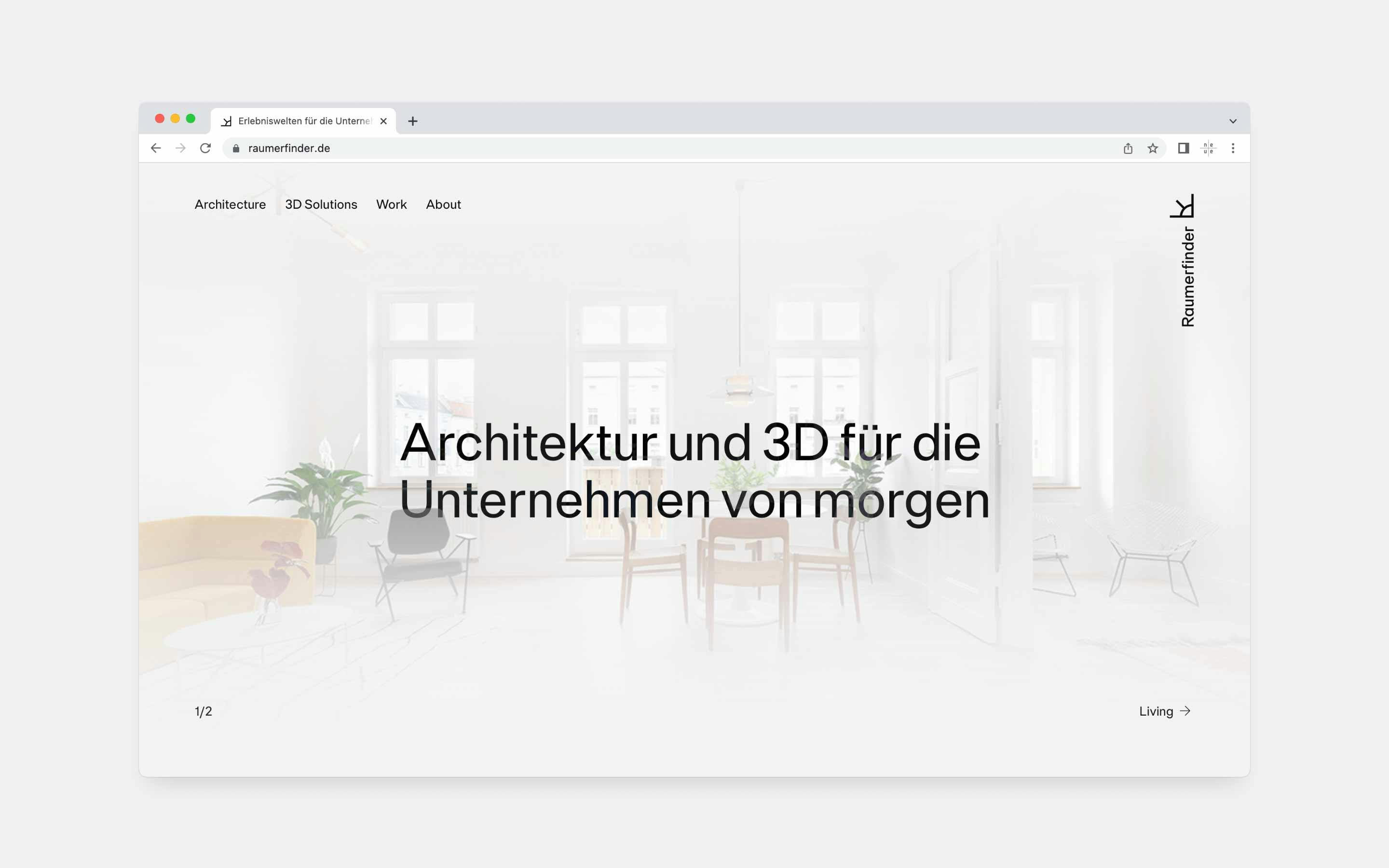
neue Singular for Raumerfinder
Raumerfinder is a Berlin-based studio for architecture and visualization. For over 10 years now experienced architects, programmers and 3D artists work in close-knit teams to fulfill the client’s demands nationwide and internationally.
Learn MoreIn-Use
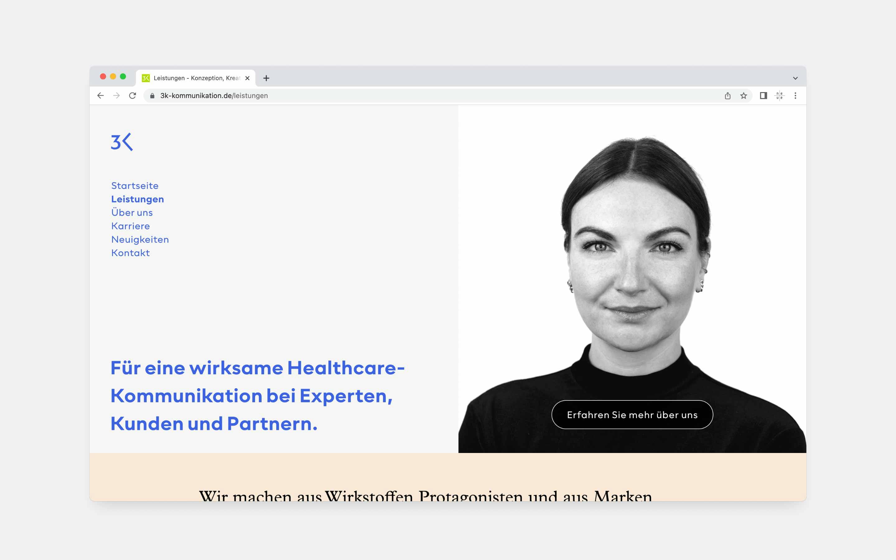
neue Radial for 3K Kommunikation
3K Kommunikation is one of the leading healthcare PR agencies in Germany. The team consists of doctors, pharmacists and scientists with a deep understanding of the individual and overall topic making 3K a trusted partner for high-profile pharmaceutical companies.
Learn MoreIn-Use
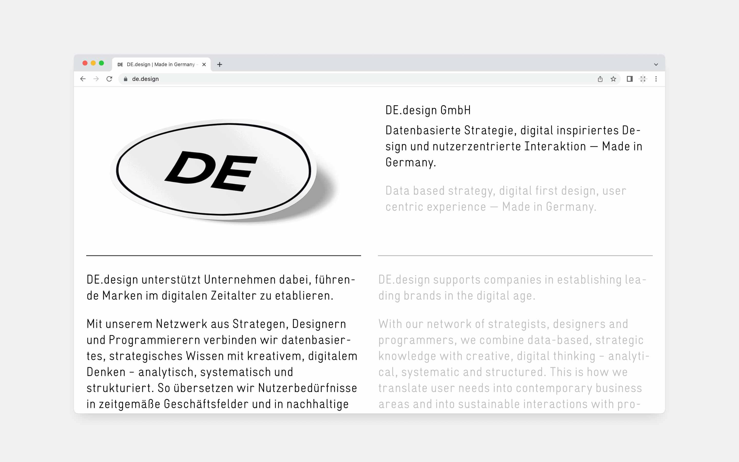
neue Vektor CNC for DE.design
DE.design supports companies in establishing leading brands in the digital age. DE entertains a network of strategists, designers and programmers, to combine data-based, strategic knowledge with creative, digital thinking.
Learn MorePreoccupations
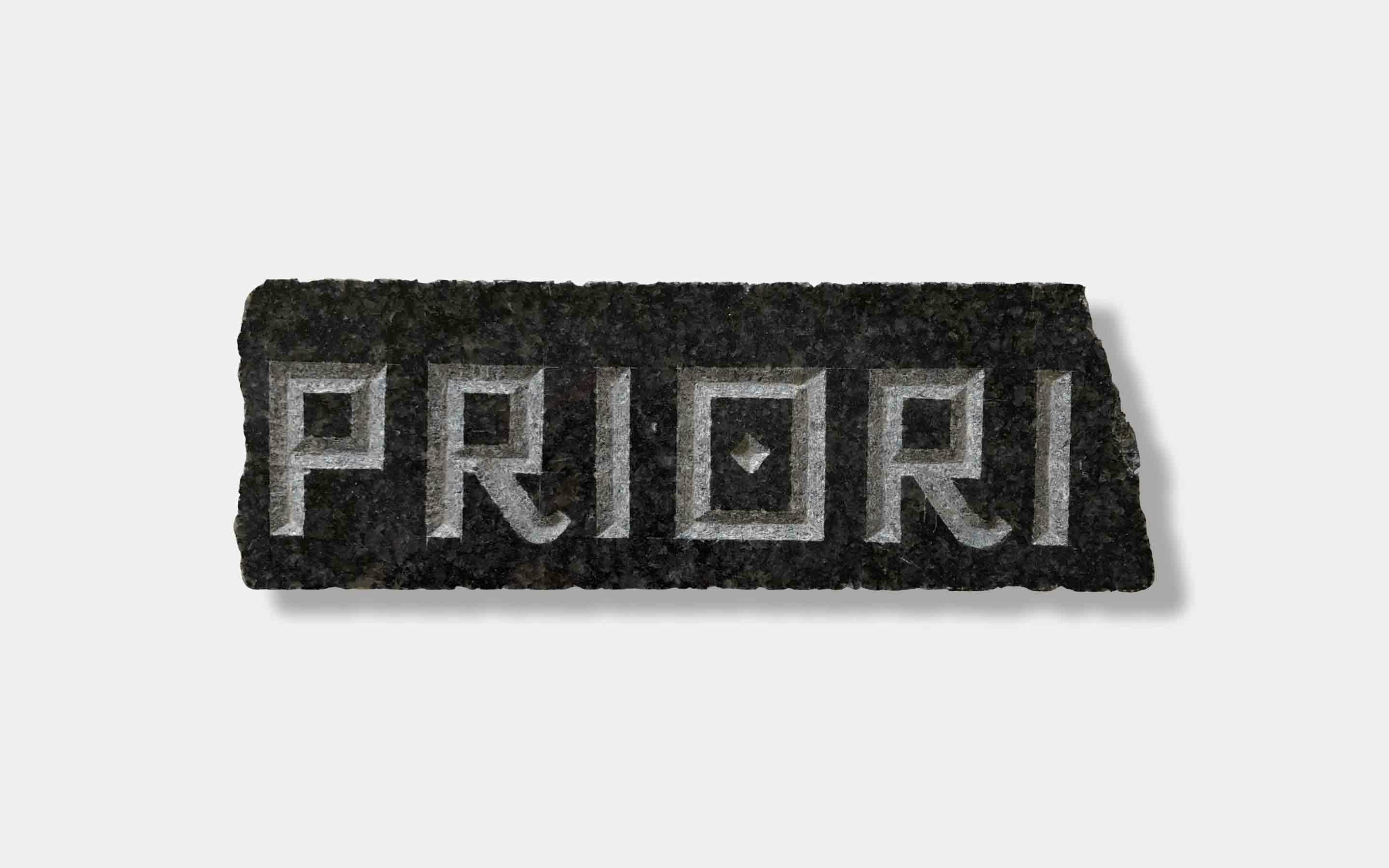
Stone Carving Exercises
neue designs on screen, on paper, on linoleum, cuts steel and carves stones. Each material calls for a different design solution which might go beyond the place it has been found and improve designs totally alien to its natural environment.
Learn MoreCustom Work
echovai
Commissioned by Helder Design to take a closer look on their logotype for echovai we checked and improved the quality of the outlines, presented modifications for individual letters, adjusted and homogenized the spacing, and exported the design.
Learn MoreReleases
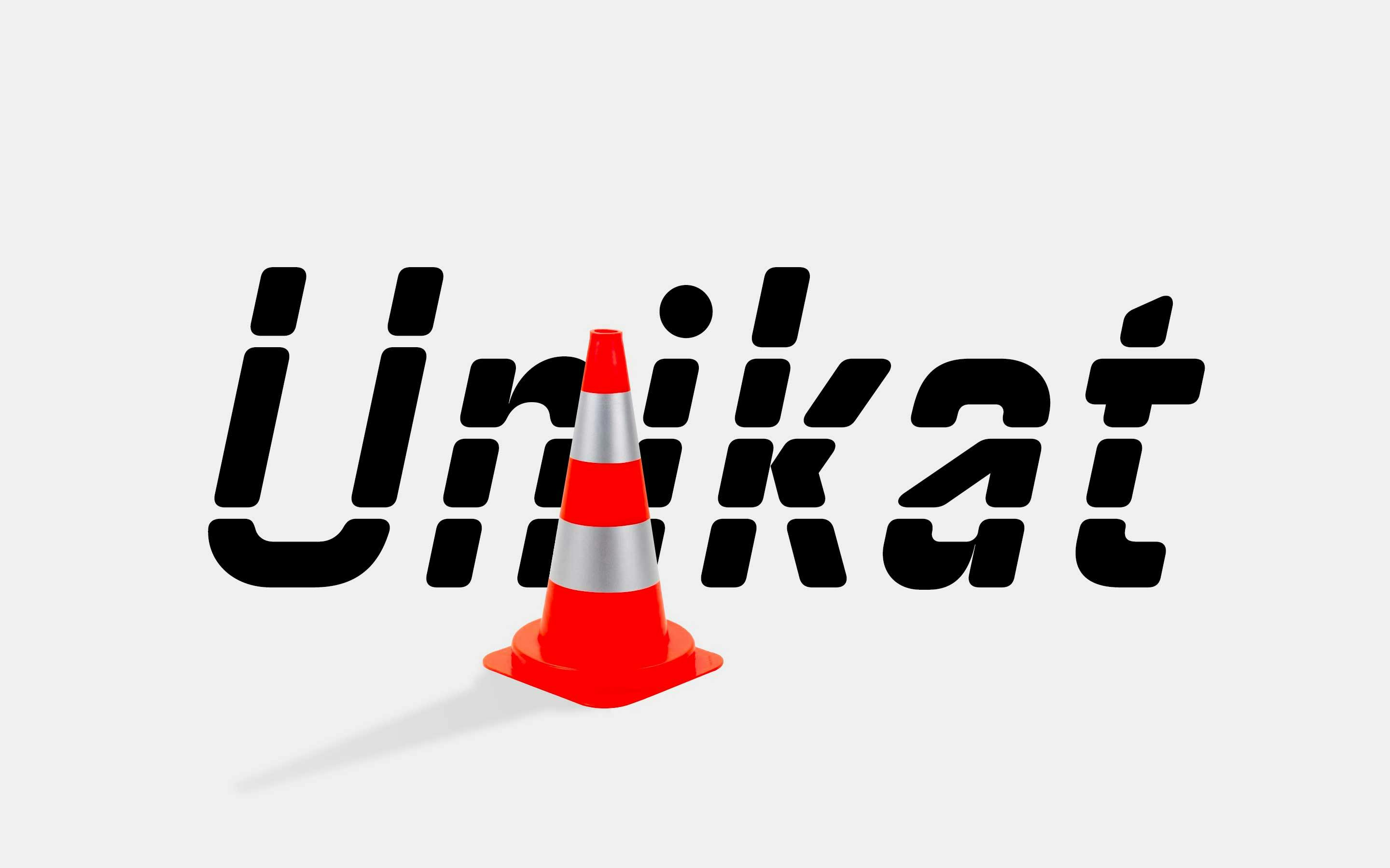
neue Unikat Stencil Release
neue Unikat Stencil is a further extension of our neue Unikat Superfamily — in addition to normal and round. Inspired by (typo)graphic street markings and with its multiple horizontal-only cuts this font family is far away from a traditional stencil designs.
Learn MoreReleases
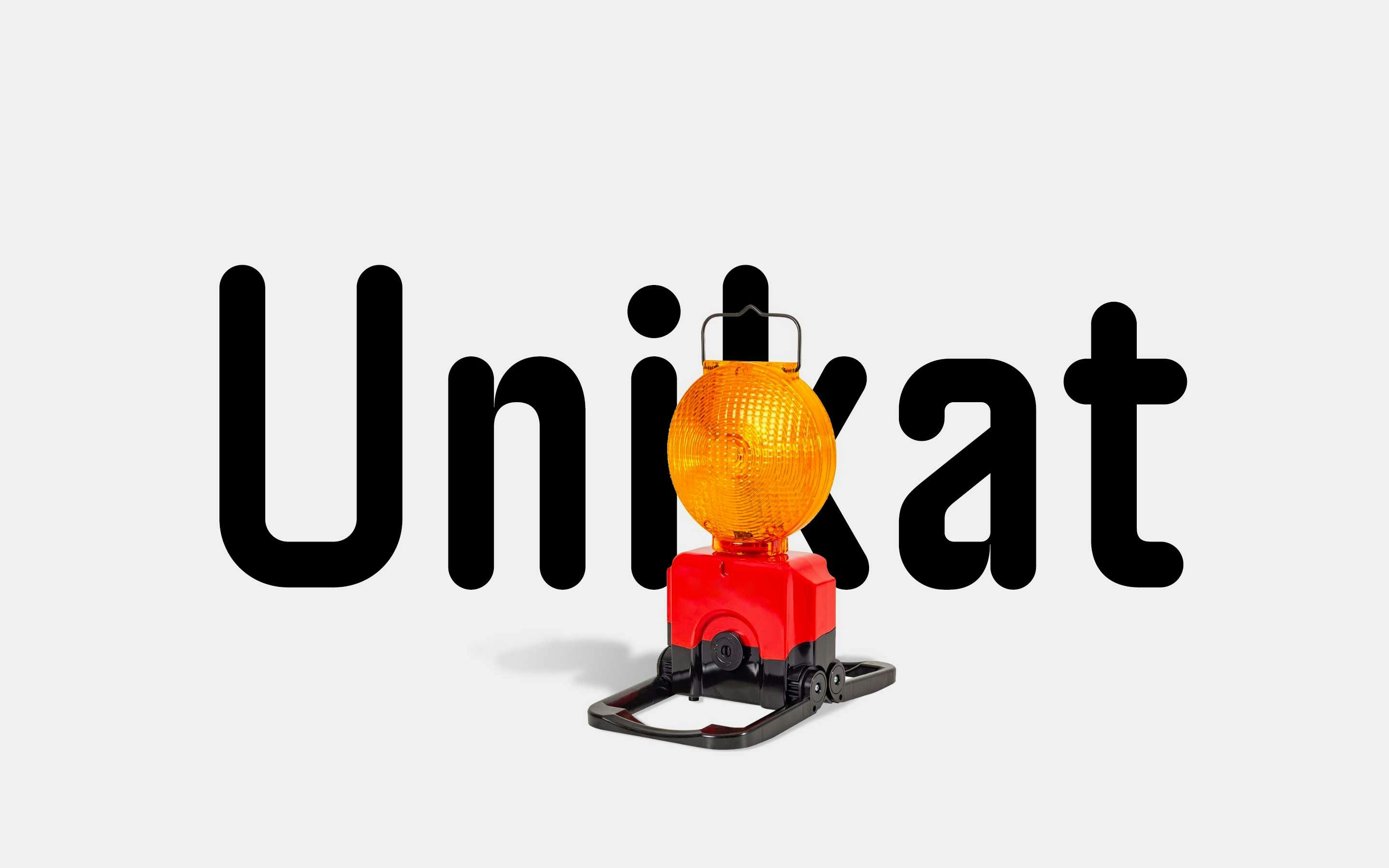
neue Unikat Round Release
To further diversify the potential usage of neue Unikat we have created neue Unikat Round — a less austere and a more friendly appealing sibling. While all stroke endings were replaced by half-circles the inner corners retained their explicit sharpness.
Learn MoreReleases
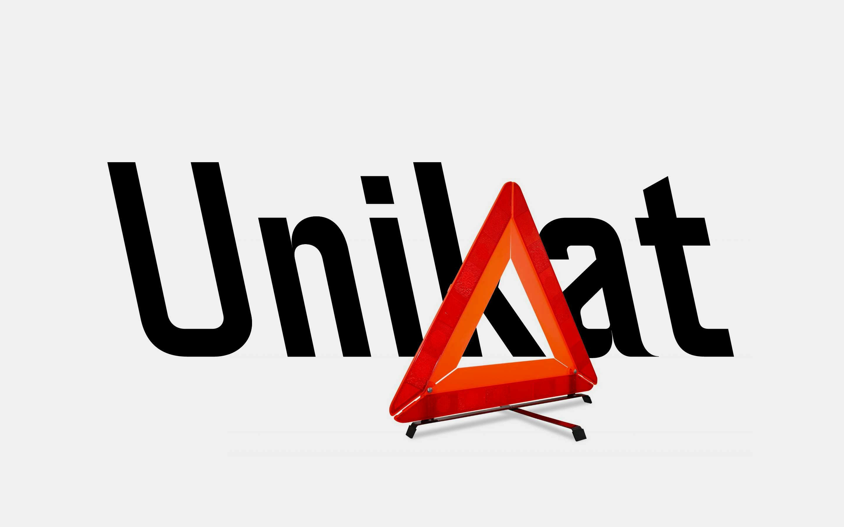
neue Unikat Release
neue Unikat is an interpretation of a typeface used by the Singapore Land Transit Authority for its directional signage. The typeface design is based on a rigid grid with little to no room for optical compensations or any kind of harmonisation.
Learn MoreReleases
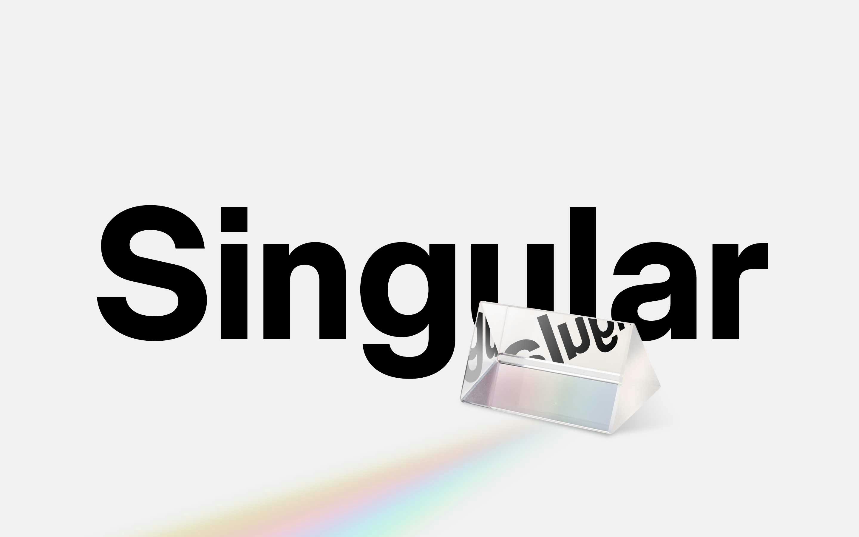
neue Singular Release
neue Singular is a contemporary Neo-grotesque sans-serif designed in three variants. The suffixes H, D, and V indicate the corresponding treatment of the stroke endings: H for horizontal, D for diagonal, and V for vertical.
Learn MoreReleases
neue Vektor CNC Release
neue Vektor CNC is engineered, not designed. The family draws inspiration from the engravings one can find on German industrial goods such as drills, ball-bearings, nameplates and all kinds of infrastructural plaques.
Learn MoreReleases
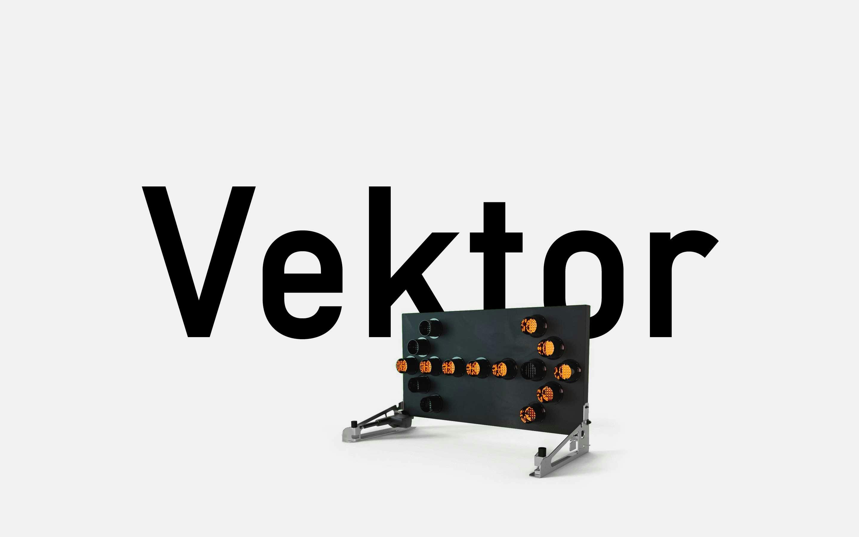
neue Vektor Release
neue Vektor is subject to the idea of “one destination, two routes”: satisfying one particular design demand with identical characteristics such as character set, number of styles, OpenType functionalities and metrics, but doing it so in two stylistically different ways.
Learn MoreReleases
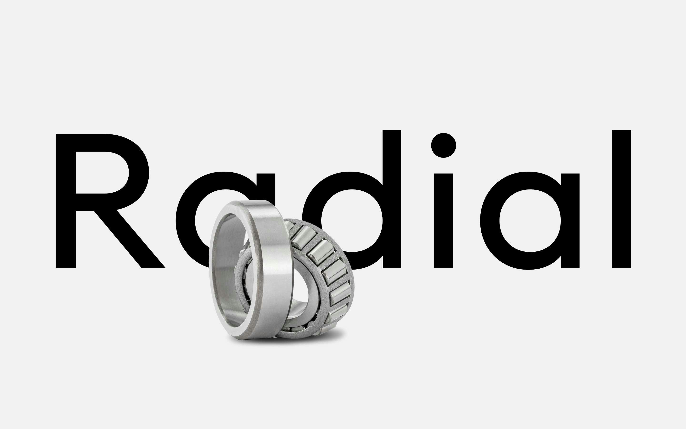
neue Radial Release
neue Radial is not what it seems at first sight. Most certainly it is not another geometric grotesque, but an impeccable visual system that unites four of the most popular sans serif genres of recent decades, integrated in this superfamily under the suffixes A, B, C and D.
Learn MoreIn-Use
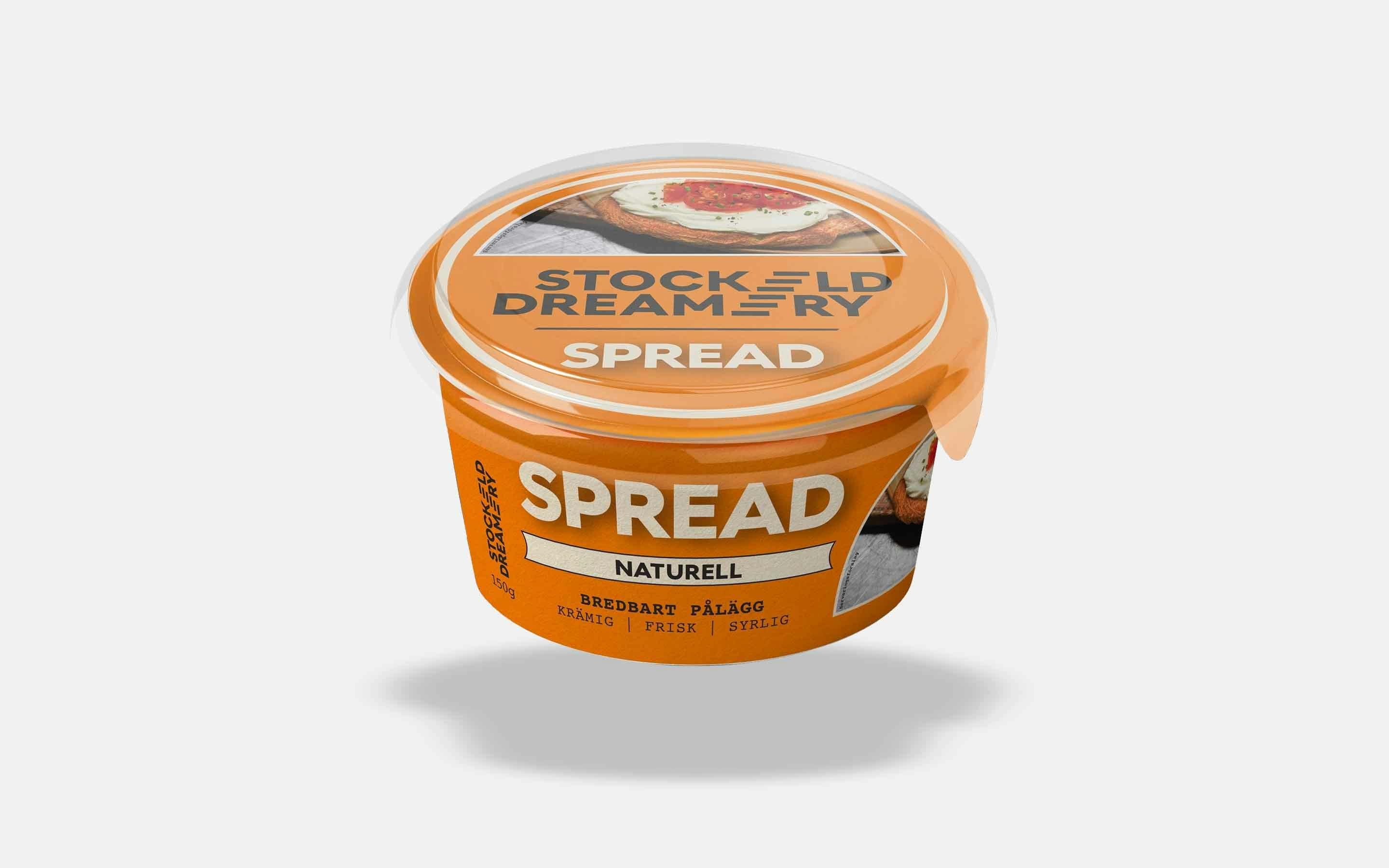
neue Radial for Stockeld Dreamery
Stockeld Dreamery is “the world’s most ambitious cheese”. A 100% plant-based cream cheese based on fermented lentils and chickpeas and up to 70% lower in CO2e impact compared to conventional dairy-based cream cheese products.
Learn MorePreoccupations
Broad Nib Writing Linocut
Based on neue’s previous work on the “standard” broad nib alphabet this became its manifestation on linoleum. A positive and a negative version was cut and multiple prints were produced using different colors and materials.
Learn MoreFurther Information
Try before you buy. neue offers Trial Fonts for each family with a reduced character set Download trial fonts. Want to customize one of our retail fonts? Sometimes a small modification of an already existing neue font does the job Learn more about Custom Fonts. Let’s have a Video Call in case you prefer it over writing emails Schedule a video call. Get in touch: neue, c/o Alexander Roth, Im Wellenbügel 14, 32108 Bad Salzuflen, Germany Find us on the mapEmailInstagramLinkedIn.